The Global Crop Map
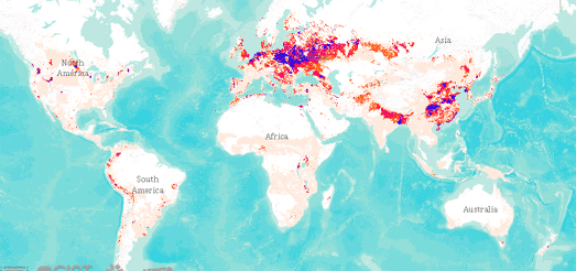
RTBMaps shows the distribution of different crops around the world. You can use the map to see where potatoes, bananas, sweet potatoes and other root vegetables & tubers are grown across the globe. The map also includes a number of socio-economic layers which allow you to view such things as population density alongside where the different crops are grown.
Select a crop from the map's drop-down menu and you can view where the crop is grown around the world. Unfortunately RTBMaps is one of those maps which dislike legends so we have to guess what the different colors means. My guess is that the different colors have something to do with the yield of the selected crop but which colors indicate a high yield and which colors indicate a low yield is anybody's guess.
The map also includes layers which show the potential yield of a crop and crop suitability. These layers provide an overview of where yields of the selected crop could be increased and areas around the world where the land is suitable for growing the chosen crop.
If you are interested in which crops are grown in the USA then you might like Bloomberg's The Consolidation of the American Harvest which maps where different crops are grown in America.


Comments