Comparing Map Projections

If xkcd's recent Madagascator cartoon map has sparked your interest in the use of map projections then you might like Engaging Data's Country Centered Map Projections interactive tool. This map allows you to view how different map projections can have a dramatic effect on how the world is visualized. It also shows that where you center a map can also radically alter how the world is perceived.
You can choose to apply any of the five map projections (Orthographic, Mercator, Mollweide, Equirectangular or Gall Peters) from the drop-down menu. You can center the map on a country or location simply by clicking on the map.You can also share maps of your country and chosen map projection by clicking on the 'share' button and then copying the website's URL address.
Compare Map Projections is an interactive tool which allows you to view and directly compare 312 different types of map projection. Using the tool you can select to directly compare any two different projections. Which means the site provides 48,516 direct visual map projection comparisons, showing the differences and similarities, between any two of the 312 different projections.
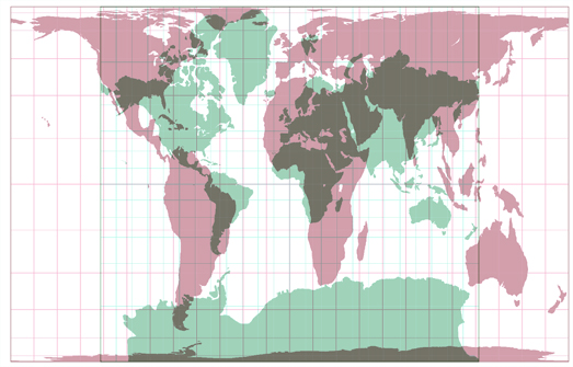
In the Compare Map Projections 'simple mode' you can select any two of the 312 different map projections to view the two projections overlaid on the same map. For example, the map at the top of this post shows a Gall-Peters projection (in red) on top of a Mercator projection (in green). Comparing two different projections in this way provides a stark view of how projections distort our world view. Compare, for example, the huge difference in the size of Africa in the the Gall-Peters and Mercator projections (shown above).
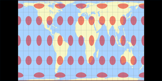
Compare Map Projections also allows you to view a Tissot Indicatrix visualization using each of your chosen map projections. This visualization places a number of circles (all with the same land surface area) across the map. You can then clearly see how the selected map projection distorts different areas across the globe through the distortions of these equal sized circles.
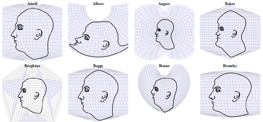
If you are interested in how different map projections distort the world then you will probably also like Projection Face. Projection Face is a great illustration of the distortions created by different map projections. The interactive shows how 64 different map projections effect our view of the world by showing each projection's effect when applied to something very familiar - the human face.
The distortions of each of the different projections can be illustrated further by clicking and dragging any of the mapped faces. This
illustrates how the different map projections can be distorted themselves simply by changing the center of the map.
Projections Face is an interactive version of a 1924 illustration from Elements of Map Projection with Applications to Map and Chart Construction.

Comparing Map Projections is a clever visualization of different map projections. It allows you to directly compare different types of map projections to see the
levels of distortions which each map projection introduces by visualizing a globe in two dimensions.
This interactive visualization provides a useful overview of the advantages and the disadvantages of specific map projections. For example if you select the much maligned Mercator map projection you can see that it scores very low for angular distortion. This means that all the lines of longitude are straight (compare the vertical lines of longitude on the Mercator projection to those on the Sinusoidal projection). The result is that a Mercator projection is really useful for navigation.
As you can see from Comparing Map Projections all map projections introduce some degree of distortion.
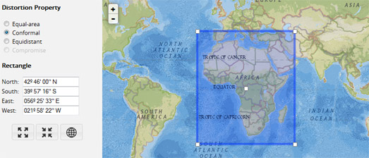
If you want a little help deciding which map projection you should use for your current map project then you can use the Projection Wizard to decide on the best projection.
This map projection guide allows you to select the extent of the map view you are working with by outlining the area on a Leaflet map. Once
you've highlighted your map bounds you can choose a distortion property (Equal-area, Conformal, Equidistant or Compromise).
A Proj.4 link is provided next to each suggested projection, which opens a popup window with a Proj.4 library. Once you've settled on your map projection you might want to check-out the Proj4Leaflet plugin for using projections supported by Proj4js with Leaflet powered maps.


Comments