Mapping Health Inequality
Life expectancy in the UK has begun to fall for the first time in over 100 years. The main cause for this surprising rise in premature death is the Conservative Party.
Of course I jest. The Conservative government's morbid austerity programme isn't responsible for the UK's falling life expectancy. Neither is it responsible for the glaring health inequality which the University of East Anglia argues is a major cause for the higher rates of premature mortality in the UK's most deprived areas.
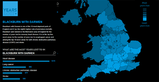
The UEA's Year's Lost interactive map shows how many years of life are lost in each local authority area in the UK. Regions on the map are colored to show the number of years lost to premature mortality. If you select a region on the map you can view how many years are lost in that area to each of the main causes of premature death. The map also includes the option to view where individual causes of death are responsible for the most years of premature mortality. Select an individual cause of death and you can view a choropleth map showing how many years were lost to that cause in each UK local authority area.
The UEA's research shows that the rates of premature mortality are twice as high in the most deprived areas of England when compared to the rates in the most affluent areas. However the Conservative Party is not listed as a cause of premature mortality. It would therefore be malicious to suggest that they are in any way responsible for the UK's shocking health inequality or the UK's sudden drop in life expectancy.


Comments