Saturday, June 30, 2018
Faces of Auschwitz
Auschwitz concentration camp was established by the Germans in occupied Poland in 1940. In the next few years it became the most deadly Nazi extermination camp. It is estimated that 1.1 million people perished in Auschwitz-Birkenau between 1940-1945.
The Auschwitz-Birkenau Memorial and Museum has 38,916 registration photographs taken of Auschwitz prisoners. They are working with Brazilian photo colorization specialist Marina Amaral and a team of academics, journalists and volunteers to colorize these photographs and to research and share the stories of those photographed.
You can explore these photos and biographies on Faces of Auschwitz. The Faces of Auschwitz interactive map shows the home town locations of the photos and stories completed so far. If you click on the map markers you can view the prisoner's colorized photograph and to click through to read the individual's story.
Since 1997 German artist Gunter Demnig has been creating memorials for individual victims of the Holocaust. Demnig's stolpersteine (stumbling blocks) are small, cobblestone-sized memorials for individual victims of Nazism.
Each stolperstein is placed in the sidewalk outside the victim's home. Stolpersteine Online is a Google Map of the memorials which have been erected. The project has created about 35,000 stumbling blocks so far. This is a very small percentage of the total number of victims of the Holocaust, however if you zoom in on any German city on this map you still can't fail to be overwhelmed by the sheer scale of the Nazis Holocaust.
Friday, June 29, 2018
Mapping City Gayborhoods
The Pudding has mapped out gay neighborhoods in 15 different cities. The map plots businesses tagged 'gay bar' and data on where same-sex unmarried partner households and same-sex married joint tax filers live, in order to determine the gay neighborhoods in each city. The Pudding has also mapped out the differences in where same-sex female couples live and where same-sex male couples live.
Men are from Chelsea, Women are from Park Slope includes three maps for each of 15 of the USA's largest cities. For each city one of the maps provides a choropleth view of where same-sex couples are more likely to live. The other two maps shows where same-sex female couples are more likely to live and where same-sex male couples live.
The Pudding has also provided a descriptive overview of the gayborhoods in each of the 15 cities. This includes information on such things as where Pride parades have been routed and where gay bars have tended to be sited. It also includes the first hand accounts of local residents about local gay friendly and gay unfriendly neighborhoods in the featured cities.
Another way to determine a city's gay friendly neighborhoods might be to see where people go after Pride. Last year Carto undertook an interesting geo-data investigation into where people go after taking part in New York's Pride parade. A Map of Where People Went After the NYC Pride Parade uses pick-up and drop-off data from New York's yellow taxis to determine what people did after New York's 2018 Pride parade.
Using data from Sunday June 26th, 2016 (the date of last year's Pride in New York) Carto isolated all the taxi pick-ups in the Pride parade area between 4-8pm (when the parade was winding down). They then created a map of all the drop-off points from these pick-ups, to see where people were going after Pride. Carto used a DBSCAN clustering algorithm to identify locations with a high density of drop-offs.
Major transit hubs feature quite prominently, presumably for people heading home, Areas with popular gay bars also appeared to be popular destinations. Locations around hotels is another take out from the mapped data.
Unequal Under the Law
Your chances of going to prison after committing a crime vary wildly depending on which state of America you are tried in. In Maine the number of people imprisoned per 100,000 residents is 153. In Louisiana it is 816. If you are white and live in Louisiana you don't have to worry about being sent to prison for a crime as much as you would as black residents of the state. The white imprisonment rate is only 438. If you are black the imprisonment rate is 1,740.
The Sentencing Project has created an interactive map which allows you to compare how different states interpret and apply criminal justice. The map allows you to make direct comparisons of each state's imprisonment rate, juvenile custody rate and the racial disparity in incarceration rates.
The Sentencing Project's State by State Data has three different visualization tools of imprisonment data in the United States. The interactive map provides choropleth views of the different imprisonment rate data providing a direct state by state comparison for the selected data-set. The 'Detailed State Data' option allows you to select a state to view a breakdown of all the imprisonment rate data for that state. The 'State Rankings' view provides an ordered view of all states for each data-set, listing the states from highest to lowest.
One thing that the Sentencing Project's data definitely reveals is that the United States likes locking people up. According to the Prison Policy Initiative's report States of Incarceration: The Global Context 2016 "every state (in the USA) is more likely to incarcerate its residents than almost every other nation on the planet". The NAACP reports that 25% of the entire world's prison population is living in American jails. This propensity to lock up its citizens affects African Americans more than most other Americans. The NAACP says that "African Americans are incarcerated at nearly six times the rate of whites" in the USA.
As we have already seen there is also a geographical factor at play in the incarceration rates of the different states in the USA. The Prison Policy Initiative states that "the South has consistently had a higher rate of incarceration than the other regions of the United States". The Pudding decided to explore if there was any connection between the high rate of incarceration in Southern states and the legacy of slavery. By mapping 150 years of census and incarceration data they wanted to see if historic incarceration rates differ between the former slave states and the non-slave states of the North.
In the Shape of Slavery The Pudding examines the number of slaves in Southern states before the Civil War, the black population across the United States over time and the number of prisoners in each state over time. Using these different map views it is possible to compare the rate of incarceration between Southern and Northern states.
Thursday, June 28, 2018
Satellite Evidence of Myanmar Atrocities
The ethnic cleansing of Rohingya Muslims in Myanmar’s western Rakhine state has caused hundreds of thousands of refugees to flee to neighboring Bangladesh. Amnesty International's Mapping Myanmar's Atrocities Against Rohingya is a story map exploring the systematic burning of Rohingya villages, mosques and homes by the Myanmar military.
As you progress through Amnesty's story map eye witness accounts provide evidence of the atrocities carried out by the Myanmar army. In particular the map recounts the Chut Pyin Massacre, where hundreds of Rohingya were killed, and the village was set ablaze. Following the Chut Pyin Massacre the army went on to burn down many more Rohingya villages. The Amnesty map uses before and after satellite images to show the targeted burning of these Rohingya villages. As Amnesty's map shows this "didn’t just happen in one area - it happened in Rohingya villages across northern Rakhine State".
Amnesty map documents the refugee routes taken by the Rohingya who fled to neighboring Bangladesh. The map also documents how the Myanmar army has been building military bases across Rakhine state, often on land where Rohingya used to live. The burning of villages and the building of military bases seems deliberately designed to deter Rohingya from returning to their homes.
Reuters has also used data from the U.N. Operational Satellite Applications Programme (UNOSAT) to map the Rohingya homes and villages which have been burned by the Myanmar military. Burned to the Ground uses satellite imagery of Myanmar to identify villages which have been shelled and / or burnt to the ground.
As you read through Burned to the Ground an interactive satellite map scrolls along a 110km strip of Rakhine state in Myanmar highlighting the burned villages while also outlining some of the atrocities carried out by the Myanmar military and government. Around 655,000 Rohingya have now been displaced. Myanmar is making sure that they will have no homes to return to.
Every Home Owner & Renter in America
There have been a few maps recently which have tried to show the best places to rent or buy in the United States by comparing the cost of renting and the cost of buying in an area. Another indicator might be to look at where people are already renting and buying properties. For that job you need the Owners vs Renters map.
Owners vs Renters is an interactive dot map showing every single home owner and renter in the United States. It uses data from the 2010 US Census. For reasons of personal privacy data is randomized within each block. This means that you can't tell the areas within your immediate neighborhood where people are renting or owning. However the map is very effective at the city level, revealing the neighborhoods with a mixture of renters and owners, the neighborhoods where most people own their homes and the neighborhoods with a majority or renters.
Owners vs Renters is particularly effective in dense urban areas. Zoom in on any major city center and you can quickly see where home owners tend to live and where lots of people rent. There could be many historical and/or social reasons why particularly blocks have a mix of owners or renters or a predominance of either owners or renters. For example, you might find it interesting to compare the Owners vs Renters dot map with the Racial Dot Map of America.
You can learn more about how the map was made with Mapbox and Tippecanoe on this blog post, Renters and Owners — Visualizing every person in the US.
All Flights Lead to Rome
Two years ago Moovel Labs created a beautiful mapped visualization called Roads to Rome. The map showed the quickest route by road from 486,713 different starting points in Europe to the eternal city of Rome.
Moovel Labs are now back with another stunning mapped visualization, this time showing the quickest flight routes to Rome from across the globe. Flights to Rome visualizes the quickest flight routes to the Italian capital from 712,425 locations around the world. Routes to the nearest airport from each of these locations are based on the OpenStreetMap road network. From there FlightRadar24 data has been used to show the flight route to Rome Fiumicino Airport.
The interactive mapped version of Flights to Rome allows you to explore a 2d map of this global network of flight routes, leading to Rome. It also includes a 3D map view which allows you to view the flight routes in and out of every major airport around the world in three dimensions. This 3D view allows you to pan around airports to observe how flight routes enter and leave the selected airport.
The two dimensional map of Flights to Rome allows the user to observe important connection hubs where global travelers are changing flights on their trips to Rome. From the east global travelers to Rome most often change flights in Moscow. Far eastern traffic tends to come via Istanbul.
Moovel Labs has also created maps visualizing the global flight routes to New York and Tokyo. If you are an Italian who wants to get as far away from Italy as possible by plane then Moovel Labs has also got you covered. It has created a list of the most remote airports from Rome.
Wednesday, June 27, 2018
Gentrification in Detroit
Turning the Corner is an Esri story map which identifies Detroit city blocks which are most likely to experience transformational neighborhood change. Using the map you can view which city blocks in Detroit are most and least likely to become gentrified and most and least likely to experience the displacement of local residents.
The map assesses the likelihood of transformational neighborhood change in a block based on both qualitative and quantitative research. The qualitative research includes surveys of residents’ own perceptions about neighborhoods. The quantitative research is based on factors such as residential vacancies, residential turnover, demolition permits, business investment and local crime data. How these factors can effect neighborhood change is explained as you progress through the story map.
Blocks on the map that are colored yellow are most likely to experience (or are already experiencing) neighborhood change. Blocks colored blue are the least likely to change. If you click on a yellow block on the map you can view details on which factors are most likely contributing toward neighborhood change (and toward potential displacement).
Ten Colombian Election Maps in One
On the 17 June Iván Duque Márquez of the Democratic Center stood against Gustavo Petro of Humane Colombia in the second round of the Colombian Presidential election. Iván Duque Márquez received the most votes and will serve as President of Colombia from 7 August 2018 to 7 August 2022.
The Colombian Presidential Elections - Second Round is a fantastic mapped visualization of the results from the second round of the Colombian Presidential election. The map starts off with a simple choropleth view showing the winner in each electoral district. It then runs through a number of different methods for mapping the results to provide an ever more nuanced analysis of the 2018 Presidential Election.
A simple choropleth view of the results shows that Iván Duque Márquez won most northern and eastern electoral districts in Colombia. Gustavo Petro won most of the southern and eastern districts. One problem, however, with this simplistic choropleth view is that it doesn't take into account the huge population differences between different districts. Election districts in the Amazon are very large in area but have small populations. This can distort the overall picture of the election map.
The map overcomes this problem by switching to scaled circular markers for each electoral district. In this view the circles are colored to show the winning candidate in the district and are scaled in size to reflect the size of the voting population. This view reveals more geographical differences in how the country voted. Municipalities near the border with Venezuela voted mostly for Iván Duque Márquez and municipalities on the coast voted more for Gustavo Petro.
The Colombian Presidential Elections - Second Round visualization ends up by removing the map completely and reorganizing the municipality circular markers by the percentage of voters who voted for each candidate (on the horizontal plane) and by region (on the vertical plane). This makes it much easier to see how Colombia voted by region. The Pacific region voted more for Petro while regions in the center and the west of the country voted more for Iván Duque Márquez.
Creating Moscow's Super-Park
Dvorulitsa Moscow is a project to transform Moscow's periphery into a superpark by transforming the yardstreets (dvorulitsa). Yardstreets are the spaces between the apartment blocks that dominate the periphery in Moscow. They are areas that are often dirty, unkempt and uninviting. Dvorulista wants to help local residents transform these communal spaces into places which people will enjoy and where they will be happy to spend time.
To achieve this aim Dvorulista wants to help locals identify yardstreets for improvement. It will then help them explore how the space is currently used and how this can be improved. These improvements could include many different things, including communal gardens, parks, cafes, cycle paths, better lighting or play areas. By supporting many organic local projects in this way it is believed that the periphery can eventually be transformed into a superpark which completely surrounds the city center.
Urbica has worked with the Dvorulitsa project to create an interactive map which shows the location of all Moscow's yardstreets and which residents can use to start and / or comment on local yardstreet projects. Yardstreets on the interactive map are colored yellow. Users can click on an individual yardstreet on the map to leave suggestions on how it could be improved or to propose a local project. The map was designed using Mapbox Studio to provide a distinctive looking map which complements the design and color-scheme of the Dvorulitsa project website.
Tuesday, June 26, 2018
Where are the children?
Donald Trump's 'zero tolerance' immigration policy has resulted in more than 2,300 children being separated from their parents and families. Torn Apart / Separados is a new interactive map which shows the locations of ICE facilities across the United States where these children might be being held.
The Torn Apart / Separados interactive map uses data from Customs and Border Protection (CBP), Immigration and Customs Enforcement (ICE) detention centers, news reports and from Google Maps entries & Facebook places. You can read more about how this data was researched in the 'Reflections' part of the site.
The interactive map lists both ICE facilities and private juvenile detention centers. If you select the 'Visualizations' option and then click on charts you can view visualizations of the average daily population in ICE detention facilities in each fiscal year from 2014-2018. You can also view the number of ICE facilities in use for the same years.
The Washington Post is also attempting to map where migrant children are being held in the United States. In Where are the migrant child facilities? Scattered across America the paper has mapped out the locations of facilities where it is known migrant children are being held and intends to update the map as more information comes to light.
Ignoring the World's Refugees
The world is suffering from a huge refugee crisis. The UN refugee agency says there are more than 25 million refugees in the world. It isn't exactly a global crisis. The reason why it isn't a global crisis is because countries in the developed world are doing very little to help. In fact about 85 percent of those 25 million refugees are being helped by low and middle-income countries.
The Center for Global Development has created an interactive map visualizing refugee numbers in 31 of the 37 developing countries hosting at least 25,000 refugees. You can click on individual countries on the map to view the total number of refugees living in the country. The map was created to show how many refugees are living near urban job opportunities but it also (inadvertently) provides a good visualization of many of the developing countries who are housing the world's refugees.
Google's EarthTime application recently released two animated visualizations showing the movement of refugees around the world. The Global Refugee Crisis: A System Overburdened also shows how poorer countries are facing the biggest burden from the current refugee crisis. It uses the example of Syria where over half of the population has been displaced, either internally or externally. Of those that have moved abroad most have moved to neighboring Jordan, Lebanon, Turkey or Iraq.
Another Google EarthTime visualization The Global Refugee Crisis: The Big Picture shows a similar story across the world. From Afghanistan to the Central African Republic and from Colombia to Iraq, when disaster hits and people are forced to flee their home countries it is neighboring countries which take in the most refugees. Countries which are themselves usually in the developing world
The World Bank has also created an interactive showing the number of refugees living in each country. The Refugee Population by Country or Territory of Asylum uses data from the United Nations High Commissioner for Refugees to visualize how many refugees lived in a country in each year from 1990-2016. Again the map reveals that countries in the developed world have taken in the least refugees. For example in 2016 the USA had a refugee population of around 273,000. In the same year Jordan and Turkey both had refugee populations of over 2,800,0000.
Mapping the Historical Layers of London
A new interactive map plans to document the history of London from the time of the Romans right up to the present day. Layers of London uses vintage maps, images and crowd-sourced information to identify locations across the capital which have important historical significance. All of which can be explored and viewed on the Layers of London interactive map.
Essentially Layers of London is an interactive map to which anyone can add historical markers. These markers identify locations of historical importance across the capital. The alpha release of Layers of London includes markers categorized into 43 different historical collections. The map includes 5 overlays which allow you to view historical maps and aerial imagery of London. The map also includes a timeline which allows you to filter the markers by date range.
Anyone can contribute to Layers of London by identifying locations of historical significance. These contributions can be supported by old photographs, first hand memories or the results of a local research project. One aim of Layers of London is to get community groups and schools across London to develop local history projects and contribute information to the interactive map. Layers of London is working with Historic England's Heritage Schools Initiative to support schools with resources for creating local history projects. Participating schools can earn a Historic England plaque while students each achieve a Heritage Schools Achievement Certificate.
If you are interested in the history of London you might also enjoy HistoryPin. HistoryPin is a crowd-sourced interactive map for browsing and sharing historical images, photographs and stories about local communities. The map includes thousands of vintage photographs of London (and the rest of the world) taken throughout the 19th and 20th centuries.
Monday, June 25, 2018
Free, Open-Source 3D Maps
OpenGlobus is a javascript library for creating interactive 3d globes. The library uses WebGL and is completely open-source and free to use.
OpenGlobus supports GeoJSON, map tile layers, image and video overlays and vector layers for displaying polylines and polygons. The API for OpenGlobus is well documented, however as yet there aren't any written tutorials for getting started with the library. If you want to make an OpenGlobus map then you are probably best starting with one of the many demo maps. You can get a good idea of the range of features that OpenGlobus supports on the Examples page, which includes a number of demo 3d globes created with OpenGlobus.
You might also like CesiumJS, which is another an open-source JavaScript library for creating interactive 3d globes and maps.
Make the World Smaller & Venice Bigger
I've added the Fra Mauro map of the world to my collection of Historical World Maps. To load the Fra Mauro map you need to click on the 1450 button. You can then zoom and pan the map to explore it in detail.
Fra Mauro's world map was created around 1450 by the Italian cartographer Fra Mauro. His map is a circular planisphere with south orientated to the top of the map. Fra Mauro's map is one of the first European world maps to break from the tradition of Bible based cartography. In other words Fra Mauro's map favors geographical accuracy rather than religious beliefs and mythological stories.
Fra Mauro lived in the Republic of Venice. Venice had for centuries been an important center of trade between Europe and the Middle East and Africa. Before becoming a monk Fra Mauro had himself traveled as a merchant and a soldier. As a cartographer he was therefore able to draw from his own experience and from the many Arab traders and world travelers passing through Venice. Instead of relying on traditional religious maps Fra Mauro could actually get first hand accounts from sailors, merchants and other travelers.
One area where Fra Mauro's break from the religious tradition of map making is apparent is in having south at the top. Placing south at the top was common in Arab maps of the time. In contrast, most European world maps had east at the top, because east was the direction of the biblical Garden of Eden. Many European maps of the time also placed Jerusalem in the exact center of the map (and world). Fra Mauro's map also breaks with this tradition.
One result of Fra Mauro's more scientific approach to map making is that his map is the first European map to show Japan as an island and to show that it was possible to sail all the way around Africa.
You can learn a little more about the Fra Mauro map on the short video on the British Library's Magnificent Map website.
The Fra Mauro map shown in my Historical World Maps comes from the David Rumsey Map Collection. It is an 1854 copy of the original.
Turkey Election Maps
Recep Tayyip Erdoğan is set to remain Turkey's president after winning yesterday's presidential election. A close referendum last year (which many think was fraudulent) gives the president extraordinary new powers. These include the power to appoint senior judges and to issue decrees with the force of law.
The Daily Sabah's Election Results page has an interactive map which shows the Presidential and Deputy President election results in each electoral region. Regions where Erdoğan got the most votes are shown in red on the Daily Sabah's map. You can hover over the individual regions on the map to view the percentage of votes cast for each candidate.
The Star also has an interactive map of the 2018 Turkish Election results. Their Election Results page includes a map which allows you to drill down to show the results in individual electoral wards. For example you can view a map of Istanbul which shows the results in each electoral district in the capital.
Both the Daily Sabah and The Star have close ties to Recep Tayyip Erdoğan.
Saturday, June 23, 2018
The Rorschach Map Tests
Take a look at the following map and tell me what you see. If you see a bat or a butterfly then we may need to discuss your relationship with your father in a little more detail.
Rorschach Satellite is a fun little map which is designed to create a kaleidoscope effect using Mapbox aerial views. The map was created by Mapbox's Damon Burgett. Essentially Rorschach Satellite places two maps side-by-side. On one map the satellite image is flipped so that it shows the mirror image of the other map. The result is that Rorschach Satellite creates patterns very similar to the ink blot patterns used by psychologists in Rorschach tests.
If you like a pattern created with Rorschach Satellite you can copy and past the map URL to share a link to your view on Rorschach Satellite.
#rorschmap uses the Google Maps API to create a very similar effect. #rorschmap can create a kaleidoscope view for any location on the Earth. Essentially the application displays the Google Maps satellite view of a location and, using the same principle of multiple reflection that you find in kaleidoscopes, creates an animated Rorschach test effect.
The map works in a similar way to Rorschach Satellite but actually has four different map views rather than two.
If that doesn't impress you then why not try #rorschmap Street View Edition. Just enter your address into the app and you can drop-down the rabbit-hole and create a kaleidoscope from the Google Maps Street View of your own home!
We haven't finished yet! You also need to check out #rorschcam, which applies the same kaleidoscope effect to New York webcams from the New York City Department of Transportation.
We might not have a map with this application but the webcam images are live so now we have a moving real-time kaleidoscope views of New York's streets. Who would have thought that New York's streets could have got any weirder?
Friday, June 22, 2018
Is Your Country Ready for an Epidemic?
According to Prevent Epidemics more than half the countries in the world are not prepared for the next big epidemic. Many of the most unprepared country are in Africa. Australia and South Korea are the two countries that are best prepared to cope with an epidemic. The United States is also well prepared to cope with a potential health epidemic.
Prevent Epidemics has mapped countries around the world based on how well they are prepared to cope with a major health epidemic. Each country has been ranked based on its ability to find, stop and prevent health threats. You can learn more about how prepared each country is on the Prevent Epidemics interactive map. Countries on the map are colored based on their 'Ready Score'. If you click on a country on the map you can view how the country ranks for the different criteria that make up its complete score. These includes individual scores for how prepared a country is for verifying an epidemic outbreak, preventing an epidemic and dealing with an epidemic.
The Prevent Epidemics ReadyScore is based on data from the Joint External Evaluation (JEE) developed by the World Health Organization. The JEE evaluates a country’s ability to find, stop and prevent disease threats. Every country page on Prevent Epidemics has a 'Take Action' button which provides information about the country's score and suggests simple actions users can take to help their country better prepare for future epidemics.
The Slang Map of America
You might want to pre-funk before checking out this shucky darn map of United States slang words. The Slang Map of the USA lists the most common slang words in every U.S. state and also includes a little quiz to test your knowledge of America's favorite colloquial phrases.
PlayNJ carried out a survey to find out the most common slang words in each state. They then compiled the results and released this fun little map. If you select a state on the map you can reveal the two most common slang words in that state. You can also click on the common slang words listed beside the map to view the three states where a slang word is most spoken.
If you click on the question mark button you can test your knowledge of American slang words by taking the Slang Map of America quiz.
In the evening, when most of the USA is sitting down for dinner, people in the Midwest have their supper instead. This is just one of the many variations in the use and choice of language which is determined by where you live in America.
Linguists at Aston University and the University of Manchester have analysed the top 1,000 words used in Twitter messages. They then used users' location data to see how often these words are used in each county in the continental United States. The results of this analysis provide an interesting insight into the regional variations in language use across the United States.
Quartz has used this analysis to create an interesting mapped visualization of the use of these top 1,000 words throughout the United States. Type a word into the Quartz Great American Word Mapper and you can view a heat-map of its use on Twitter in each county of the USA.
The most popular interactive webpage on the New York Times website in 2013 was How Y’all, Youse and You Guys Talk. This interactive feature asks a series of questions about your pronunciation and use of certain words.
From the answers you give to the questions the NYT creates your personal dialect map. This heat-map shows you which areas of the USA have a dialect similar to your own. You can also view a heat-map for each of the individual questions.
The NYT interactive also asks you whether you call your evening meal 'dinner' or 'supper'. The NYT map shows very similar results to the Quartz map for where these words are most used in the USA.
Trump's Migrant Camps for Children
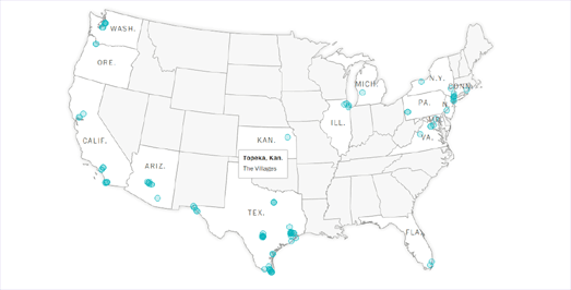
In Where are the migrant child facilities? Scattered across America The Washington Post is attempting to map where migrant children are being held in the United States. The paper has mapped out the locations of facilities where it is known migrant children are being held and intends to update the map as more information comes to light.
At the moment the map is just a simple interactive graphic with markers showing the locations of the known facilities. The result is that the map doesn't work well for states like Texas who have a large number of facilities where children are being held. If you hover over the map markers you can view the name of a facility. Unfortunately the markers in Texas and in some other states are so numerous that it isn't possible to view the name of every facility on the map.
The Washington Post's map already needs zoom controls so that readers can drill down to all the individual facilities. If the Post does intend to update this map as the story develops a better interactive map will be needed.
Thursday, June 21, 2018
Refugee Journeys
It is almost impossible to imagine the desperate situations which people must find themselves in to begin the perilous and life-threatening journeys that are the lot of most of the world's refugees. Some politicians like Donald Trump and Italy's Matteo Salvini seem completely incapable of empathy and presumably cannot imagine how desperate the life of a refugee can be. Perhaps they should be forced to read these accounts of refugee journeys.
Spanish photojournalist Javier Bauluz walked with refugees from Greece to Germany in order to document the journey taken by thousands of refugees as they try to make it to the safety of Europe. You can read about this journey on Seeking Refuge for My Children, a photo report about the long and dangerous trek from Greece, through Macedonia, Serbia, Hungary, Austria and Germany.
Javier's report is broken up into six chapters, each focused on one stage of the journey from Greece to Germany. The route of the journey is displayed on an accompanying interactive map. This map can be used to navigate to any of the six chapters in Seeking Refuge for My Children. Javier's first hand account of the refugees' journeys combined with his powerful photographs of desperate people in a desperate situation combine to provide an evocative and moving insight into the appalling journeys of the refugees seeking entry to Europe.
More than 5,000 refugees died in 2016 trying to get to Europe across the Mediterranean Sea. Crossing the Mediterranean Sea by Boat - Mapping and Documenting Migratory Journeys and Experiences is an international research project, led by the University of Warwick, which carried out 257 in-depth qualitative interviews with people who have made this journey.
The project has released an interactive story map which allows you to view some of these migratory journeys on a map, while also learning about the individual experiences of the people forced to make these treacherous journeys.
Each of these individual journeys are mapped to show each stage of the person's migration from Africa to Europe. 'Back' and 'Next' buttons allow the user to follow each stage of the journey made by the interviewed refugees. As the map updates the side-panel also updates to provide information about the journey. This information includes the first-hand experiences of the individual refugee and more general information about the conditions that refugees experience at each of the mapped locations.
In 2014 the Global Mail created a superb mapped interactive report on one migrant's personal journey. Filmmaker Matt Abbott gave Muhammad Hussain, a Hazara Pakistani about to set out on a journey to seek asylum in Australia, a video camera and asked him to film his experiences. The result is Hussain's Journey.
The Global Mail's mapped report starts off with Matt Abbot's own recordings of Muhammad Hussain's family and life in Karachi. When Muhammad set off on his dangerous journey to Australia he took over the filming himself. The mapped report of this journey allows you to view his experiences in safe houses, in smugglers’ homes and, in the final stretch of his journey, across the ocean in a boat that is barely seaworthy.
The Flow of Human Trafficking
Europe & Human Trafficking visualizes the illegal movement of the victims of modern slavery around Europe. There are over 2 million people in Europe living in modern slavery due to human trafficking.
The map uses flow lines to show the movement of modern slaves around Europe. The map also uses scaled red and blue circles to show the number of modern slaves in each country and the size of each country's GDP. If you click on these red and blue markers the flow lines on the map change to show the countries where the selected country's modern slaves originate.
Europe & Human Trafficking uses the Leaflet.Canvas-Flowmap-Layer plug-in for LeafletJS. The plug-in uses Bezier curves to visualize the movement of objects from one location to another (obviously in this case the thing being moved is people). One purpose of using Bezier curves is that you can show the direction of flow by using either a convex or concave curve on your flow line. The direction of flow is also visualized by the library using animated dots which travel along the flow map lines in the direction of flow.
The Leaflet.Canvas-Flowmap-Layer was inspired by Sarah Bellum's ArcGIS Canvas Flowmap Layer, a popular plug-in for ArcGIS.
Wednesday, June 20, 2018
Discovering Imaginary Islands
Back in 2012 scientists from the University of Sydney sailed to Sandy Island, an island which Google Maps clearly showed in the Pacific Ocean. Unfortunately when they arrived at the location indicated by Google Maps all they found was a lot more empty sea. Sandy Island didn't exist. In fact it was a phantom island.
Phantom islands are fake islands that have appeared on maps for a period of time, only to be later removed when it is proved that they don't actually exist. Most of the islands come from the reports of sailors exploring previously unknown areas. Presumably they were a mixture of mythical tales and geographical error in positioning real islands on new maps
Phantom Islands – A Sonic Atlas is an impressive interactive map which takes you on a tour of some of the world's imagined islands. Each of the islands has its own phantom marker on the map. Click on a phantom island and you can learn how the island came to be invented. You can also discover when the island first appeared on an atlas and when it last appeared on any map. Press on the 'Cruise' button and you will be taken on an audio tour of all the Phantom Islands.
Also See
Sandy Island - the man responsible for Google's non-island
Refugee Routes to Italy
The Stories Behind a Line is a visual presentation of six different refugees' journeys to Italy. This visualization uses simple lines to represent the nightmare journeys undertaken by six asylum seekers from their homes to Europe. These simple lines are used to show the geographical routes and the distances traveled by each refugee. Each journey line also serves as a visual metaphor through which each individual story can be told.
Each of the asylum seeker's journeys in The Stories Behind a Line is represented by its own individual journey line. These lines show the distance traveled, the number of days spent traveling and the methods of transportation of each refugee from their hometown to Italy. Each of the journeys is shown as a simple black line on a white background (although you can reveal the map behind each journey if you want). Red markers are placed along the lines which can be clicked to reveal the personal narrative behind each journey.
It is possible to switch between the geographically shaped lines to straight lines, with a more analytical view of the distances traveled. In this view the lines are converted to a straight strip map segment. These strip map segments break down the important stages in each refugee's journey and the distances between these stages.
You can learn more about how and why this visual representation of six refugee journeys was created in a Driven Journalism post by the visualization's authors. The Stories Behind a Line: A Visual Narrative of Six Asylum Seekers' Routes to Italy also explores some of the design and coding choices made in creating the visualization.
The Geography of the World Cup
The most expensive football team at this World Cup is France. The combined transfer market value of all the players in the French team is £972.45 million. Spain, who are many people's favorite to win the World Cup, have the second most expensive team, with a combined transfer market value of £930.60 million. Brasil have the third most expensive team.
You can discover the combined transfer market of every country's team on the FIFA 2018 National Squads interactive map. Teams in the 2018 World Cup are represented by red markers on the map. The country's with blue markers did not qualify for the 2018 Cup. Of these teams Italy stands out. The Italian team has a total transfer market value £598 million, making it the 8th most expensive team in the world. However all those expensive players were unable to help Italy qualify for this year's competition.
Where all those expensive players play their football is another matter. The English Premier League has the most players playing in the 2018 World Cup. 123 players in this World Cup play in the EPL. 81 players in the World Cup play in Spain. 67 play in Germany and 58 play in Italy.
You can find out more about where this year's World Cup players ply their trade on WC Rosters, a tableau visualization of where World Cup players play their club football. Only the England football team in this year's World Cup have all their players playing in their domestic league. Russia comes second in this regard with 21 of the 23 Russian squad playing in the Russian league (Russian league teams must play five Russians, this means Russian players demand high wages in the Russian league and have little financial incentive for playing abroad).
Manchester City in the English Premier League are the club with the most players in the 2018 World Cup. 16 players in this year's competition are owned by Manchester City. Real Madrid have 15 players and Barcelona have 14 players in the World Cup.
Tuesday, June 19, 2018
The American Income Gap
The Income Extremes for Wealth Divide interactive map shows the richest and poorest households in each census tract area in the United States. The map visualizes two dot map layers showing the number of households earning over $200,000 and the number of households earning under $25,000. The result is a map which clearly shows the income divide in American towns and cities.
If you select a census tract on the map an information window opens displaying the tract's population and number of households. It also informs you about the number of households in the census tract which have an income greater than $200,000 and the number of households which have an income less than $25,000. The yellow and blue dots don't show the exact addresses of households but are randomized within each census tract area.
Esri's Predominant Income Range by Households is a similar map, however this map shows the most dominant income range in each census tract in the United States. The map uses income data from the 5-year American Community Survey in 2016 to show the income range of the most people in each tract. Using the map you can explore the reality of income inequality in every local neighborhood.
While exploring the map you might spot patterns which recur in states, cities and communities across the country. For example you should be able to spot the income divide between many metro and rural areas. In college towns you might see low income student-dominated neighborhoods surrounded by wealthier neighborhoods.
The map reveals that a number of cities, such as Philadelphia, Seattle and Houston have a thriving downtown core. While cities such as Detroit and Cleveland have urban centers which are struggling economically.
Apple Maps in LeafletJS
Apple launched its desktop mapping API, Mapkit.js, two weeks ago. You can view documentation, demo maps and sample code of Mapkit on Apple's developer page. What Mapkit's developer page doesn't tell you is how to add third party map layers to a Mapkit powered map. It also doesn't tell you how you can use Mapkit's own basemap layers with other popular mapping libraries.
Mapkit's developer page is a little basic at the moment. I've found geo.ebp.ch useful when trying to build a map with Mapkit. Their blog post A New Map in Town includes a demo map using Mapkit's driving directions service. This demo map also shows you how to add another map tile layer to a Mapkit powered map. The map loads a WMTS layer from ArcGIS Online. The demo map uses Codepen so it is easy to see how you can use the example to load any other WMTS layer into a Mapkit powered map.
You can of course also use Mapkit's basemaps in other mapping libraries. For example you could use Apple's map layers in a Leaflet powered map. You can use map tiles from Apple Maps in LeafletJS by using the MapkitMutant plugin for LeafletJS. MapkitMutant is a LeafletJS plugin which allows you to use Apple Map's basemaps. Mapkit's basemaps are a road-map, a satellite (aerial) map and satellite with labels.
Although LeafletJS is an open-source JavaScript library which is free to use Apple's Mapkit is neither of these things. This means that if you want to use Mapkit's basemaps within a Leaflet powered map you will still need an Apple authorization token and will still need to be aware of Apple's charges. A note at the very bottom of the Mapkit developer page says that "MapKit JS beta provides a free daily limit of 250,000 map initializations and 25,000 service calls."
Monday, June 18, 2018
Death from Alcoholism
Mike Bostock has written up a great introduction into the different methods that you can use to compare the difference between two different values in a mapped data visualization. To illustrate the methods of comparison he has used Deaths from Alcohol Use Disorders in 1980 and 2014. To illustrate the difference in the number of deaths from alcohol between these two dates he has created a series of interactive maps, each of which uses a different method to visualize the same data.
Methods of Comparison, Compared is published on Observable, Mike's platform for exploratory data analysis. Observable is not only a platform for data analysis, visualization, and exploration. It is also a platform for teaching and sharing techniques in coding and creating better data visualization. 'Methods of Comparison, Compared' is a great example of this, as it not only includes a number of interactive choropleth maps but also explores and explains the methodology used in their creation.
In comparing the change in the number alcohol related deaths in each U.S. county between 1980 and 2014 it is possible to use a number of different methods. 'Methods of Comparison, Compared' shows three different choropleth maps, each of which uses a different method. These are a map showing the simple difference in the number of deaths between the two dates, a second map which shows the relative change and a third map which shows the ratio.
Each method results in a different mapped visualization of the same data. Each method has its own advantages and disadvantages.
Antipodean Weather
Around 70% of the Earth's surface is covered by water. This means that there aren't that many populated locations in the world that have populated antipodes. Christchurch in New Zealand is one. If you tunneled straight through the Earth from Christchurch you would eventually emerge in A Coruña, Spain. If you started in Hong Kong you could conceivably burrow your way to La Quiaca in Argentina.
Wikipedia has a useful list of cities with exact (or almost exact) antipodes. It also lists cities which are within 100 km of having another city as an antipodes. If you want to know where you would end up if you tunneled through the Earth from your location then you could use the Antipodes Map. The Antipodes Map shows you where you would end up if you tunneled straight through the Earth.
However no one wants to tunnel through the Earth without knowing what the weather is like at your antipodes. Imagine how stupid you would feel if you spent all day tunneling through the Earth only to find out it is raining at your antipodes when you arrive. That is why you need Antiweather.
Enter your location into Antiweather and not only can you find out what the weather is like where you live but also how the weather is right now on the exact other side of the Earth.
4,000 Irish Shipwrecks
The Wreck Viewer is a new interactive map which shows the locations of 4,000 shipwrecks around the shores of Ireland, dating back as far as the 16th century. The map was created by Ireland's National Monuments Service (NMS) to help provide access to and visualize the NMS’s Wreck Inventory.
Each red dot on the map represents a wreck for which there is a known location. 78% of the wrecks in the Wreck Inventory have no known precise location. If you select a wreck on the map you can read the wreck description. This includes details on the ship name, type of vessel and the date the vessel sank. The details also contain (where available) the wreck summary description which provides details on the vessel's history, voyage, cargo, passengers and the story of its loss. At present only 20% of ships in the database have a summary description.
Saturday, June 16, 2018
Who Moves Where in Europe?
In Europe citizens of countries in the EU and the European Free Trade Association (EFTA) are free to live, study, work and retire in any other EU or EFTA zone country. Swissinfo has been looking at the effect of free movement on the net migration rate in each of the countries in the EU & EFTA.
Which European countries attract the most immigrants? shows the difference between the number of immigrants and emigrants in each country based on movement within the free movement area. Areas with a positive net migration rate (where more people are moving to) are colored blue on the map and areas & regions with a net migration rate (where people are leaving) are colored brown on the map.
As you might expect migrants within Europe tend to move to regions that have the strongest economies. Conversely the areas and regions where the most people move from tend to be areas with weaker economies.
This map is featured in Swissinfo's 'migration' series. This in-depth series explores the issues of migration around the world (particularly in how it effects Switzerland) and includes a number of maps and other data visualizations of global and European migration data.
Friday, June 15, 2018
Friday's Portrait of Earth
Japan's Himawari-8 satellite is in stationary orbit over New Guinea where it captures some truly amazing imagery of the Earth. Every day the satellite captures imagery of the western Pacific, Australia, and parts of Asia, Antarctica & Alaska.
Digital Typhoon's Weather Satellite Himawari Viewer is an easy way to explore the latest satellite images from Himawari and explore historical Earth images captured by the satellite. The viewer takes the latest satellite images of Earth captured by Himawari and displays them as an interactive Leaflet map. This allows you to zoom-in and pan around satellite images of the Earth which were actually captured earlier today.
You can also view time-lapse animations of the latest Himawari-8 satellite imagery, on Himawari-8 Real-time Web. Himawari-8 Real-time Web defaults to create and show animations of Himawari's latest satellite views of Earth. You can also use the calendar to view historical imagery and animations for any other date.
Thursday, June 14, 2018
The Atlanta Rap Map
According to the Syncopated Geography of Hip-Hop "the sounds of rap music in Atlanta have grown out of the blending of hard-core sounds from the West (Gangsta Rap and G-Funk), bass beats from Florida, and styles and images from the North". The sounds of rap music in Atlanta were also hugely inspired by the city of Atlanta itself.
The introduction to the Atlanta Rap Map says that the map explores "the symbiotic relationship between art and space". In essence, however, this is an interactive map showing Atlanta locations mentioned in the lyrics of Childish Gambino, Ludacris and OutKast.
The map provides a great resource for exploring the places that are important to each of the featured three rap acts. If you click on the categorized markers on this map you can read the lyrics that mention the location and the name of the Childish Gambino, Ludacris and OutKast song that mentions the place. The map really does show "the symbiotic relationship between art and space". In fact I think I can even tell where the three rap acts grew up in Atlanta purely from the clusters of the three different colored markers on the map.
The Pudding analyzed the lyrics of about 50,000 songs in order to discover the most common words used in Hip Hop. From this analysis they were then able to make an interactive map which groups Hip Hop artists by lyrical similarity.
The Words That are Most Hip Hop interactive map organizes the faces of Hip Hop artists based on the overlap between the words they use in their lyrics. You can hover over the faces on the map to reveal the name of each artist. The map reveals distinct etymological families in Hip Hop. For example there is the Wu-Tang branch of the language of Hip Hop whose members share a very similar lexicon.
The different dialects of Hip Hop that emerge on the map may owe a lot to the physical geography of the Hip Hop artists. Further study is needed to see if the lyrical similarity between artists correlates to geographical closeness. The Atlanta rap artists Childish Gambino and Ludacris are quite close to each other on the map and OutKast aren't too far away.
To prove a link between Hip Hop dialects and geography you might want to explore the Geography of Hip-Hop interactive map. The Geography of Hip-Hop documents the history and geography of Hip Hop. The map (and accompanying essay) explore how Hip Hop has spread around the world and how different cites have developed their own distinct sounds and styles of Hip Hop.
The interactive Hip Hop map allows you to browse and listen to Hip Hop music by location. The map features 955 songs, most of which you can listen to directly from the map. The size of the markers on the map reflects the number of artists featured from that location. In this way you can get a rough idea about the size of the Hip Hop communities in these different urban locations.
By listening to the songs listed in one city you may begin to get a feel for the sound and style of Hip Hop from that location. You can learn more about the development of Hip Hop in the accompanying essay, The Syncopated Geography of Hip-Hop. The essay explores the influence of geography on Hip Hop communities & styles and how Hip Hop music reflects the influence of the different urban locales where it is made.