Taxis are the New Pizza

In the early days of online mapping the go to demo for any new mapping platform was an interactive mapped visualization of pizza restaurants. These days the go to demo map appears to be New York taxi data. Here are just a few of the interactive maps which have visualized taxi journeys in New York.
NYC Taxi Rides is a comprehensive data visualization of New York yellow cab taxi rides. The map was created to demonstrate the capabilities of the MapD Extreme Analytics Platform. Using the NYC Taxi Ride visualization it is possible to explore patterns in New York taxi journeys in a number of ways.
The data dashboard consists of a number of connected components. These include components for payment types, days of the week & time of day and an interactive map. The components allow you to filter the data shown on the map and, if you select data from one of the components, will automatically update all the other charts and the map. So, for example, if you select Tuesday on the 'Records by Day' component you can view just the locations of Tuesday's taxi pick-ups on the map and the updated charts for the other record types for Tuesday's taxi data.
The NYC Taxi Rides map uses taxi data from December 2015.
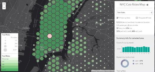
The NYC Cab Rides map is an interactive map visualizing Yellow Cab trip data in New York City from July 2015 - June 2016. The map allows you to see where the most New York cab rides begin, the pick-up locations where cab drivers can expect the largest tips, where in the city passengers pay in cash & where they pay by credit, the number of passengers and the length of journeys.
The map uses hexagonal binning to provide a spatial histogram of New York taxi ride data. The hexagons represent the number of rides in each location on the map in two different ways. It uses both a color ramp and the size of the hexagons themselves to indicate the total number of rides at each location on the map.
If you hover over a hexagon on the map you can view the exact number of rides as well as the average length & cost of the rides and the percentage of passengers that paid by cash and credit card. If you click on a hexagon on the map then the map changes to visualize the taxi rides to or from that location from everywhere else in the city.
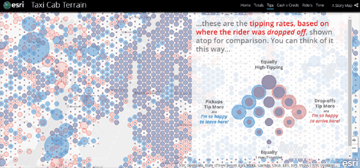
The NYC Cab Rides Map was made to partner John Nelson's story map which also explores Yellow Cab trip data in New York City. In Taxi Cab Terrain Nelson examines how different New York boroughs use and pay for taxi cab journeys. He then looks at the underlying socio-economic data in those neighborhoods to see if they help explain the differences in how inhabitants of different New York neighborhoods use and pay for cabs.
In Taxi Cab Terrain Esri has mapped out the locations where the most New York cab rides begin, the pick-up locations where cab drivers can expect the largest tips, where in the city passengers pay in cash & where they pay by credit, the number of passengers and the length of journeys.
Back in 2014 Chris Whong also created an impressive interactive map using New York taxi data. Chris' map provided a great insight into the daily life of one New York taxi driver. Chris' NYC Taxis: A Day in the Life is a MapBox visualization of the journey of one New York taxi over the course of 24 hours.
You can also explore New York taxi journeys in the NYC Taxi Holiday Visualization, which animates taxi journeys from New York's airports over the course of a month and half, and Hubcab, a mapped visualization of 170 million taxi trips over one year in New York.


Comments