Where the Money Comes From
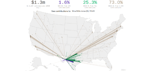
73% of the total money given to House candidates in the 2018 midterm elections comes from outside each candidate's district. You can now find out where your candidate's contributions come from on a new interactive map from Axios.
Axios' map Outside Money Floods House Campaigns allows you to see where every House candidate's money comes from. If you select a candidate's name from the drop-down menu you can view a map of the USA which includes flow-lines showing all the money flowing into the candidate's election campaign. The flow-lines on the map are also colored to show where each donation comes from. The blue lines show donations which have come from within the candidate's district. The green lines show money that has been donated from within state and the grey lines show all the donations coming from other states.
The total money donated to the candidate is shown above the map. This total is also broken down to show the percentage that came from within the candidate's district, the percentage from within the candidate's state and the percentage that came from the rest of the USA.
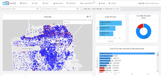
The MapD Political Donations map visualizes 25 years worth of political donations data on a Mapbox GL powered interactive map. Using the map you can explore where and how much Americans have donated to the Democrats and Republicans since 1990.
Zoom-in on the map and you can see locations where political donations have been made. Blue dots on the map show donations made to Democratic candidates and red dots show donations to Republicans. The size of the dots represent the relative size of each donation.
Beside the map you can see charts showing the amounts made to each party and to individual candidates. One of the most impressive aspects of this visualization is the speed that it responds. Move the location on the map and both the map and the charts almost instantly update to show the data for the current map view.


Comments