This Is What 200,000 Deaths Looks Like
The Washington Post has released a sobering visualization of the over 200,000 deaths from Covid-19 in the United States. In order to try to humanize the sheer scale of deaths from Covid-19 in the USA the Post has created an interactive map which shows you what 200,000 deaths would look like if they all occurred in your neighborhood.
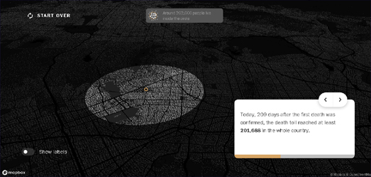
In What if all covid‑19 deaths in the United States had happened in your neighborhood? the Post allows you to visualize the over 200,000 deaths which have happened in the last 209 days compared to your local population. Enter your address into the WaPo's interactive map and it will draw a circle around your home showing the extent where 201,688 people live. This is the number of people who have died in the U.S. since the beginning of the present health emergency.
It is a brilliant idea to visualize Covid-19 deaths in terms of the local population. The human brain finds it very difficult to understand large numbers, mostly because we don't have a ready context for numbers over a certain size. So when we say over 200,000 people have died from Covid-19 we have difficulty processing the scale of this disaster. The Washington Post map provides a fantastic way to contextualize this number by allowing you to see what this number of deaths would look like if they all happened among the population of your immediate neighborhood.
The Post's map is a great idea. So it is important to credit Brazilian newspaper Folha de S.Paolo whose idea it was. The Washington Post map is an almost direct clone of the Brazilian newspaper's No Epicentro map. No Epicentro works in exactly the same way as the Post's map - only No Epicentro visualizes the number of Brazilian Covid-19 deaths on top of any address in Brazil.


Comments