Beyond Snowfall
In 2012 the New York Times published a groundbreaking online article about the 2012 Tunnel Creek avalanche. The NYT's Snow Fall managed to seamlessly incorporate animated maps and other multimedia into its account of the avalanche in a way that didn't distract from the narrative flow. This integration of media and data within an online narrative was one of the first examples of the scrollytelling format.
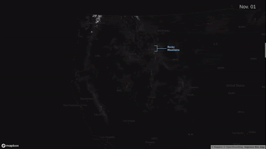
William Davis's interactive map Snowfall owes more than just its title to the NYT's groundbreaking 2012 article. Davis's map is a fantastic visualization of snowfall in the United States over this winter. As you scroll the map visualizes 6-hour snowfall accumulation across the country from October 13 to December 18, 2022.
Like the NYT's original Snow Fall article William's Snowfall map seamlessly integrates the visuals within the emerging narrative. However while the Times employed an 11 person team for six months to produce Snow Fall William Davis single-handedly created Snowfall in a matter of days. Of course data visualization technologies have developed significantly in the decade since the Times published Snow Fall and I suspect William Davis was aided quite significantly by being able to adapt Mapbox's Scrollytell ing Template.
Which shouldn't distract at all from the beauty of William Davis's Snowfall map. As you scroll through Snowfall you advance chronologically day by day through the winter of 2022. As you do so it is amazing to be able to see daily snowfall accumulations instantaneously visualized on the Snowfall map. As you scroll information windows are also used to provide context about some of the significant and unusual snowfalls seen at locations across the United States over the course of the last few months.
I don't know if Davis's Snowfall is an intentional homographical homage to the NYT's 2012 Snow Fall article but it is a fantastic example of how data can be visualized on an interactive map.


Comments