Wednesday, September 30, 2015
West Side Stories
West Side Stories: Gentrification in West Oakland is a nicely designed map providing first-hand accounts of gentrification in West Oakland, California. Created by Oakland non-profit organization Youth Radio, West Side Stories allows local residents to document their experiences of living in West Oakland and the effect of gentrification on their lives.
The map consists of a number of audio recordings made by local people. It also provides information on some local landmarks. You can scroll through the map sidebar to find the different audio recordings and the map will automatically zoom and pan to the relevant location. Alternatively you can select a marker on the map and the sidebar will scroll to the relevant entry.
Mapping the Shrinking Arctic Ice Cap
A couple of months ago MasterMaps created a really impressive mapped visualization showing the extent of the Arctic ice cap over time. The Arctic Sea Ice map compares the monthly sea ice cover in the Arctic for any month since 2006.
Mapbox has now released a map which allows you to view monthly Arctic sea ice changes all the way back to 1976 (when consistent satellite measurements began). Mapping Arctic Sea Ice uses data from the National Snow and Ice Data Center to show the sea ice cover for any month.
If you select a month from the timeline you can not only view the extent of the sea ice coverage for that month but also a line graph showing the total ice area in km2 and the temperature anomaly above the norm over time. The graph shows a clear trend of rising temperatures in the Arctic and a fall in the area of sea ice coverage.
The polar projection in the Arctic Sea Ice map was created with D3.js. You can easily create your own polar projection in Leaflet using Arctic Web Map, an Arctic specific web mapping tool, consisting of an Arctic-focused tile server. If you want to know how Mapbox created their polar projection then read the explanation beneath the map on the Mapbox blog.
Water on Mars
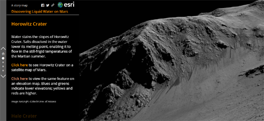
On Monday NASA announced that 'recurring slope lineae' and hydrated salts discovered on the sides of craters are proof of water flow on Mars. A new Esri Story map, Discovering Liquid Water on Mars, provides a great illustration of these recurring slope lineae using NASA imagery and maps of Mars.
The story map uses imagery from the Horowitz, Hale, Garni and Palikir craters to show examples of these dark streaks which are caused by subsurface water flow. In particular the timelapse images from the Palikir and Horowitz craters do a great job at showing how the streaks appear, lengthen and vanish with the passing of seasons on Mars.
Discovering Liquid Water on Mars also allows you to view the location of each of the four craters on a satellite map and an elevation map of Mars.
Tuesday, September 29, 2015
Flying Around the World
Hello, New World is an amazing virtual flight around the world composed of a number of seamlessly connected 360 degree interactive videos. It's a bit like exploring the world with Google Street View but with interactive videos rather than still images.
This interactive whirlwind tour of the world flies you over Mount Fuji, the Great Wall of China, the Great Barrier Reef and a number of other locations around the world. As the tour plays you can rotate the camera's point of view and explore the view around you as you fly over these world famous landmarks.
The different interactive videos of the different locations are seamlessly cut together. At the end of one video the camera flies into the clouds and then emerges out of the clouds into a different location. There is a lot to explore in this interactive but my favorites are diving under the water at the Great Barrier Reef, the night-time timelapse at Mt. MacKay and the fireworks over the Shanghai skyline.
New York's Crowdsourced Neighborhoods
Back in August DNAinfo asked New Yorker's to draw their neighborhoods on an interactive map. By allowing the crowd to decide on the boundaries of their local neighborhoods DNAinfo hoped to settle the old argument over the exact position of New York neighborhoods.
Where Exactly is Your Neighborhood allows you to pick a New York neighborhood and then draw the neighborhood boundary on top of a Leaflet map. Once you have drawn your neighborhood's border on the map you can compare your neighborhood boundary with those submitted by other New Yorkers.
You can now also view the composite maps of New York's crowdsourced neighborhoods. The results of over 12,000 responses are now in, providing crowdsourced boundaries for 250 New York neighborhoods. DNAInfo's New York Map allows you to select any New York neighborhood and view a choropleth map of the crowdsourced results.
The darkest color on the map shows the area of New York which most people thought lie within the selected neighborhood. The lighter colored areas indicate locations that a few dissenters also thought were encompassed by the neighborhood boundary.
I'm not sure that the DNAInfo's crowdsourcing efforts have conclusively settled the argument over New York's neighborhood boundaries. In some neighborhoods there does seem to be a fair amount of agreement over the area's boundaries. Other neighborhoods however seem harder to define. The arguments will continue ...
The Sunshine Map
Peter Kerpedjiev has created a really interesting map of annual worldwide weather data. The map uses historical climate data from Wikipedia's city 'weather boxes' to visualize how weather changes during the year around the world.
Using the Sunshine Map it is possible to view the number of hours of sunshine across the globe for every month of the year. The map also allows you to view the changing rates of precipitation, the highest & lowest temperatures and the amount of snowfall.
The map uses Jason Davies' D3 voronoi library to divide the world up into regions based on the closest city with Wikipedia climate data. This does mean that some areas of the world are quite large, where Wikipedia only has a few cities with climate data.
Unfortunately the map is quite small and doesn't include a full-screen button. If you have a page inspector in your browser it is worth adjusting the height and width of the map element to make the map bigger.
Monday, September 28, 2015
The Search for Life on Mars
Today NASA confirmed that it has evidence of liquid water flowing on Mars. The new evidence consists of hydrated salts discovered on downhill streaks on the side of Hale Crater. It is believed that the hydrated salts would lower the freezing point of liquid brine and that the streaks on the crater are therefore evidence of the shallow subsurface flow of briny water.
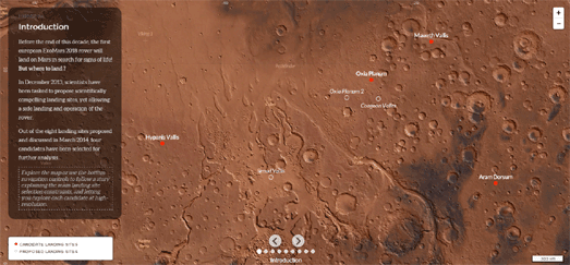
Entirely by coincidence the European Space Agency has collaborated with CartoDB to release a new map of Mars. This new story map shows the four possible landing sites for the ExoMars 2018 Mission. ESA's ExoMars programme will land a rover on the surface of Mars to search for signs of past and present life.
Where on Mars? is a superbly crafted story map which explains the various criteria being used to pick the perfect landing site for the rover. The map includes a number of different map views of the red planet. Using the forward and back buttons on the map you can progress through the different map layers to learn more about how the final landing site will be chosen.
An altimetry map layer provides a heat map view of elevation on Mars. Because the lander requires a parachute to land on Mars the landing site must be lower than -2km to give the parachute enough time to slow the lander down. If you mouse-over the elevation map a window will open to tell you when you are over an area too elevated to be a potential landing site.
Because the ExoMars Rover is solar powered the landing site must also be within a certain band of latitude straddling the equator. As you progress through the story map this band of latitude is highlighted on the map. Again if you mouse-over the map an information window will open to show you when you are outside this latitude band.
As you progress you can learn more about the geological constraints for the perfect landing site, the landing eclipse (the probability of landing within a given distance of the target site) and some of the important locations close to the potential landing sites.
Explore the Dragons Isle of Berk
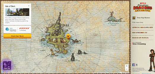
No-one believed that vikings and dragons could live together in peace and harmony. The dragon trainers of the Isle of Berk proved them wrong. Now thanks to the mapping skills of Hiccup and Toothless you can explore the Island of Berk and all the outlying islands on a fully interactive Google Map.
The Dragons: Race to the Edge Map includes two main map layers. The 'Map View' shows you the locations of the main outlying islands. If you select an island's map marker you can learn more about the island and even learn how many dragon hours it would take you to fly there.
The 'Dragon View' map shows you the locations of all the different dragon species. You can click on a dragon species marker to learn a little more about the dragons' abilities and nature.
The Amazing 3D Swiss Alps Balloon Ride
If you've ever wanted to fly in a hot air balloon over the Swiss Alps then you need to have a look at Suisse Mania. This stunning 3d map takes you on a virtual journey over Switzerland and allows you to explore this beautiful country from the air.
The Suisse Mania experience was created by the Swiss supermarket chain Migros. If you live in Switzerland you might want to look out for any 'jokers' flying around the map. If you find a joker then you might win a real ride in a hot air balloon or some Migros shopping vouchers.
If you don't live in Switzerland you can still use the map to explore the delights of the Swiss landscape. Use your left mouse button to move around the map. The right mouse button rotates your view and you can use your scroll wheel to zoom in and out on the map.
As you travel around the map you can click on buildings and other features on the map to listen to the history of the selected location. You can also add the selected locations to your own scrapbook. There are 54 special objects to collect in all. Good hunting ....
200 Years of Dutch Mapping
In 1815 the Topographisch Bureau was established in the Netherlands to collect and provide access to geographical information. Kadaster, the Dutch government's mapping agency, is marking this 200 year anniversary of Dutch map mapping with Tijdreis.
Tijdreis allows you to explore vintage maps from the Dutch mapping agency dating back to 1815. This portal to the historical maps of the Dutch government's mapping agency includes a time-line which allows you to explore the vintage maps by year. Select a year from the timeline and the map will automatically update to show the relevant historical map.
For each year several maps are available. When you zoom in on an area, where available, the most detailed vintage map for the selected year will be shown. Sometimes there will be no change to the map shown for several years, this may mean that no new maps were created for the selected location during those years.
Sunday, September 27, 2015
Maps of the Week
Mapzen's Tangram mapping platform is a library for creating 2D & 3D maps using WebGL. One of the main advantages of Tangram is the ability to style all aspects of the map to create really stunning looking individual maps.
Patricio Gonzalez Vivo has used Tangram to create a beautiful looking map based on the art of Ryoji Ikeda. The Ikeda Map is a beautiful black & white map, illuminated with the animated lights of road traffic and lights shining from the 3d building windows. Patricio used three pseudo-random procedural patterns to create the animations. You can learn more about how the map was made on the Mapzen blog.
The Berliner Morgenpost's Lärmkarte Berlin provides a heat-map view of road, public transit, airport and industrial noise throughout the German capital.
If you mouse-over any part of the heat-map layer you can view the noise levels at that location. The information includes the recorded decibel levels for both day & night time and a breakdown of the decibel levels from road and transit noise.
The data for the map comes from a noise survey undertaken every five years by the Berlin Senate Administration for Urban Development and Environment. The two information windows, at the top right of the map, provide links to the noisiest and quietest neighborhoods in Berlin, with video interviews with residents who live in these areas.
The GDELT Project map isn't the most beautiful map I've ever seen but it did feature in the most read post of the week.
The map shows all the books from the HathiTrust collection. The data from these books is now available from the GDELT Project as one of two separate BigQuery datasets. These datasets are:
Internet Archive Book Collection in Google BigQuery (includes fulltext for 1800-1922 books)
HathiTrust Book Collection in Google BigQuery
There is obviously a lot of mapping potential in these 3.5 million books. The GDELT Project map shows the locations of all the locations mentioned in the collection from 1800-2011. One obvious pattern on the map is the growth of North American locations mentioned in the books as the years pass.
Saturday, September 26, 2015
Popes Around the World
Pope Francis' visit to the United States is the tenth time a pope has visited the country since 1964. In that time only Poland has received as many papal visits. The Washington Post's When Popes Hit the Road is a map of all papal visits to countries around the world since the early sixties.
The main map allows you to mouse-over any country on the map to view how many times a pope has visited the country. The accompanying timeline also allows you to select any of the 5 popes since 1964 to view where they have traveled around the world. If you scroll down the page you can also view individual maps for each of the 5 popes.
What most surprised me about the Washington Post's map is the number of visits to the United States. Obviously the U.S. has a huge population but I've never really thought of it as a predominantly Roman Catholic country. There are many more obviously Roman Catholic countries, which you might expect pope's to visit more regularly.
That's not to say that there isn't interest in Roman Catholicism in the United States. Google has released a Religion in America in Search Google Map which allows you to view the search interest in the major religions in 2014-2015 in each major metropolitan area.
If you look at the search history for 'Catholic' there appears to be quite uniform search interest in the religion across the country. Some other religions appear to have less widespread appeal across the country. For example, if you look at the map of the Mormon religion, you can see that most search interest comes from Nevada and the surrounding states.
Friday, September 25, 2015
Banning Men from Main Street
Students at the University of North Carolina have created a crowd-sourced map to document sexual harassment in and around the university campus. The map started as a large canvas map to which students could add orange thumbprints wherever they had experienced or witnessed catcalling.
The data collected on the canvas map was then used to create this interactive Catcall Map. The interactive version of the map also allows students to add instances of harassment to the map by using the edit button.
Hopefully the map will raise awareness of catcalling at the University and elsewhere. At the very least it should lead to the banning of men from West Franklin Street, where it appears most men are unable to restrain themselves from harassing any passing woman.
Property Price Contours
In the last ten years properties east of the I-35 have risen more dramatically than anywhere else in Austin. You can see the rise in property values across the city very clearly on this Residential Land Value Change in Austin map.
The map uses data from the appraised values of around 150,000 residential properties in Austin from 2005 – 2015. The use of isolines with heat-map shaded areas is an interesting way to visualize the data on the map. It is particularly effective in picking out islands of the city where prices have risen more drastically than elsewhere in the city.
Mapping the History of Housing Segregation
The Home Owners' Loan Corporation (HOLC) was a government-sponsored corporation created as part of President Franklin D. Roosevelt's New Deal. Its purpose was to refinance home mortgages which were in default to prevent foreclosure. The unintended result however was to introduce housing segregation in U.S. cities, a segregation which largely remains to this day.
The HOLC is often cited as starting the practice of mortgage redlining. Redlining is the process of denying services to residents of certain areas based on the racial composition of those areas. Mapping Inequality, Redlining in New Deal America allows you to view the residential security maps created by the Home Owners' Loan Corporation to indicate the level of security for real-estate investments.
The result of the maps was that residents in the more affluent and largely white neighborhoods were far more likely to receive financing. Residents in the poorer and black communities were deemed more of a risk and so less likely to receive financial support.
You can observe the effects of redlining more clearly in this Esri Storymap about segregation in Washington D.C.. Mapping Segregation in Washington DC is a public history project exploring the historic segregation of D.C.’s housing. The map reveals how restrictive deed covenants were used in the early 20th century to exclude the city's black population from D.C.'s best housing.
Esri's Story Map template was used by the project to provide a narrative map which examines the use of racially restrictive covenants over the decades and the later legal attempts to overcome these restrictive practices.
The map concentrates on the north-west neighborhoods of Bloomingdale, Columbia Heights, Mount Pleasant, Park View, and Pleasant Plains. As you progress through the Story Map markers are added to the map to show the locations of properties whose covenants were challenged in court. These legal challenges and their verdicts are discussed in more detail in the map sidebar.
Propublica has also examined the effects of housing segregation in a number of U.S. cities. In Housing Segregation: The Great Migration and Beyond Propublica allows you to examine the geographical distribution of the black population in a number of cities over time.
What clearly emerges in each of the city maps is that little has changed in the reality of housing segregation in the U.S. since the 1940's. For example, in the map above you can see the distribution of the black population in New York City in 1940 (on the left) and in 2000 (on the right). Although the black population in now far bigger the majority of the black population are still living in mostly the same areas as they were in 1940.
The Leaflet Map of Pluto & the 3D Globe
The Australian Broadcasting Corporation has created an interactive Leaflet map of Pluto from an enhanced colour image of the planet. The ABC's Pluto Map allows you to zoom in on the most high-resolution image of Pluto released by NASA so far.
The map tiles for the interactive were created using Zoomify. Creating map tiles form an image with Zoomify is a fairly painless process thanks to Bjørn Sandvik's Leaflet.Zoomify plug-in. If you want to create map tiles for Leaflet from your own image then Bjorn's Showing Zoomify Images with Leaflet tutorial is a good place to learn how to use Zoomify to create your map tiles and how to use the resulting tiles with the Leaflet mapping platform.
If you want to take NASA's Pluto for a spin then you should also take a look at the New York Time's 3d globe of Pluto created from NASA imagery. The NYT's Pluto Globe uses a number of images of the planet to create an interactive globe of Pluto.
Some parts of the NYT's Pluto globe consist of higher resolution images than other parts of the planet and the planet's 'south pole' remains uncovered for now. However the Pluto Globe does include a few map labels showing you the locations of some of the planet's named regions.
Thursday, September 24, 2015
French River Views
Riverview is a new interactive French mapping platform from Suez Environnement, designed to encourage people to discover the beauty of rivers and river environments. The site has launched with a map of l'Yvette. L'Yvette is a sub-tributary of the river Seine which meanders through the departments of Yvelines and Essonne in France.
At the heart of Riverview is a Leaflet map featuring a number of activities, points of interest and custom Street View tours associated with the l'Yvette. My favorite feature of the map is the custom Street View tours, indicated on the map by the green target map markers. If you select one of these markers on the map you can take a virtual stroll along the banks of the l'Yvette, using the custom shot panoramic photographs.
As well as these virtual tours the map allows you to overlay other information on the map, such as the location of riverside walks, bike paths and nearby points of interest.
Riverview has launched with just the one river but other French rivers will soon be added to the map.
Mapping the Sounds of Russia
Vladimir Kryutchev runs a Russian audioblog in which he posts sound recordings of life in Sergiev Posad, a small Russian town some 70 kilometers north-east of Moscow. Each of the posts that Vladimir makes on his audioblog Oontz includes a sound recording and a map showing where the recording was made.
Vladimir's audiblog also includes the Sergiev Posad 24/7 Soundmap, which allows you to search and listen to the audio recordings by location and by time of day. Each of the recordings are shown on the map by colored markers. The colors of the marker indicate the time of day when the recording was made (if you click on one of the colored markers in the map header you can view a map showing only the recordings made during that period of the day).
If you click on a sound recording's marker on the map an information window opens with an embedded audio player. If you then click on the play button you can listen to the sound recording directly from the map.
Hat-tip - The London Sound Survey
Wednesday, September 23, 2015
Crocodile Maps
The Franklin Eco-laboratory at the University of Queensland has electronically tagged a number of crocodiles. The tags allow the laboratory to monitor the location of crocodiles in real-time and to study the range and movements of the animals in the wild.
The laboratory's Crocodile Tracks website includes five interactive map showing the tracks of five different crocodiles. Using the maps you can observe the surprisingly large range of each of the five crocodiles over a period of time.
Unfortunately the maps don't include a scale. Without a map scale it is quite hard to get a sense of how far an individual crocodile has traveled. I think the maps would also benefit from a timeline. You can click on the individual tracking points on a map to view the time and date of the location tracked. It would be easier however to judge the passage of time if you could load each point consecutively using a timeline.
My final problem with the map is the choice of color for the tracking polylines. The white location tracks work well on the satellite map but become almost invisible if you switch to the OSM map layer.
If you like these crocodile maps then you might enjoy these other animal tracking maps.
The Healthiest Places to Live in Canada
A new interactive map from the 10 and 3 suggests that the healthiest places to live in Canada are in one of the metro areas of Toronto and Vancouver. The unhealthiest places to live are in rural and isolated areas of Quebec, Ontario and Saskatchewan.
The Canada Health Map shows the healthiest and unhealthiest regions in Canada based on a number of health statistics. The map divides the country into 117 health regions and colors each region based on seven key health indicators (the rate of asthma, diabetes & cancer, access to medical doctors, daily smoking rate, rate of overweight residents and perceived mental health.).
If you mouse-over a region on the map you can view the health statistics for each of the seven key indicators in the selected area.
Mapping London's Million Pound Houses
There is only one thing the British like talking about more than the weather and that is the price of their houses. That is why the whole of the British cartography industry is now dedicated to mapping property values in the UK.
For example, Which magazine has released a new interactive map showing all properties that have sold for more than £1 million. The Million Pound Property Sales Map plots all million pound houses sold in London or the south-east between 1995 and 2015.
However property in the UK isn't just expensive in the south-east of the UK. There are also million pound houses elsewhere in the country. The Million Pound map and the Two Million Pound map shows the locations of expensive properties throughout the UK.
Both these UK maps show the locations of houses sold in England and Wales using data from Hamptons International and the Land Registry. The Million Pound map shows properties which sold for above £1m in 2013. The Two Million Pound map shows properties which sold for above £2 million since 1995.
One of the reasons property prices in the UK are so high is because of the number of buildings owned by offshore companies. Satirical magazine Private Eye has created an interactive map which shows the amount of English & Welsh land that has been bought by these offshore companies.
Selling England by the Offshore Pound uses Land Registry data to plot all land parcels registered in the name of an offshore company between 2005 and July 2014. So, if you want to know why there are so many million pound houses in the UK, then you might want to ask your local friendly tax dodging parasite why their properties are registered overseas.
If all these UK property maps haven't put you off the idea of owning a home in the UK then you should check out this Guardian newspaper map. This map helps you find an area where you can afford to buy a property in England and Wales based on your annual income. Unfortunately you probably can't afford to buy a house in most of the country.
If you earn the national average wage in England or Wales then you can not afford to buy a house in 93% of the country. That's right you can't afford to a buy even the smallest, worst kept properties, almost anywhere in the entire country. Don't worry though, if you do well and manage to raise you income to twice the national average salary then you just might be able to afford a house in one of the country's poorest neighborhoods
Unaffordable Country is a choropleth map which colours postcode areas based on the affordability of properties in the area. Type in your average salary and the map will show you all the areas where you can afford to live - or, as is more likely, all the places in the country where you can't afford to live.
For example, where I live, in one of the poorest boroughs in the whole country, you would need to earn around three times the national average salary to be able to afford a house. In other words you would need to be in the top 5% of the country's wage earners to be able to afford to live in one of the country's poorest boroughs.
Tuesday, September 22, 2015
The Color Palette of Reno
Color Reno has analyzed 15,000 photos taken in Reno to determine their predominant colors. The day of the year and the location of each photo has also been extracted to create an animated map showing the changing colors of Reno over the course of a year.
Color Reno includes a number of interactive maps. The animated maps drop colored round markers on the map for every day of the year. The colors represent the predominant color in each photo. As the maps cycle through the year you can observe the changing colors of Reno.
Color Reno also includes one non-animate map which simply plots the location of each of the photos used in the experiment. If you click on any of the markers you can click through to view the photo on Flickr.
The Berlin Noise Map
The Berliner Morgenpost has published an interactive map of noise levels throughout Berlin. Lärmkarte Berlin provides a heat-map view of road, public transit, airport and industrial noise throughout the city.
If you mouse-over any part of the heat-map layer you can view the noise levels at that location. The information includes the recorded decibel levels for both day & night time and a breakdown of the decibel levels from road and transit noise.
The data for the map comes from a noise survey undertaken every five years by the Berlin Senate Administration for Urban Development and Environment. The map does not include ambient neighborhood noise, for example from nearby pubs and nightclubs.
The two information windows, at the top right of the map, provide links to the noisiest and quietest neighborhoods in Berlin, with video interviews with residents who live in these areas.
Mapping the City that Never Sleeps
Patricio Gonzalez Vivo has created a beautiful Tangram map based on the art of Ryoji Ikeda. The Ikeda Map is a beautiful black & white map, illuminated with the animated lights of road traffic and lights shining from the 3d building windows.
Mapzen's Tangram mapping platform is a library for creating 2D & 3D maps using WebGL. One of the main advantages of Tangram is the ability to style all aspects of the map to create really stunning looking individual maps.
If you like the Ikeda Map then you might also like this Cross Hatch map (pictured). Other Tangram maps include the Lego Style map, made out of colored plastic brick textures, the Tron Map, the Day / Night Map and Tangram Patterns.
Monday, September 21, 2015
Mapping all the Books
Earliest this month the GDELT Project made available data from 3.5 million digitized books on Google BigQuery. The data is available in two separate BigQuery datasets:
Internet Archive Book Collection in Google BigQuery (includes fulltext for 1800-1922 books)
HathiTrust Book Collection in Google BigQuery
There is obviously a lot of mapping potential in all those 3.5 million books. For example you could map the number of books published by location by year. This GDELT Project map uses CartoDB's Torque library to do just that.
The map shows all the books from the HathiTrust collection. The HathiTrust collection contains millions of titles digitized from libraries around the world. This map shows the locations of all the locations mentioned in the collection from 1800-2011. One obvious pattern is the growth of North American locations mentioned in the books as the years pass.
If you want to start using the two BigQuery tables yourself then this GDELT Project introduction Google BigQuery + 3.5M Books: Sample Queries should prove useful. The article includes a number of sample queries which you can run on either of the two BigQuery datasets. It also includes a couple of maps made from data obtained from sample queries.
One of the example maps shows locations made in Civil War related books (screenshot above). The other example maps all books published 1900 to 1920 with the subject tag 'World War'.
ColorBrewer and ClassyBrew for Maps
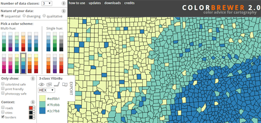
Cynthia Brewer's ColorBrewer is an online tool to help cartographers choose good color schemes for their maps. The tool helps you to think about what type of data you are visualizing and what would be an appropriate color scheme.
The tool includes three types of color scheme, sequential, diverging and qualitative. You simply need to choose which scheme best fits your data, choose the number of classes in your data and then choose a multi-hue or single color palette range. As you make your design decisions you can automatically see the scheme being applied to a sample map.
When making your choice of color scheme it is worth reading the advice provided (using the information button) about when to use a sequential, diverging or qualitative color scheme with your data.
If you plan to use ColorBrewer with a Leaflet map you might want to also check out ClassyBrew. ClassyBrew is a tool which uses ColorBrewer theory to help you choose a color scheme for your data and even generates the code to create a Leaflet map.
Like ColorBrewer you can choose whether your data is sequential, diverging and qualitative and then view how your choice of color scheme looks on a demonstration map.
The London Collision Map
Transport for London has released a new interactive map showing the location of all traffic collisions reported to the police in London since 2005. The London Collision Map visualizes when and where collisions occurred in London over the last decade and the severity of each traffic accident.
It is possible to filter the results by year, vehicle, collision severity and by age group. When zoomed out the map presents a choropleth view of the number of traffic collisions in each London borough. If you use the timeline beneath the map to change the year you can can get a quick overview of whether road safety in each borough is improving or deteriorating over time.
When you zoom in on the map the individual collisions appear on the map. If you select a marked collision on the map you can view the details of the accident, including the date and time of the accident, the type of vehicles involved and details about any injuries.
Sunday, September 20, 2015
Maps Mania's Maps of the Week
My favorite map this week was Balls, Barrels and Boxes, an impressive demonstration of a physics engine running on a 3d Esri map. The demo map allows you to drop balls, barrels or boxes on any location in the world and see how the objects react to the natural terrain.
The map was created using the cannon.js physics engine with Esri JS 4.0. You can explore the code behind the map in more detail on this GitHub page. The demo is a lot of fun to play with. With the Google Earth API being deprecated, hopefully this demo will also inspire other developers to create animated 3d visualizations and games with Esri and cannon.js.
The Metropolitan Museum of Art has a new interactive museum map designed especially for young visitors. The MetKids Map allows children to discover some of the fun and interesting things that they can find when they visit the museum. It also includes lots of inspiring and creative activities for kids to do during and after their trip to the MET.
The hand-drawn map of the MET has been made interactive using the OpenLayers mapping platform. It contains a number of map markers. The yellow markers seem to indicate some of the main important locations in the museum. The red markers show the locations of some of the exhibits which you can see when you visit the museum.
If you select a marker on the map you can read more about the selected exhibit or room. These descriptions include photos, audio, video clips and suggestions of fun activities that children can do in response to the museum's exhibits.
If the weather never makes you happy then you need this perfect weather map from the Washington Post. The map allows you to enter your perfect temperature range (which BTW is 71-80°F) and then shows you the areas of the country with the most days within your range.
The Perfect Weather map allows you to set the coldest and hottest temperature that you are comfortable with. It then uses 30-year's worth of temperature averages from the Centers for Disease Control and Prevention to produce a choropleth map showing which U.S. counties get the most number of days within that temperature range (you can mouse-over individual counties on the map to discover how many days a year are likely to fall within your comfort zone).
Once you've discovered the perfect place to live all you then need to do is move house and get a new job.
Saturday, September 19, 2015
Sailing the Seven Seas
The Climatological Database for the World's Oceans 1750-1850 is extracting meteorological data from historical ship logbooks. These historical records contain a wealth of data both about the routes taken by ships and the weather conditions encountered by the ships during their voyages.
Morgan Herlocker has taken the location data from these 100 years of ship logs and plotted them on a Mapbox map. The thousands of data points in Ships Logs have been processed into vector tilesets using tippecanoe.
One thing that clearly emerges from all this data is the routes of the major shipping lanes from 1750-1850.
Welcome to Moldova
In 2014 Paolo Paterlini and Cesare De Giglio traveled extensively throughout Moldova, interviewing the Moldovan people they met and filming the urban and rural landscapes of the country. This material is now available online in the form of a multimedia documentary, called The Moldovan Diaries.
The documentary provides a fascinating insight into the human and political geography of this Eastern European country. At the heart of the interactive is a Leaflet map which allows you to navigate the interviews and articles by region and location.
Before diving into the map and the interviews it is worth reading the two introductory articles, The Moldovan Diaries and the Recent History of Moldova (accessed via 'the project' tab in the top menu). These two articles provide a great introduction into the history and people of Moldova.
Friday, September 18, 2015
Replay the 2015 Red Bull X-Alps
You can now replay highlights of the 2015 Red Bull X-Alps on a 3d map. The Red Bull X-Alps is an adventure race in which competitors must hike or fly 1,000 km across the Alps. Every kilometer of the race must be covered either on foot or by paraglider.
For this year's race Red Bull have partnered with Doarama to provide 3d mapped highlights from the race. The interactive uses the Cesium 3d mapping platform to provide an animated playback of Day 10 of the race, showing the GPS tracks of the competitors on a 3d map of the Alps.
While you watch the Red Bull X-Alps Doarama of Day 10 of the race you can choose which athlete to follow by using the 'people/focus icon' in the top right corner of the map. You can control the speed of the replay using the tortoise and hare buttons. You can also pan around the 3d map and zoom in and out on any of the athletes.
The Rail Map of Industrial Decline
Rail Map Online is a Google Map of UK railway lines, showing both the present UK rail network and historical (now closed) railway lines.
The map provides a great overview of the UK's historical rail network. Zoom in almost anywhere on the map and you can see how extensive the UK rail network used to be. In fact the map provides a pretty impressive snapshot of a once powerful industrial nation moving towards a post-industrial age.
When you zoom in on the map and switch to satellite view you might wonder why so many rail lines were built to service what look like just empty fields. Luckily the map also includes a number of historical map options. Switch to the Ordnance Survey 6in map and you will probably discover that those now empty fields were once factories, mills or mines.
It turns out that an historical map of the UK rail network also provides a fascinating insight into the UK's industrial decline.