Maps of the Week

Mapping Immigrant America is a dot map showing the number and origin of immigrants throughout the United States. Each dot on the map represents 20 immigrants and the dots are colored by the general region of origin. The data for the map comes from the 2009-2013 American Community Survey carried out at the census tract level.
If you zoom in on most cities on the map you can see how immigrants from the same general region of origin often seem to cluster in the same neighborhoods. The 'about' page contains more information about the data used and how the map was created. It also reveals that some navigational tools, such as a search option, are in the pipeline.

Two UK housing maps raised some interesting questions this week. The Guardian newspaper's Unaffordable Country visualizes house price in England & Wales. The map allows you to see where you can afford to buy a property based on your annual income. Unfortunately you probably can't afford to buy a house in most of the country.
The choropleth map colours postcode areas based on the cost of property in the area. Type in your average salary and the map will show you all the areas where you can afford to live - or, as is more likely, all the places in the country where you can't afford to live.

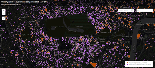
One of the reasons property prices in the UK are so high is because of the number of buildings owned by offshore companies. Satirical magazine Private Eye this week published an interactive map which shows the amount of English & Welsh land that has been bought by these offshore companies.
Selling England by the Offshore Pound uses Land Registry data to plot all land parcels registered in the name of an offshore company between 2005 and July 2014. One look at the map and you can tell that there are a lot of properties in the UK now registered to overseas owners.

MasterMaps has created a really impressive mapped visualization of the Arctic ice cap. The Arctic Sea Ice map allows you to compare the monthly sea ice cover in the Arctic for any month since 2006.
If you select a month from the bottom timeline you can then use the top timeline to make a direct comparison of any month for each year from 2006 to 2015. Every time you adjust the timeline the Arctic see ice coverage is automatically updated on the map.


Comments