Four Seasons in One Map
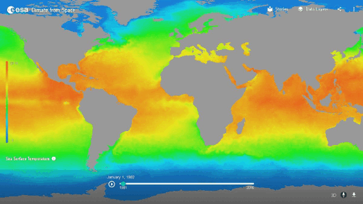
This animated map shows the temperature of the sea surface changing over the course of one year. Sea surface temperature influences the weather and the climate around the globe. The temperature of the sea effects the temperature of the air above it and influences atmospheric wind, warmth and water content. On the map you can see the cycle of warming and cooling with the passing of the seasons. Ocean currents and circulations can also be seen as the year progresses.
This animation of sea surface temperatures was created using ESA's Climate from Space interactive map. The Climate from Space map allows you to explore 40 years of climate data from the European Space Agency's Climate Change Initiative.on an interactive globe. The map includes over 20 key climate measures, including cloud cover, CO2 levels, permafrost and global temperatures.
The map includes 40 years of data. So, as well as exploring seasonal climate changes over the course of one year, you can use the map to explore how climate change has effected key climate measures since 1982. The Climate from Space map also includes a number of Climate Stories in which climate scientists help explain the influence of these key climate measures on our climate and their importance in tracking global climate change.
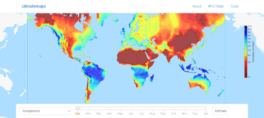
You can also explore how the weather changes through the course of a year on Climatemaps' interactive weather visualization. Climatemaps shows how different weather metrics change over the duration of 12 months across the whole world. The map animates average global monthly climate data from 1961-1990 to show you when every location in the world has its hottest, driest or wettest weather.
You can select from a range of weather layers from the drop-down menu (including precipitation, cloud cover and average temperatures). You can then view the weather data animated on the map through a whole year (you might need to let the animation play through a couple of times before all the monthly layers load completely).

The Digital Sandbox also visualizes the changing seasons on Earth. This time on an interactive 3D globe. The Digital Twin Sandbox includes an animated snow layer visualizing the global levels of snow over the course of one whole year. As the globe spins you can view the levels of snow rising and falling across the whole world during the passing of 365 days.
If all that snow leaves you feeling cold then you can visualize other data on the interactive globe instead. Foe example, select the NDVI (Normalized Difference Vegetation Index) layer and you can view the growth and fall of vegetation around the world over the course of the year.
The data for both the snow and vegetation layers visualized on the
interactive globe comes from Sentinel-2 satellites. You can read
more about how the data can be accessed and how the interactive globe
was created on the Sentinel Hub blog post, Digital Twin Sandbox Sentinel-2 collection available to everyone.


Comments