The Most Popular Maps of 2018
I thought it might be interesting to have a quick look at which Maps Mania posts were the most popular in 2018. The number of page views is not necessarily the best guide to the popularity of individual Maps Mania posts or interactive maps (posts from January have had a lot longer to gather page views than posts from this week). However it can be a good guide to the sorts of posts that have been popular this year.
It's the Economy Stupid
In 2018 four of the top ten posts on Maps Mania were about the American economy:
Mapping America's Most Distressed Areas - this map of the Distressed Communities Index ranks the economic well-being of every community in the United States.
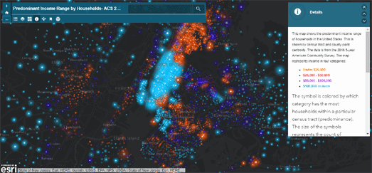
Income Inequality in Your Town - this Esri map shows how much money people are earning in each census tract in the United States. It shows the huge income inequality which can exist in different neighborhoods even in the same towns.
How Minimum is the Minimum Wage - this Esri map reveals the living wage level in each state and shows how the minimum wage has fallen or risen in real terms in each state over the last 48 years.
Saying Goodbye to the American Dream - this Esri map visualizes the areas of the USA with the highest percentage of non-citizen residents & DACA recipients and the estimated economic impact that their removal will have on an area's GDP.
Quadrennial Sporting Events
After the American economy the next favorite subject on Maps Mania this year was global sports events. Two maps about the Winter Olympics in Pyeongchang made the top ten. One map about the summer World Cup in Russia also made the top ten.
Pyeongchang 2018 - this Esri story map looks at how many gold medals different countries have won at past Winter Olympics, how each country's gold haul has changed over time and the global distribution of Winter Olympic gold medals.
The 2018 Winter Olympics Medal Map - an interactive map showing the numbers of medals won by each country at the 2018 Winter Olympics.
Russia's World Cup Stadiums - an interactive guided tour of the soccer stadiums which were used in the 2018 World Cup in Russia.
Miscellaneous
The other three maps to make the top ten most read posts were:
The Most Popular Street Names in the USA - these maps explore the most popular names given to roads in the United States of America.
Europe's Population in 3D - this 3D map shows the population of Europe as peaks and troughs, where height represents the population density at any point in the continent.
Mapping Lines of Sight - this Leaflet map can show lines of sight. It uses turf.js to map viewsheds - showing where an individual's line of sight would be blocked by buildings.


Comments