Who Isn't Getting Vaccinated?

The Centers for Disease Control and Prevention has created a bivariate map which visualizes both vaccination rates and the Social Vulnerability Index (SVI) at the county level. The COVID-19 Vaccination Equity map shows both the levels of vaccination coverage in each county and the levels of SVI.
The SVI uses data on poverty levels, housing, and vehicle access to estimate a community’s ability to respond to and recover from disasters or disease outbreaks. For example the index can be used to identify areas which are most likely to be adversely effected by epidemics such as Covid-19.
The reddest counties on the map are those with the highest SVI scores and the lowest vaccination coverage. For example much of the Black Belt in the American South appears red on the map. Black Belt counties have historically ranked toward the bottom of American regions for quality of life indicators such as poverty, income levels and mortality rates. These counties are now among those with the lowest vaccination rates.
Covid-19 vaccinations are extremely important in preventing deaths from the highly transmissible variants of the disease now emerging. Last Thursday the director of the CDC, Dr. Rochelle Walensky, announced that over the last few months 99.5% of deaths from Covid-19 in the United States were in unvaccinated people. Estimates from the CDC show that the highly transmissible Delta variant now makes up more than half of Covid cases in the US.

The New York Times' Covid-19 Vaccinations interactive map allows you to see the percentage of the population who are vaccinated in each county. On this map lighter hues show the counties with the lowest rates of vaccinations.
Around 67% of Americans have now received at least one shot of the vaccine. Louisiana (49.6%) and Mississippi (47.2%) are the two states with the lowest percentage of adults having received at least one shot.

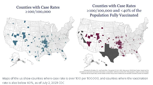
McKinsey & Company has a bivariate map which visualizes both the percentage of the population in every county who have received a Covid-19 vaccination and the number of active cases of Covid-19 in each county. This map reveals the clear link between low vaccination rates and active cases of Covid-19.
McKinsey's Covid-19 Vaccine Distribution map uses the color red to show the counties with the lowest percentage of the population vaccinated and with a high rate of coronavirus. The turquoise color on this map shows counties with high vaccination rates and low numbers of active Covid-19 cases.If a county was dark blue on this map it would indicate a high level of vaccination and a high number of Covid-19 cases. The absence of counties colored dark blue suggests that vaccinations are very effective in controlling the spread of Covid-19.


Comments