Dividing America by Population
Engaging Data has released a new interactive map which allows you to divide the United States into areas with equal populations. The map uses 2018 county population data from the US Census Bureau to allow you to see the different ways that the U.S. could be divided into different population areas.
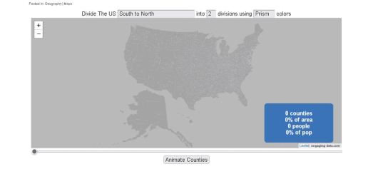
Using the Splitting the US by Population interactive map you can visualize US population density in a number of different interesting ways. The map can split the country into 1,2,3,4,5,8 and 10 different segments, each section having an equal population. There are a number of different ways that you can make these divisions. For example you can split the country East to West, North to South or even into concentric rings.
A good example of this is the animated map above. Here you can see the U.S. being divided into a North area and a South area, both of which have an equal population.

You can also play around with equal population areas using Slate's Equal Population Mapper. This interactive map allows you to compare the populations of select cities and counties with other locations in the United States.
The Equal Population Mapper lets you click anywhere on a map of the United States to view a circular region of equal population to New York around the selected area. The map is a very effective tool to visualize the population density of New York in comparison to other regions of the US. The map isn't restricted to only visualizing the population of New York. You can also use the map to view the populations of Los Angeles
County, Wyoming, New Jersey, Texas and the coastal areas of the United States.


Comments