Here Be Climate Change
It is shocking how quickly climate scientists are pivoting from visualizing the future impact of climate change to visualizations showing the impact that climate change is having right now.
Interactive maps such as Climate Central's Coastal Risk Screening Tool (projected sea level rise) and the Analog Atlas (global heating) allow us to see how climate change is likely to impact us directly in the future. These are maps which rely on climate change models to show future climate projections. Unfortunately we no longer need to rely on visualizations of future climate change. In fact climate scientists are already increasingly releasing data visualizations which show the impact that climate change is already making on our climate and on our lives.
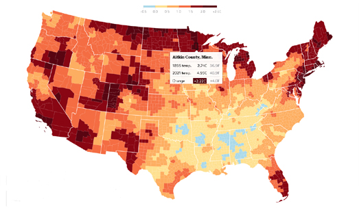
Yesterday The Guardian published an interactive map which visualizes how much temperatures have risen in every US county over the last 125 years. The map in A third of Americans are already facing above-average warming allows you to see how much the average annual temperature has already risen in every single county in the contiguous United States. Shockingly at least 499 counties have already seen temperature increases of over 1.5C.

You can also see how much average annual temperatures have increased where you live via a powerful 'warming stripes' visualization. In 2018 Ed Hawkins, a climate scientist at the National Centre for
Atmospheric Science at the University of Reading, released a powerful
data visualization to illustrate how temperatures have risen around the
globe over the last century. His warming stripes visualization shows the
average yearly temperature for every year over 100+ years.
You can get your own warming stripes for different regions and
countries around the world (and for individual U.S. states). Select a
region and then a country from the drop-down menu on #ShowYourStripes and you can view and download an image showing how temperatures have risen over the last 100+ years at your selected location.
Other publications have begun to examine the direct effect that climate change is having on people's lives. In Who Damages the Climate the Most and Who Bears the Consequences, the German newspaper Tagesspiegel looked at the effects that climate change is already having on many African countries.
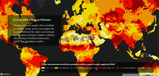
CrisisGroup's interactive map How Climate Change Fuels Deadly Conflict shows where in the world climate issues, like water scarcity and climatic volatility are already leading to conflicts between different communities and countries. You can also explore the impact that climate change is already having on people across the world on the Communities in Crisis interactive map. Communities in Crisis is an online book which looks at the impact that climate change is having on communities around the globe. The book consists of 12 chapters, each of which deals with a specific threat from climate change, including threats such as rising sea levels, drought, extreme heat waves and food and water insecurity.


Comments