Thursday, May 31, 2018
Mapping New York Taxi Journeys
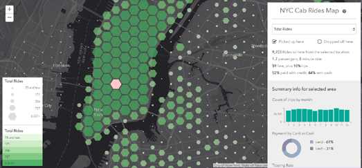
The NYC Cab Rides map is an interactive map visualizing Yellow Cab trip data in New York City from July 2015 - June 2016. The map allows you to see where the most New York cab rides begin, the pick-up locations where cab drivers can expect the largest tips, where in the city passengers pay in cash & where they pay by credit, the number of passengers and the length of journeys.
The map uses hexagonal binning to provide a spatial histogram of New York taxi ride data. The hexagons represent the number of rides in each location on the map in two different ways. It uses both a color ramp and the size of the hexagons themselves to indicate the total number of rides at each location on the map.
If you hover over a hexagon on the map you can view the exact number of rides as well as the average length & cost of the rides and the percentage of passengers that paid by cash and credit card. If you click on a hexagon on the map then the map changes to visualizes the taxi rides to or from that location from everywhere else in the city.
The NYC Cab Rides Map was made to partner John Nelson's story map which also explores Yellow Cab trip data in New York City. In Taxi Cab Terrain Nelson examines how different New York boroughs use and pay for taxi cab journeys. He then looks at the underlying socio-economic data in those neighborhoods to see if they help explain the differences in how inhabitants of different New York neighborhoods use and pay for cabs.
In Taxi Cab Terrain Esri has mapped out the locations where the most New York cab rides begin, the pick-up locations where cab drivers can expect the largest tips, where in the city passengers pay in cash & where they pay by credit, the number of passengers and the length of journeys.
Back in 2014 Chris Whong also created an impressive interactive map using New York taxi data. Chris' map provided a great insight into the daily life of one New York taxi driver. Chris' NYC Taxis: A Day in the Life is a MapBox visualization of the journey of one New York taxi over the course of 24 hours.
You can also explore New York taxi journeys in the NYC Taxi Holiday Visualization, which animates taxi journeys from New York's airports over the course of a month and half, and Hubcab, a mapped visualization of 170 million taxi trips over one year in New York.
The Interactive Moll Map Collection
Bernard Pavel Moll was an 18th century German diplomat, cartographer and collector of maps. During his lifetime Moll collected thousands of maps. Thanks to Moll's Map Collection you can browse his collection of vintage maps online. Moll's Map Collection has digitized Moll's original maps and made them available to view as interactive maps.
The maps are organised by location. You can therefore search the maps by location. For example - if you want to see historical, vintage maps of Venice you need to first select Italy and then select the Republic of Venice. You can then choose from the many, many maps of Venice in the Moll Map Collection.
When you select to view an individual vintage map it is displayed as an interactive map, which you can browse at will. If you click on the 'Zobrazit na StareMapy.cz' button you can view the map overlaid on top of a modern map layer in Georeferencer.
Wednesday, May 30, 2018
Hawaii's Lava Flows from Space
NASA has released a stunning satellite image of the lava flows erupting from Hawaii's Kilaueu Volcano. The Infrared Glow of Kilaueu's Lava Flows was captured on May 23rd 2018.
NASA's satellite image was captured by Landsat 8. It is a false-color infrared and green light bands image, which helps to highlight the active lava flows. The purple color around the lava flows are clouds being lit from below by the lava itself.
Esri's KÄ«lauea: Fountains of Fire also includes some recent satellite imagery of the volcano's active lava flows. Esri's story map explores this recent satellite imagery and goes on to explain why Kilaueu is so active.
The map showcases some of the recent satellite imagery of the lava flows. This includes both natural color imagery and false color imagery. This false color imagery uses the near infrared band to show the lave flows with greater clarity.
Esri's story map goes on to show the Kilaueu Volcano's position in the circum-Pacific Belt, where 90% of the Earth's seismic activity occurs. It also takes a much closer look at Kilauenu itself. This examination includes an animated map showing where historical lava flows have occurred, in chronological order, since 1790.
Swiss Hiking Trails in 3D
You can't beat hiking in the Swiss Alps. And if you can't beat it then why not join in with this new Swiss National Park Hiking Trails Map. The application allows you to search and find hiking trails in the Swiss National Park by level of difficulty, by length of time, and by the severity of the ascents. It then shows you a glorious 3D map of your chosen hiking route.
After deciding on the level of difficulty and selecting your hike you can view the route of your hike on top of a 3D map of the Swiss National Park. The details section in the map sidebar provides information on the elevations and climbs on the route and how long the hike should last. An interactive elevation chart shows you the severity of the ascents all along your chosen route. If you hover over the elevation chart the location is also highlighted on the map itself.
The 'Basemap' option in the map sidebar allows you to switch the basemap layer to a topographic or satellite map.
The Interactive Mao Kun Map
The Mao Kun Map is the earliest Chinese map to accurately map Southern Asia, Persia, Arabia and East Africa. The map was first published in the 17th century in the military treatise Wubei Zhi. The introduction to the map in Wubei Zhi suggests that the Mao Kun charts are based on documents from the expeditions of Zheng He. The Mao Kun Map is also sometimes known as Zheng He's Navigation Map.
The map is a long strip map charting the sea route from the Ming capital in Nanjing to the East Coast of Africa (the map is arranged from right to left, starting from Nanjing and finishing in Hormuz.) You can follow the whole route in close detail on the Interactive Zheng He Sailing Map. This interactive version of the map was created by Professor Anthony Barbieri-Low of the University of California, Santa Barbara.
The interactive map includes translations of 100 of the Chinese place-names on the map. If you hover over these place-names (highlighted in red on the map) you can read the English translation. If you click on a highlighted place-name you can view the selected location on Google Maps. All these translated and mapped locations are also available from a drop-down menu, which provides a quick way to find a location on the map. A small inset map runs along the top of the map to show where you are currently looking on the huge strip map.
The dotted lines on the map are sailing routes. The Chinese text along these routes provide sailing instructions, including compass points and distances. The sailing instructions are more detailed in Chinese waters. The map itself is also more accurate in Chinese territory and is less complete the further west it goes.
Tuesday, May 29, 2018
The Memorial Day Map
For Memorial Day Axios created an interactive map of U.S. military deaths since 9/11. The map shows how many soldiers have given their lives for their country since 9/11 in every county in the contiguous United States. The Memorial Day Map uses the home towns for each of the fallen soldiers.
The circle markers are scaled to show the total number of deaths in each county. It is important to note that these are total numbers. For example Los Angeles County is the biggest marker on the map. This is because the 167 deaths of soldiers is the largest number of any county. That doesn't mean that LA County has suffered the highest number of deaths per population. The colors of the markers represent the normalized number of deaths per 100,000 of the population. Bexar County in Texas has the highest rate of military deaths of all U.S. counties (with more than one million people).
Since 9/11 6,940 U.S. military service members have died in service.
The Live Jurassic World Dashboard Map
The huge theme park island in the 2015 movie Jurassic World is largely run from a central control room. One whole wall of this control room is dominated by an enormous dashboard, featuring a map of the theme park island and what are presumably live camera and data feeds.
Sergio Domenech of Esri Spain decided to recreate the Jurassic World control dashboard in Esri maps. You can play with his interactive recreation of the dashboard at Jurassic World Dashboard. The dashboard was created using features which are available to anybody using the ArcGIS platform.
The central map in the control dashboard shows La Palma in the Canary Islands. The island bears a marked similarity to the fictional island of Isla Nublar where the Jurassic World theme park is located. The data and webcam images used in the control dashboard all come from the La Palma Open Data site.
You can read more about how the dashboard was made in this JuraGIS Park story map. You can also read more about the map (in Spanish) on the Spanish Esri blog.
You can explore the renowned Jurassic World entertainment complex in more detail using the Jurassic World Map. This custom designed interactive map of the world's latest, and some say most dangerous theme park, features the locations of hotels, restaurants, rest rooms and all the park's best rides and shows.
Due to unforeseen circumstances all those park facilities are now closed. In fact if you click on the markers on the map you will discover that all these facilities have now suffered a little dinosaur damage. In fact the whole park appears to now be closed.
The UK Population Born Overseas
The Office for National Statistics has released a new interactive map which shows the number of people who were born overseas in each local authority area in the UK. The Non-UK Born Population Map uses a choropleth layer to show the percentage of the population in each local authority in 2017 who were born overseas.
My own local authority area in east London has the highest percentage of non-UK born citizens. 57% of the people in Newham were not born in the UK. London as a whole is the region with the highest percentage of the population being non-UK born. 38% of the population of London was born overseas.
The Non-UK Born Population Map also shows the change in the percentage of the non-UK born population in each local authority over the last ten years, the percentage of non-British nationals living in each area and the change in the percentage of non-British nationals in each area over the last ten years.
The map doesn't break down which countries the non-UK born population are from. Poland is the most common country of birth outside the UK. You can learn more about the countries where the UK's non-UK born population come from in the ONS's statistical bulletin, Population of the UK by country of birth and nationality: 2017.
Monday, May 28, 2018
Where Disasters Happen
The New York Times has discovered that 90% of federal assistance given after natural disasters is paid to ZIP codes that contain less than 20 percent of the population. In The Places in the U.S. Where Disaster Strikes Again and Again the Times debates whether providing federal assistance to communities after disasters just encourages Americans to continue living in disaster prone areas.
The Times article begins with a large static map showing where disasters have occurred in the USA from 2002-2017. The map shows were federal assistance has been made by the Small Business Administration. It therefore provides a reasonably accurate picture of where communities have been affected by natural disasters.
The Times article goes on to provide a year by year breakdown of the pattern of natural disasters across the USA using a small multiples mapped visualization. On these small maps tropical storms, severe weather (tornadoes & flooding) and wildfires, earthquakes & other disasters are color coded to show where each occurred. These small multiples are repeated at the end of the article as larger maps.
These annual maps clearly show that certain types of natural disaster do seem to occur in certain parts of the country. These patterns can be more clearly shown by overlaying individual types of disaster on a map. For example by showing historical hurricane tracks on one map of the USA.
NOAA's Historical Hurricane Tracks map allows you to view global hurricane data dating back as far as 1842. Using the map you can search and visualize hurricane data by storm name, location and by date. If you enter the name of a hurricane (for example 2012's Hurricane Sandy) you can pick out the individual hurricane's track on the map.
The map clearly shows that the East Coast and the Gulf of Mexico are most susceptible to tropical storms in the USA. Clearly if you live on the Gulf of Mexico or the East Coast the sensible thing to do is move inland a little. At least you could move inland if you don't mind tornadoes.
Exploring Three Decades of Violent Storms is a mapped visualization of thirty years of tornado strikes in the USA. The map uses historical tornado data to provide an overview of where tornadoes have struck over the last thirty years.
The map allows you to filter the data by location. The details in the map sidebar update automatically as you pan and zoom the map, to only show the data from the current map bounds. You can also select an individual tornado on the map to view its strength, length and the number of injuries & fatalities caused.
Tornado Tracks, 1950-2014 also allows you to view historical tornado data on an interactive map. This map visualizes each tornado's individual path. You can filter the tornadoes shown on the map by scale, by year range and by the number of casualties caused. You can also select an individual tornado track on the map to view its strength, date, length & width and the number of injuries & fatalities.
The Berlin Building Age Map
Berlin finally has an interactive building age map. It was made by the Berliner Morgenpost. Which means that Berlin has a really great building age map. An interactive map which shows the age of every building in the German capital.
The Berlin Building Age Map, like other building age maps, colors individual building footprints on a map of the city to show the decade when every building was built. However the Berliner Morgenpost's individual take on this now familiar format is to to use the map as the background to a fascinating exploration of Berlin's architectural history.
As you scroll through the article the map filters the buildings shown on the map era by era. In this way the newspaper takes you on a chronological tour of the city's historical development and architecture. For each era the story map examines some of the particularities of the buildings of this era and where in Berlin you can find typical buildings from the featured era.
Instead of scrolling through the story map you can select to explore the map for yourself. In this mode you can click on individual blocks on the map to view the age of buildings and search for individual addresses on the map.
Sunday, May 27, 2018
Repeal the 8th Referendum Results Maps
Ireland has voted overwhelmingly to overturn its ban on abortions. With a two-thirds majority the yes vote won a referendum to abolish the 8th amendment of the Irish constitution, an amendment which has made abortions illegal in Ireland. The Irish government has now promised to overturn the ban and allow legal terminations by the end of the year.
The Irish Times has created a simple interactive choropleth map which effectively shows the landslide victory for the 'Yes' vote across nearly the whole of Ireland. The Irish Times Referendum Results map uses just two colors (blue for 'Yes' and red for 'No') to show the overall result in each constituency. Using only two colors for the map's choropleth color ramp is an effective way to visualize how every single constituency in the country, apart from Donegal, had a majority voting 'Yes'.
Of course there were various levels of support for the 'Yes' vote in the different constituencies. The Irish Times map shows this by allowing users to hover over each constituency to see the percentage of 'Yes' and 'No' votes. The map also has the option to look a little more closer at the 'Yes' and 'No' votes in each constituency. Click on the 'Yes %' or 'No %' buttons and more color stops are added to the color palette to give an overall view of the percentage of 'Yes' and 'No' voters in each constituency.
The Guardian's choropleth map of the referendum results uses more colors. Under 50%, or a no vote, is shown in red. So Donegal still stands out on the map as the only constituency where a majority voted 'No'. The Guardian's use of 6 colors to show the different percentages for voting 'Yes' reveals that constituencies in Dublin (the cut-out map) were most strongly in favor of repealing the 8th.
It is a little too simplistic to say that support for the 'Yes' vote almost radiates out from Dublin but the map does show a small trend for support for the 'Yes' vote to fall away a little the further a constituency is from the capital. However there are probably too many outliers to this general trend to give it too much significance.
Saturday, May 26, 2018
The Sexist Streets of the World
The street names of Vienna memorialize the lives of thousands of men. 4,269 of them. That is how many streets in the Austrian capital have been named for famous (and not so famous) men. The lives of women are not celebrated quite so much in the street names of Vienna. In fact only 356 streets have been named for women.
Street Names in Vienna visualizes all the streets named for men and women on an interactive map. On the map streets named for men are colored blue and streets named for women are colored red. You can click on the individual streets to learn a little more about each individual memorialized in Vienna's street names.
Street Names in Vienna also includes a statistics view. If you click on the little graph icon above the map all the male and female streets transition into two long roads. This shows the total length of all the roads named for men and the total length of all the roads named for women. 1,541 km of roads (or 42.4% of the total length of Vienna's roads) are named for men. 109 km (or 3% of the total length of Vienna's roads) have been named for women.
The animated transitions between the map and statistics views of the data were created using D3.js. You can learn how the transitions are made on the map creator's tutorial on Transitions from Maps to Diagrams.
It isn't only in Vienna where a patriarchal view of the world is reflected in the names of its streets. Mapbox has analysed the number of street names named after men and women throughout the world and determined that far more streets are named after men than women.
Mapbox has created an interactive map showing the distribution of male and female street names in major cities across the world. On the map all the male street names are colored blue and all the female street names are colored red. The map reveals that there is a far higher proportion of blue streets than red streets throughout the world. According to Mapping Female versus Male Street Names if you add up all the streets in Bengaluru, Chennai, London, Mumbai, New Delhi, Paris, and San Francisco only 27.5% are named after women.
Geochicas have also been investigating the under-representation of women in street names. They have looked at a number of Latin American and Spanish cities to explore the number of streets named for men compared to the number of streets named for women.
Las Calles de las Mujeres is an interactive map which shows all streets named for men and women in Asuncion, Barcelona, Buenos Aires, Cochabamba, Lima and Montevideo. In each city roads named for men are colored blue and roads colored yellow have been named for women. The colors on the map provide a quick overview of how many streets have been named for women compared to men. Just to make sure that there is no doubt about the issue the map sidebar also includes a pie chart that shows the percentage of streets named for both men and women in each city.
Las Calles de las Mujeres also aims to celebrate the small percentage of women who have been commemorated by having streets named for them. It has therefore linked to the Wikipedia articles (where available) of the women whose names appear on the map. You can read more about the project (in Spanish) at Geochicas.
Earlier this year Zeit Online released a fascinating analysis of the most popular German street names. As part of this investigation they looked into how street names reflect society's prejudices, beliefs and attitudes. One thing the project revealed was the under-representation of women in city street names.
In Streetscapes: Mozart, Marx and a Dictator Zeit Online looks at the trends of naming streets for people and historical events. One thing that they discovered is that streets are far more likely to be named for men than they are for women. For example in Hamburg 2,511 streets are named after men and only 397 are named after women.
Friday, May 25, 2018
Viewing Real-Time Satellite Imagery
You can now view and download near real-time full-resolution satellite imagery from NOAA's National Environmental Satellite, Data, and Information Service. At NOAA's Imagery & Data website you can view a number of interactive maps which provide you with access to satellite imagery of Earth taken in the last 24 hours.
The Western Hemisphere map allows you to view the latest 24 hour satellite imagery of the Western Hemisphere, while the Global Archive map allows you to view satellite imagery of the whole Earth. Both these maps include a timeline feature which allows you to see the latest satellite imagery animated on top of an interactive map.
As well as these two maps which allow you to view and download NOAA's latest satellite imagery, the Imagery & Data website includes NOAA's Image of the Day. This feature provides a close-up view of some of the latest significant weather and environmental events taking place around the world. The website also provides a link to NOAA's Historic Events, which looks at satellite imagery of historic storms, floods, fires, and other global events.
The Virtual Globes Museum
The Virtual Globes Museum is a website which allows you to view historical vintage globes as interactive virtual WebGL 3d globes. The collection includes Earth and celestial globes dating back to 1507.
The first globe in the collection is the 1507 Waldseemüller globe. This was the first globe known to include the word 'America'. The label 'America' is placed on what we now call South America. The collection also includes a number of Earth and celestial globes by the Dutch cartographer Willem Blaeu and by the Venetian Vincenzo Coronelli.
The University of Lausanne in Switzerland has released two interactive 3d globes which are digitized versions of the University's globes made by Gerard Mercator in the 16th century. The two recently discovered globes exist as a homogeneous pair, one being a terrestrial globe and the other a celestial globe.
The University has used Esri's Scene Viewer to create their two interactive 3d globes from Mercator's originals. This allows you to inspect Mercator's Earth Globe and Mercator's Celestial Globe in detail from your own browser. The Earth globe is made from plates engraved by Mercator in Louvain in 1541.
Mercator's Earth globe improves significantly on the Ptolemaic view of the world which dominated during the 16th century. For example, his representation of the Mediterranean and Africa are much more accurate than many other contemporary maps based on Ptolemy.
The State Library of New South Wales has also created a couple of interactive 3d globes from vintage historical maps and globe gores. Their Meridian application allows you to view virtual globes of Miranda's World Map (1706) and Coronelli's Terrestial Globe.
Meridian was created using the Three.js library. You can read more about how Meridian created their virtual globes from Miranda's two dimensional vintage map and from Coronelli's globe gores on the DX Lab blog.
Thursday, May 24, 2018
The Spy Planes Spying on Texas
Last year Buzzfeed released an award winning investigation into the use of spy planes by the FBI and the DHS over mainland America. Buzzfeed's Spies in the Skies investigation mapped out the flight paths of the FBI and the DHS planes to reveal the areas where these federal planes have been spying.
The Texas Observer has now released a very similar investigation into the aerial surveillance carried out by the Texas Department of Public Safety (DPS). The Texas Department of Public Safety owns two high altitude spy planes.
In Eyes Above Texas the Texas Observer has used tracking data for the two planes, obtained from Flightradar24, to create a map of where the planes have flown. The Esri map shows all the known flight paths undertaken by both planes from January 1, 2015 to July 31, 2017. The map includes a closer view of all the places where the two planes might have flown into Mexico. Under the Department of Public Safety's own rules the planes are not allowed to fly over other countries.
The Observer has used DPS flight logs to color code the planes' flight paths to show those where the flight's purpose is for border security and those where the flights have another purpose. The Observer's map also includes a search facility. You can therefore enter your own address to see how often the DPS spy planes have flown over your house.
Spy Satellites Spy Shrinking Rain Forest
North Carolina State University has used historical aerial imagery captured by the Corona spy satellite in the 1960's & 1970's to track the loss of the Atlantic Forest. The Atlantic Forest is a rainforest located in the border area between Argentina, Brazil, and Paraguay. Over 85% of the Atlantic Forest has now been lost to deforestation.
The Making of a Forest is an Esri story map which uses three different sources to visualize how the rainforest has shrunk over the last seventy years. As well as using historical imagery from the Corona satellite the North Carolina State University analyzed historical aerial photography captured by the Brazilian government in the 1950's & 1980's and Landsat satellite imagery dating back to the 1970's.
As you progress through The Making of a Forest you can view the fixed-wing imagery and satellite imagery from different decades overlaid on top of a map of the Atlantic Forest. This imagery shows how the parts of the rainforest which are now inside the Brazilian and Argentinian national parks in the area are very healthy. Outside of the national parks what was once the Atlantic Forest is now mainly farmland.
China's Great Sea Grab
For a number of years the Republic of China has been engaged in a huge territory grab in the South China Sea. It has claimed countless coral reefs and engaged in building artificial islands, both of which it is using to construct new military bases. Other countries in the area dispute China's ownership of these islands and are becoming increasingly worried about the country's growing military presence.
Reuters has been examining satellite imagery to track China's military expansion in the South China Sea. In Concrete and Coral Reuters has worked with Earthrise Media to explore China's construction projects, particularly on the Paracel and Spratly islands. As part of this investigation Reuters has mapped out the extent of China's dredging and reclamation work on both island chains. This is presented in two maps showing the extent of the Paracel and Spratley islands before and after China's reclamation work.
Both these maps show that the territory owned by China has increased dramatically over the last few years as it reclaims land for military installations. During the same period the amount of reefs and islands owned by other countries on the Spratly Islands has remained largely the same. Only South Vietnam appears to have reclaimed a little land, and nowhere near to the extent of China.
Reuters' small multiples graphic of the Spratly and Paracel Islands is supported by satellite imagery which similarly shows the extent of China's dredging and reclamation work. The satellite imagery also reveals the extent of China's military construction work on the islands.
The Asia Maritime Transparency Initiative has mapped out all the territorial claims of the Asia Pacific. Its Maritime Claims of the Asia Pacific attempts to provide an as complete, accurate and up-to-date map as possible of all the competing maritime claims in the region.
On the map each country's territorial claims are shown using color-coded borders. The map includes a filter option which allows you to view any combination of countries' claims on the map. By selecting any two country's territorial claims on the map it is possible to see exactly where they have territorial disputes.
The Asia Maritime Transparency Initiative map doesn't show territorial claims for the Spratly and Paracel Islands "due to a lack of clarity about what each country claims".
In the last few years both China and Japan have escalated their military presence in the South and East China Seas. China has also become caught up in diplomatic rows with Vietnam, Taiwan, Malaysia, the Philippines and Brunei over long standing conflicting claims over territorial rights in the China seas.
Al Jeezera has published a map examining the history of the South China Sea Disputes. The map explores some of the historical hot-spots between China and its neighbors in the area since 1974. The map itself was created using Leaflet.js and the Knight Lab Story Maps library.
The Story Maps template means that you can explore the map chronologically, using the forward and back arrows to progress through Al Jaeera's mapped history of the region. You can also click on the map markers to jump to individual locations on the map to learn more about the history of territorial disputes in that area.
Wednesday, May 23, 2018
Travel Time Quantiles
Route Times uses data from Google Maps driving directions to visualize where you can drive to in a set amount of time from the center of five major cities around the globe.
Select one of the five cities on Route Times and a number of polylines will be drawn on top of a Leaflet.js map of the chosen city. Each polyline represents a driving route from the center of the city. Each route is colored to show how long it takes to drive. If you click a route's polyline on the map you can view exactly how long it takes to drive and the distance of the route.
The author of the map, Cris Moya, has released the code on GitHub for a very similar map. GoogleTravelTime can create similar route times maps for any location on Earth, and for any time of day or day of the week (again based on Google Maps's driving directions).
Urbanization in England & Wales
The Urban Growth Explorer visualizes the huge urbanization of England & Wales in the last 150 years. The map overlays modern UK town and city boundaries on top of an 1885 Ordnance Survey map to visualize how Britain's towns and cities have grown since the mid-19th century.
Before industrialization England & Wales were both largely rural countries. In 1801 the proportion of the population living in towns and cities with more than 20,000 people was 17%. In 1891 that proportion had risen to 54%. This shift from a largely rural population to an urban population led to the huge growth in the size of towns and cities. For example, in 1717 the city of Manchester had a population of 10,000. By 1911 it had grown to 2.3 million.
Using the Urban Growth Explorer you can search for a town or city in England & Wales and view (where available) a 2015 town boundary overlaid on top of a map of the location from 1885. If no modern boundary is available for your town you can switch to the side-by-side view to compare the 1885 map with the modern aerial view of your town.
You can also explore the UK's shift from a predominately rural to urban country in Populations Past. In the second half of the 19th Century Great Britain went through a process of demographic transition as the industrial revolution fundamentally changed the way that people lived.
The University of Cambridge's Populations Past is an interactive atlas of Victorian and Edwardian England & Wales. The map allows you to explore some of the huge social and geographical changes which took place in England & Wales during the second half of the 19th century and the effect that those changes had on the population.
The map includes a number of different demographic measures and socio-economic indicators which allow you to explore for yourself the effect of the demographic transition over time and between different locations. The side-by-side view uses two different maps to help visualize the effects of the demographic transition on locations throughout England & Wales over time.
Tuesday, May 22, 2018
The 50 Most Dangerous Cities in the World
The Most Dangerous Cities in the World interactive map shows the 50 cities across the globe with the highest homicide rates in 2017. According to the map the most dangerous city in the world is Los Cabos in Mexico. Caracas is the city with the second highest homicide rate and Acapulco is third.
One of the most obvious observations to make is that all but 3 of the 50 most dangerous cities are in the continents of North America and South America. The 3 not in the Americas are all in South Africa. The 4 U.S. cities in the top 50 are St Louis, Baltimore, New Orleans and Detroit.
When browsing the map you need to click on the 'i' in the map toolbar to make the map markers interactive. Once you've clicked on the 'i' you can select the map markers to view the number of homicides in a city and its homicide rate. If you zoom in on a marker a map label will appear showing where it ranks in the top 50 most dangerous cities.
You can read more about where the data comes from and how the homicide rates are compiled on the gvSIG blog.
If you are worried about traveling abroad then International SOS provide a very basic interactive map of the travel risks for every country of the world. Their Travel Risk Map provides an overview of the travel risks in each country for medical, security and road safety.
Countries are colored on the Travel Risk Map to show the International SOS assessment of the travel risks in these three categories. The map therefore provides a very basic guide as to where it is safe to travel in the world. You should also check your government's latest travel advice as well. Many governments provide useful advice for their citizens planning to travel abroad. For example the UK's Foreign and Commonwealth Office provides up-to-date Foreign Travel Advice.
Mapping the History of the World
MappiMundi is a new interactive mapping platform for recording and exploring historical events in space and time. The ultimate goal of MappiMunid is to create a complete world atlas of historical events one event at a time.
Anybody can become a registered user of MappiMundi and use the platform to map out an historical event. Unregistered users can explore the interactive maps of historical events that have already been created by registered users.
A good place to start exploring the capabilities and available features of MappiMundi is the Atlas of World Territories and Battles throughout History. This project maps out major wars and territories in world history. You can use the timeline (directly under the map) to select specific dates in world history and the map automatically updates to show you country borders at the selected time and major battles that occurred in that date range. You can then click on the country / territory polygons or the battle markers to learn more about the countries or historical events.
There are a number of other interactive history mapping projects working on similar platforms. You can view some examples of these on this post on The History of the World - Part Three.
The New York Subway Rental Map
The NYC Subway Rental Map reveals the median rent for a one bedroom apartment in the area around every stop on the New York subway system. The map can also show you if rental rates have gone up or down at each subway stop year-on-year.
The map provides an interesting visualization of New York's affordable and non-affordable neighborhoods using a map of the city that most New Yorkers are familiar with. Every single subway stop on RentHop's interactive map is colored to show the median rent within 0.6 mile of the MTA subway station. If you select a station's marker on the map you can view the exact median rent in the area and the percentage change to the cost of renting in the area since 2017.
According to RentHop rents have dropped around many stops in Manhattan Island and Brooklyn. In fact about half of the stops in Manhattan experienced drops in the cost of renting. On the other hand many stops in the Bronx have experienced a growth in rental rates year-on-year.
Monday, May 21, 2018
How Americans Get to Work
Across the whole of the United States most people travel to work by car and on their own. Apart from a few counties around New York City, the District of Colombia, most counties in Alaska and San Juan country in Colorado most Americans prefer to commute alone and by car.
Flowing data has mapped out the most popular methods of communing in each U.S. county. The How Americans Get to Work interactive map provides a choropleth view showing the most popular method of commuting in each separate county. The blue counties on the map (in the screenshot above) show all the counties where 'Drive Alone' is the most popular method of commuting.
In a few counties around New York and in D.C. the most popular method of commuting is public transport. San Juan, Colorado is the only county outside of Alaska where the most popular method of commuting is by foot.
All the different modes of transport can be filtered on the map. Therefore you can turn off the 'Drive Alone' commuters to see which are the next most popular methods of commuting in each American county.
The Real-Time Global Air Pollution Map
AirVisual Earth is a real-time interactive map of worldwide air pollution. The map includes an animated wind layer and an animated heat map showing the level of air pollution around the world based on the Air Quality Index (AQI).
AirVisual Earth owes an obvious debt of inspiration to Cameron Beccario's Earth. Cameron's very similar interactive globe also has animated wind and air pollution layers. Earth also includes real-time aurora predictions and ocean currents.
The air pollution data for AirVisual Earth comes from thousands of EPA monitoring stations around the world. Data for the map also comes from owners of AirVisual's own air quality monitors across the globe. You can see where all these measurements come from on AirVisual's AQI Stations Map. This map shows the real-time readings from over 9,000 worldwide locations.
The Worst Drivers in Britain
The worst drivers in the UK live in Somerset & Avon. A new interactive map visualizes the number of different driving offences based on the number of registered drivers in each area of the country. The map reveals that Avon and Somerset has the worst driving record overall, with nearly 200,000 offences.
The UK's Driving Offence Hotspot map shows eight different categories of driving offence, from speeding to running lights and ignoring signs. Drivers in Somerset & Avon were caught speeding more than drivers in any other area. Drivers in London were the worst offenders of driving while using the phone (not hands free) and drivers in Scotland were the worst offenders of driving carelessly. careless driving.
The UK's Driving Offence Hotspot map provides a choropleth view for each of the eight categories of driving offence. If you select a category you can then click on areas of the UK to view how they rank for that offence, the total number of drivers who were penalized for that offence and how many offences there were per 10,000 drivers.
Saturday, May 19, 2018
101 Mass Shootings in 2018
Yesterday's tragic shooting in a Texas high school was the 101st mass shooting incident in the USA this year. You can see the locations of all 101 mass shootings on ABC 15's interactive map. The map plots every mass shooting incident so far this year according to the Gun Violence Archive's database.
The Gun Violence Archive is also the data source for Vox's interactive map of Mass Shootings Since Sandy Hook. Vox's map shows the locations of all 1,686 mass shootings that have occurred in the U.S. since Sandy Hook in 2012.
Esri's School Shootings Map concentrates only on those mass shootings which have occurred in schools. This map shows every school mass shooting since Columbine in 1999. Esri's map uses the Washington Post’s database of school shootings, which has had to be continually updated since 1999.
Esri's map is the best map of the three. It's use of scaled markers shows the number of casualties at each incident. Unfortunately, because mass school shootings have now become so common place in the USA, the Esri map could now use a timeline feature. This would enable users to filter the results shown by date to get a sense of whether school shootings in America are really becoming more frequent year by year.
The Royal Wedding Map
The UK's Ordnance Survey has released a story map which allows you to follow today's royal wedding on an interactive map. The story map includes all the important locations on this important day.
The Royal Wedding map plots Prince Harry's and Meghan Markle's movements over the course of their special day. It follows the royal couple from Windsor Castle to St George's Chapel, where the marriage ceremony is taking place. As you progress through the story the bird's-eye view map zooms and pans around the royal town of Windsor to highlight all the featured locations.
The map sidebar includes information about the happy couple, the guests and the featured locations. It also include times of when all the important events will take place on this royal wedding day. You can therefore easily follow Harry & Meghan's marriage journey on the Royal Wedding map as you watch the coverage on television.
Friday, May 18, 2018
The Plastic Polluted Pacific Ocean
Henderson Island is a remote island in the South Pacific. Nobody lives there but, despite being uninhabited, its beaches are covered in rubbish. In fact 19 tonnes of trash made up of 37 million separate pieces litter this deserted island.
In What Happens to the Plastic we Throw Out National Geographic explains how domestic plastic trash ends up polluting a remote island in the middle of the South Pacific. As you progress through National Geographic's story a background map of the South Pacific shows the levels of mismanaged municipal plastic waste produced by countries on the Pacific Ocean. Much of this plastic waste eventually ends up in the Pacific. Carry on scrolling and the map updates to show the levels of plastic waste entering the ocean from rivers in Asia and North, Central & South America.
National Geographic identify the Yangtze River as the most polluted river in the world. Most of that pollution eventually ends up in the Pacific by way of the East China Sea. The background map animates the modeled pathways of marine debris to show how the plastic from the world's rivers ends up creating the huge plastic gyres polluting our oceans.
Can You Guess the City?
City-Guesser is a fun map quiz which tests your knowledge of world cities. In City-Guesser you are shown the maps of major cities around the world. All you have to do is name which city is being shown in each map. To ensure that the game isn't ridiculous easy all the place-name labels have been removed from each city map.
If you guess correctly you proceed to the next round. Guess wrong and it is game over. You get points for each correct answer. The game keeps a record of the maximum level you reach (the number of correct answers in one game) and your highest score. Your aim therefore is to beat your own high score and your highest level reached. Or you can try and beat me. So far I've reached level 7
You might also like these other map based games:
Quizzity - point to the named locations on a map of the world.
Guess the world city from its cold war Soviet spy map
Guess the city from its bike lane map
Click that 'hood! - a geography game that tests your knowledge of city neighborhoods.
Thursday, May 17, 2018
Mapping LA by Night
Just Downtonw's LA Streetlights is an interactive map of street-lighting in Los Angeles. The map features dark extruded building footprints lit up by models of all the city's streetlights.
I don't think that the map was created for any other purpose than it looks really striking and provides an interesting map of the city at night. You can see, however, how the map could be useful to city planning departments, especially for reporting faults, scheduling repairs and maintaining the city's streetlights.
The map itself uses Mapbox GL's extrusion property both to show the city's buildings in 3d and for the streetlight models themselves. The data for the maps comes from Los Angeles GeoHub, the city's new public website for location-based open data.
How Gerrymandered is Your State?
PlanScore has mapped the level of gerrymandering in all 50 states in the USA. PlanScore includes a comprehensive historical dataset of partisan gerrymandering, so you can examine the history of gerrymandering in each state and which political parties the districts have been gerrymandered to support.
The PlanScore choropleth map shows the level of gerrymandering in each state for both the U.S. House and State House elections. The darker the red or blue colors on the map then the more skewed the districts are towards the represented political party. If you select a state on the map you can view a more detailed report on the partisan bias in that state and how that compares to the level of gerrymandering in other states.
PlanScore has also developed a scoring service which allows you to test how fair or gerrymandered new district plans are. To use this service you just need to upload a shapefile or GeoJSON file of a district plan. PlanScore will then reveal the levels of the plan’s underlying partisan skew, showing how much the plan has been gerrymandered.
Also See
What's Your Vote Worth - an interactive story map which explores the history of America's voting system, the right to vote and how voter representation is skewed under the present system and map. The story map includes a choropleth view of how much one vote is worth in each state.
The Gerrymandering Project - FiveThirtyEight has had a go at redrawing America's voting districts for themselves. In the Atlas of Redistricting FiveThirtyEight has created a number of new congressional maps, each designed to show how districts can be redrawn to favor different political parties.
How Gerrymandered is your Congressional District? - this 2014 map from the Washington Post colors each congressional district based on its gerrymandered score (determined by the Post's analysis).
Wednesday, May 16, 2018
Erosion of the World's Coastlines
The State of the World’s Beaches is a report into how the world's coastline has changed since 1984. The authors of the report analyzed 33 years of satellite imagery, from 1984–2016, to create a global dataset of shoreline change rates. From this analysis it was determined that 24% of the world’s sandy beaches are eroding and 28% are accreting. 48% of sandy coastlines remained stable over the 33 years analysed in the study..
You can view where shorelines are eroding or accreting on the Long-term Shoreline Changes map. This map shows shoreline erosion and accretion rates for the whole world. The lines marked red on the map show where erosion took place over the 33 years and the green areas show where shoreline accretion has occurred. The length of the lines visualize the extent of the erosion or accretion over the 33 years examined in the study.
You can click on the individual lines on the map to view a time series chart. This chart shows the shoreline position for each year available from the satellite analysis. You can read the full State of the World's Beaches on the Nature website.
The Car Crash Prediction System
A new mapped based tool claims to be able to predict the likelihood of automobile collisions for every street and intersection. It uses machine learning and historical collision data to determine the future risk of car crashes on city streets.
The Louisville Automobile Collision Prediction System color-codes sections of Louisville's roads based on their predicted collision risk score. Using the colors of the roads you can determine the predicted risk of a future car collision. If you select individual road segments on the map you can view the underlying historical collision data on which the collision risk score is based.
The slide control in the map control panel allows you to filter the section and intersections shown on the map by a risk score range. This therefore allows you to search the map for the most risky sections or intersections or to locate the safest roads and intersection in Louisville.
You can read more about how the collision prediction system works by clicking on the 'Full Report' link above the map.
If you remain a little skeptical about these types of precog maps then you might enjoy the satirical White Collar Crime Risk Zones interactive map.
Open Palestine
This year Israel is celebrating its 70th anniversary. It therefore seems like an appropriate time to remember what existed before the creation of the State of Israel. 70 years ago 700,000 Palestinians were expelled from their homes to create a Jewish state. Over the last 70 years Palestinian villages have been destroyed or renamed and the map has been almost entirely redrawn.
Palestine Open Maps allows you to browse historic maps from the period of the British Mandate of Palestine and to view information about both the present day locations and those erased in the last 70 years. At the moment the platform allows you to explore vintage maps from 1880 and from the 1940's & 1950's.
This is very much an alpha release of Palestine Open Maps. The release notes say that you can add data about "present and erased localities' but none of the layers under the "Change of status since 1945' heading appear to be working. The split screen option also seems to be a work in progress, which means you can't yet compare the vintage maps with the present map of the area side-by-side.