

DMOZ is an open-content directory of World Wide Web links which uses a hierarchical scheme for organizing site listings. Listings on a similar topic in DMOZ are grouped into categories, which can then include smaller categories.
Internaut Explorer uses the CartoDB interactive mapping platform to create a visualization of DMOZ's 3,809,444 web links and 782,239 topics. The map allows you to explore a visual representation of DMOZ links organized into a radial chart. Each segment of the circle shows a different DMOZ category of links. When you zoom in on the map the individual DMOZ link categories appear.

The Internet Map is a Google Map of the 350,000 largest websites in the world. The map was created by Ruslan Enikeev and the Russian creative agency Positive Communications.
The circles on the map represent individual websites. The size of each circle on the map is determined by website traffic. The larger the amount of traffic, the bigger the circle. The location of websites on the map is determined by the links between sites. The more traffic generated from links between different websites then the closer the websites are displayed on the map.
It is actually possible to search the map by country to find the most popular websites in individual countries.
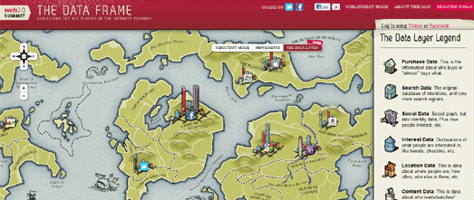
Unfortunately the Web 2.0 Summit's Web 2 Map no longer exists. The Web 2 Map used an interesting geographical metaphor to visualize the internet, representing different sectors of the Internet as countries on a map.
Each country on the map had a capital city representing the dominant website or company within that sector. The buildings or skyscrapers in the city acting as a metaphor for the different data segments within the dominant player in that sector.
For example, the country of the Union of Social Networks included a Facebook capital city. The Facebook city was dominated by a 'social' skyscraper but also includeed a smaller 'location' building to reflect that Facebook also allows users to check-in at different locations.
Every year Telegeography create an interactive map of the physical presence of the internet in the real world, with their undersea cable map.
The 2015 Submarine Cable map is inspired by medieval and renaissance cartography and features not only a vintage map style but sea monsters, map border illustrations and images showing some of the common causes of cable faults.
The map shows 299 submarine cable systems across the globe, that are active or are under construction. The border illustrations provide information on the capacity data of some of the major cable routes. Other inset illustrations provide information on how submarine cables are laid.
Images on the map explain some of the common causes of cable faults. Some fictional causes of cable faults are also included in the map in the form of mythical sea monsters. The text provided with each monster includes a reference to which historical map the mythical creature was taken from.
No comments:
Post a Comment