Six of the Best Mapbox Map Styles
Mapbox's Tilemill and Mapbox Studio applications are incredible tools for map developers to control the design and style of nearly every aspect of their maps. Using Tilemill or Mapbox Studio it is possible to create some truly gorgeous looking maps.
To see what is possible with these tools you should have a close look at some of these beautiful maps:
The Woodcut Map
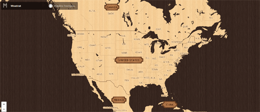
This woodcut style map makes great use of textures to create a beautiful looking map. There is a lot to love about this map. I really like the wooden shielded country labels and the level of detail which emerges at different zoom levels.
The map's creator, Eleanor Lutz, has also taken the time to explain some of the design choices and technical details behind the design of the map on the Mapbox blog.
Space Station Earth
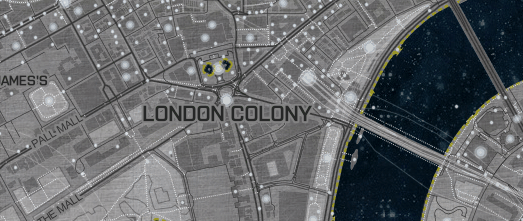
Space Station Earth is a lovely science fiction themed map. The map changes city names to space colonies, uses custom textures for road and building borders and uses over-sized markers for stores, parks, and other points of interest to simulate city lights.
The accompanying post on the Mapbox blog includes an interesting account of some of the design choices made in creating the map.
The Hand Drawn Map
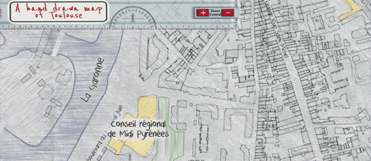
The Hand Drawn Map of Toulouse, created with Tilemill, customizes the look of OpenStreetMap data to create a beautiful hand-drawn styled map. It is the lovingly created detail on this map that help make it so special. From the post-it note themed labels to the hand-sketched textures it is easy to actually mistake this for a real hand-drawn map.
The map's creator Karl Azémar has also published an interesting post about how he created the hand-drawn style (in French).
The Pencil Map
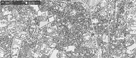
Similar in style to the hand-drawn map above, the Pencil Map has the look of a lovingly illustrated map, The map makes use of textures for water and building features. I think the map looks best when zoomed in on urban areas (as in the screenshot above), where the buildings really do look like they have been sketched by hand.
The Pirate Map
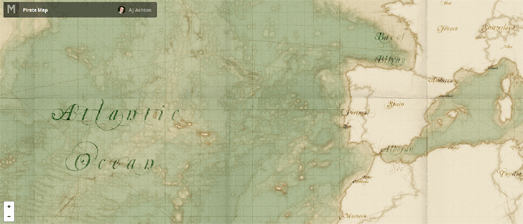
A J Ashton's Pirate Map is another map that make great use of textures to create a vintage map style. The Pirate Map also makes great use of the map label fonts to create a unified theme for the map's overall design.
There is an even better version of the Pirate Map which comes included with Mapbox Studio. So, if you download Mapbox Studio, you can play with the design of this map yourself.
The Van Gogh Map
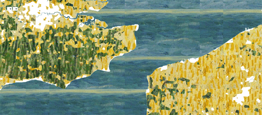
The Van Gogh Map uses a few images actually taken from Van Gogh paintings as textures for the map feature types. The result is a map style which you probably wouldn't want to use very often but the map does serve as a neat demo of how developers can create interesting and unique map styles.
This might not be the map that Van Gogh would have made himself, if he were a cartographer, but it does include details from some of his paintings. Feature types on this map, such as water and different types of land cover, are made up of map tiles created with textures taken from a few of Van Gogh's paintings.
To see what is possible with these tools you should have a close look at some of these beautiful maps:
The Woodcut Map

This woodcut style map makes great use of textures to create a beautiful looking map. There is a lot to love about this map. I really like the wooden shielded country labels and the level of detail which emerges at different zoom levels.
The map's creator, Eleanor Lutz, has also taken the time to explain some of the design choices and technical details behind the design of the map on the Mapbox blog.
Space Station Earth

Space Station Earth is a lovely science fiction themed map. The map changes city names to space colonies, uses custom textures for road and building borders and uses over-sized markers for stores, parks, and other points of interest to simulate city lights.
The accompanying post on the Mapbox blog includes an interesting account of some of the design choices made in creating the map.
The Hand Drawn Map

The Hand Drawn Map of Toulouse, created with Tilemill, customizes the look of OpenStreetMap data to create a beautiful hand-drawn styled map. It is the lovingly created detail on this map that help make it so special. From the post-it note themed labels to the hand-sketched textures it is easy to actually mistake this for a real hand-drawn map.
The map's creator Karl Azémar has also published an interesting post about how he created the hand-drawn style (in French).
The Pencil Map

Similar in style to the hand-drawn map above, the Pencil Map has the look of a lovingly illustrated map, The map makes use of textures for water and building features. I think the map looks best when zoomed in on urban areas (as in the screenshot above), where the buildings really do look like they have been sketched by hand.
The Pirate Map

A J Ashton's Pirate Map is another map that make great use of textures to create a vintage map style. The Pirate Map also makes great use of the map label fonts to create a unified theme for the map's overall design.
There is an even better version of the Pirate Map which comes included with Mapbox Studio. So, if you download Mapbox Studio, you can play with the design of this map yourself.
The Van Gogh Map

The Van Gogh Map uses a few images actually taken from Van Gogh paintings as textures for the map feature types. The result is a map style which you probably wouldn't want to use very often but the map does serve as a neat demo of how developers can create interesting and unique map styles.
This might not be the map that Van Gogh would have made himself, if he were a cartographer, but it does include details from some of his paintings. Feature types on this map, such as water and different types of land cover, are made up of map tiles created with textures taken from a few of Van Gogh's paintings.


Comments