Saturday, October 31, 2015
Switzerland's Political Map Moves to the Right
This month the populist right-wing Swiss People's Party (UDC) won a record 29.4% of the vote in the Federal Elections in Switzerland, making it the biggest party in the National Council, the lower house of the Federal Assembly of Switzerland. The UDC's victory has largely been seen as a result of the European refugee crisis, with the UDC's anti-immigration stance proving popular with many Swiss voters.
Le Temps has mapped out the percentage of votes won by the UDC in each of Switzerland's cantons. La carte du vote UDC en Suisse is a choropleth map showing the share of the vote won by the UDC across Switzerland. The map reveals that the party performed particularly well in German speaking areas. It also seems to have done well in the suburbs or outskirts of large towns and cities.
Friday, October 30, 2015
TanGRIM
Mapzen's map-tile servers are haunted. If you use Tangrim maps tonight you will find that they have been attacked by a ghostly reanimated fog. The map also appears to be showing the locations of the normally hidden poltergeists of the world.
The fog background seems to be have been created by using some foggy background images, which have been animated by continually adjusting their scale and opacity. You can use the search box at the top of the map to zoom to a number of worldwide cities.
The Trick or Treat Google Map
This Halloween you can use Google Maps to find the sweetest Trick or Treat houses in your neighborhood. Treaster is every ghouls favorite crowdourced guide to the best trick or treating spots in your town.
Share your location with Treaster and a handy Google Map will show you all the local houses which have signed up to be 'treats' for Halloween. Fellow trick & treaters can give any house on the map a thumbs-up if they receive a good haul. The result of these up-votes is that the best houses on the map are indicted by bigger pumpkin map markers.
If your house is trick or treat friendly you can easily add a pumpkin to show your house on the map.
Death Map New York
Death Map NYC is a a map of homicides and motor vehicle related deaths in New York over the last two years. Homicides on the map are indicated by the skull markers with the glock pistols, other deaths are represented by a skull icon on its own.
The map uses a nice polygon masking effect to show only New York on the map. However, as the map's creator acknowledges, the map does have a problem in displaying the large number of markers. Marker clustering could have been used to handle the large number of markers more efficiently.
The map could also benefit from an option to filter the data on the map. It would be nice to be able to just view the homicides on the map or view only the motor vehicle related deaths. It would also be useful to be able to filter the results shown by month.
Halloween Street View
There are thousands of listicle articles on the internet proclaiming to show you the scariest place on Street View.
They are all very, very lame!
Not any more. Here is my definitive guide to the Scariest Places on Street View.
Once the page loads you just need to use the arrow buttons in the top right hand corner to progress through the scary Street View scenes. Unfortunately the Google Maps API doesn't handle indoor Street View very well so I couldn't always show the scariest scenes. However feel free to navigate around these scary locations using the Street View buttons or click on the Google logo to open the scene on Google Maps.
Thursday, October 29, 2015
The Noise Pollution Map - With Real Noise
This London Noise Pollution Map has utilized an innovative method for representing traffic noise data in the English capital. It actually uses the volume of a background audio recording to represent the volume of noise pollution on London roads.
The map does include a conventional heat map level to show average road and rail noises between 7 am and 11 pm. However if you mouse-over a location of the map the volume of a background audio recording rises or falls to show the levels of noise pollution at the selected position. An inset noise oscilloscope also shows the levels of noise pollution at the chosen location.
Mapping the Invasion of Norway
In April 1940 Germany invaded Norway. Norway and its allies managed to continue the fight against the invasion for 62 days. However Germany's invasion of France in May caused Norway's allies to withdraw and the Norwegian government was forced to seek exile in London.
Invasjonen av Norge is a really nicely designed story map recounting the Norwegian War in 1940. The history of the campaign is told in chronological order. As you scroll through the chronology in the map side-panel the map automatically updates to show the relevant location.
The Mapbox created map uses labelled markers. You can replicate this in your own Mapbox or Leaflet maps using the Leaflet.label or the Leaflet.iconlabel plug-ins. You can create your own story map with Mapbox very easily by using the Scroll-driven navigation with markers and a narrative example map in the Mapbox documentation as your starting template.
Wednesday, October 28, 2015
Sons of Gallipoli
Sons of Gallipoli is a fascinating web documentary about the First World War battle in Gallipoli, told through the stories of one Turkish and one Australian mother. The documentary features a number of videos retelling the history of the Battle of Gallipoli. It also features a really nicely designed custom map.
The interactive map of the Eastern Mediterranean is actually made from one static image so it doesn't have many zoom levels. However it does feature a number of markers. You can click on the markers to learn more about the role the selected location played in the battle. Most of the markers also contain vintage photographs of the location taken during the First World War.
One really nice design feature of the map is the parallax effect on some of map labels and the map legend. Notice how when you pan around the map some of labels move at different speeds to the background map layer.
Scaling the Solar System
OMG Space is a scaled representation of the Solar System. Starting with the Sun, at the top of the webpage, as you scroll down you travel out towards the edge of the Solar System, passing all the planets as you do so.
The Sun and the planets and the distances between them are all to scale, so without using the links it will probably take you some time to scroll to the very edge of the Solar System.
If the thought of scrolling across the whole Solar System sounds a little daunting you can enter hyperspace by using the planet links running across the bottom of the page. Select a planet link and the website quickly scrolls to the chosen planet.
Historical Maps of Berlin
Berlin in the Twentieth Century underwent profound and dramatic changes. It was a city divided and then reunited. You can track many of these changes in HistoMap Berlin's collection of Twentieth Century historical maps of Berlin.
To view the available vintage maps for an area you first need to click on a location on the map. The available maps for that location will then be shown in the map side-bar. To view a map you simply need to select it in the side-bar and click the 'add' button'.
If you select the 'More Layers' tab you can view the 1910 Straube-Plan of the city. The 'More Layers' tab also includes a 'Berlin Wall' option, which allows you to overlay a map of the Berlin Wall on top of any of the other vintage maps.
Tuesday, October 27, 2015
Mapping Europe's Refugee Crisis
Lucify has released an impressive mapped visualization of the number of refugees who have arrived in Europe since 2012. The Flow Towards Europe allows you to view the number of refugees that have arrived in each European country and which countries the refugees have come from.
Each animated marker on the map indicates 25 people. The starting point and destination of each marker shows the country of origin of the represented refugees and their country of destination in Europe. If you click on a country on the map you can view the total number of refugees to arrive in the selected country, while their countries of origin are highlighted on the map.
You can also interact with the line chart above the map. The line chart shows the total number of refugees over time. You can mouse-over the timeline to move to any date since 2012 and view the number of refugees arriving in a country or Europe as a whole by that date.
The James Bond Tracking Map
People love James Bond films for the set-piece action scenes, the amazing cars, lethal gadgets and crazy arch-villains. I also love them for the stunning worldwide set locations. When you go to a James Bond film you know that you are going to be taken on a non-stop roller coaster ride of action set against a backdrop of some of the world's most iconic global locations.
Esri UK also seem impressed with James Bond's choice of destinations and have therefore created the James Bond Travel Map. The map shows the locations around the world which James Bond has visited on Her Majesty's Service.
Press 'play' on the map and a number of great circle polylines are animated on the map showing Bond's journey from London to locations around the world. Once the animation has finished playing markers appear on the map. You can then click on the marker to find out in which Bond movie the location appeared in.
Unfortunately that is as far as this map goes. I know that for copyright reasons Esri probably can't show clips from the films. However the map could at least show some photos of some of these amazing global locations.
If you are a fan of James Bond then you might also like Assist Moneypenny, a Street View based game from Sony released to promote the upcoming James Bond film Spectre.
Beyond Mercator
Mapzen has published links to a number of experimental interactive maps which use experimental map projections. While none of these experimental map projections are quite ready to threaten the dominant position of Web Mercator online, they do show that other map projections are available. They are also pretty awesome in that usual freaky Tangram way.
Among the more experimental map projections in Escape from Mercator is an Inception map projection (which Maps Mania looked at last week), a Katamari projection (pictured above), a psychedelic wavy map projection and a 2d to 3d transitional projection.
The example maps also include an Albers projection (pictured), which actually works very well as an interactive map projection.
Mapzen are right to point out that all these map projections are 'highly experimental'. However they are also really interesting. They also hint that Web Mercator's reign as the dominant web mapping projection may one day come to an end.
Monday, October 26, 2015
Fly Around the World with Mapbox GL
You can now pretend you are an astronaut aboard the International Space Station with this nice little Mapbox GL animated map. The map takes you on an animated tour around the equator, providing you with a choice of a map, satellite or hybrid view.
While this map won't make Map Mania's round-up of the best Maps of the Week, it is a very neat demonstration of two functions in the Mapbox GL API. The map uses CameraOperations to adjust the pitch of the map, providing an oblique view of the Earth. It also uses AnimationOptions to animate the map and take you on a tour around the Earth's equator.
Exploring the World's Most Northern City
Be Norilsk is a superb web-documentary about the Russian city of Norilsk. The history and character of this Siberian industrial city is explored in the documentary using interactive maps, timelines, 360 degree videos and 3d models.
The documentary is split into two main parts; the first part examines the history of the city over the Twentieth Century, while the second part looks at the city of Norilsk today.
The history of Norilsk, explored in the first part of the documentary, is told through the use of an amazing interactive timeline and 3d map. Progress through the timeline and you can actually watch the city grow through the addition of buildings to the 3d map.
The second half of the documentary, looking at Norilsk today, uses a number of different multi-media formats. This part of the documentary starts with an interactive 360 video of the airport. The video includes markers which you can interact with to learn more about the airport and city.
Once you have explored the airport you are then taken on video bus ride through the city of Norilsk. While the video plays you can jump off the bus at a number of different locations, allowing you to explore the city at your own pace.
What Your Phone Data Says About You
Mimi Onuoha has been tracking mobile phones in London for National Geographic. Four different groups of people agreed to share one month's worth of mobile phone location and message data with Mimi. She then set about mapping their movements for that month. You can view all four maps on National Geographic's Pathways project.
The identities of the individuals within each of the four groups has not been revealed. They are simply identified as 'the co-workers', 'the couple', 'the family' and 'the room-mates'. For each of the four separate groups Mimi has created an animated map which visualizes the movements of each of the group's individual members over the course of the tracked month.
Mimi Onuoha has then used the four tracking maps to try and interpret the data to see what she can infer about the lives of the individuals tracked. On each map you can click on the 'insights' and 'conclusions' buttons to reveal what Mimi thinks the data reveals about the four tracked groups and the individuals within those groups.
Via: Visualoop
Sunday, October 25, 2015
Maps of the Week
This week we all got to celebrate Back to the Future Day with this amazing Esri 3d map of Hill Valley
Jump into this 3d map of Hill Valley and you can stroll around the town square, where you will find the courthouse and the famous clock tower. If you search around the back streets you will even find your DeLorean, sitting ready to bring you back to the future.
I believe the 3d map is based on Universal Studio's Courthouse Square backlot set. The model includes five cameras, which appear to change the lighting effect on the current point of view. The model also includes a 'damage' mode which gives you a glimpse of the future Hill Valley and the fate that just might lie in store for some of the town's buildings,
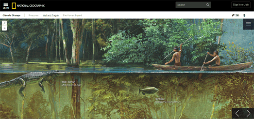
This week I was also really impressed by National Geographic's Amazonia Under Threat, a detailed examination of the effect of people and human industry on the delicate ecosystem of the Amazon region.
This story map uses the Leaflet mapping platform to explore the extent of deforestation and the encroachment of people on the Amazon. Leaflet has also been used in the report to present some beautiful illustrations of life in the Amazon.
Using the Leaflet mapping library as an illustrative device is a clever idea. It allows readers of the National Geographic's report to explore the illustrations in detail using the panning and zooming controls which they are used to from the other Leaflet maps in the investigation.
The Carina Nebula
Astronomers at the Ruhr University Bochum in Germany have used the Leaflet mapping platform to create a Map of the Milky Way. The map is made from 268 individual images and consists of around 46 billion pixels, making it the largest astronomical image ever created. Using the map the university has been able to identify more than 50,000 new variable objects which have never been recorded before.
It took me a while to realize but the coordinates box, in the bottom left corner of the map, is actually a search box. This means that you can enter the name of individual stars to find them on the map. You can read more about the map in this press release from the Ruhr University Bochum.
Saturday, October 24, 2015
The Hurricane Patricia Movie Map
The Mapbox GL API is able to load video files as a layer on a map. This means that you can add drone or satellite captured moving images directly to your maps. The results can look pretty amazing.
If you don't own your own satellite or drone you can still use this video overlaid on a map feature. One option is to create an animated video from other data. This is what Mapbox has done with data from NOAA’s’s Global Forecast System. They have created a video from NOAA's predictive GFS-model of Hurricane Patricia wind gusts, from October 19th to October 26th, and overlaid it on top of a Mapbox map of North and Central America and the Central Pacific.
You can view the map on the Mapbox Blog. If you don't believe that the movie file is actually a layer on the map, then rotate (right-click and drag), pan and zoom the map and notice how the video rotates, zooms and pans with the map.
The Largest Ever Astronomical Map
The Carina Nebula
Astronomers at the Ruhr University Bochum in Germany have used the Leaflet mapping platform to create a Map of the Milky Way. The map is made from 268 individual images and consists of around 46 billion pixels, making it the largest astronomical image ever created. Using the map the university has been able to identify more than 50,000 new variable objects which have never been recorded before.
It took me a while to realize but the coordinates box, in the bottom left corner of the map, is actually a search box. This means that you can enter the name of individual stars to find them on the map.
Unfortunately the map doesn't use the Leaflet-Hash plug-in so you can't link to specific views on the map. It would be a simple task to add the plug-in to provide dynamic URL's. This would allow users to share links to specific locations on the map.
You can read more about the map in this press release from the Ruhr University Bochum.
Friday, October 23, 2015
Mapping Seattle Planning Applications
Seattle in Progress is a Google Map of building projects in Seattle. Using the map you can find out which buildings and building plots in the city are currently in development or have plans to be developed.
The data for the map comes from the city's land use permits database. Users can filter the map to show planning permits which have been applied for, permits which have been approved and projects which have been completed in the last year.
If you select a marker on the map you can view a summary of the Land Use Summary for the plot, sign-up to receive e-mail notifications about the application and follow the link to the full proposal, detailed information and submitted renderings of the proposed construction.
Viral Maps
The Leaflet TimeDimension plug-in allows you to animate layers on a Leaflet map in a number of different ways in order to show changes in data over time. The examples page includes a number of different maps showing how the plug-in can be used in lots of different ways.
A new Oil Spill Simulation provides a neat demonstration of how the plug-in can be used to animate a polygon on a Leaflet map. When you press play on the map the polygon flows and grows on the map, kind of reminiscent of a virus moving around, as seen through a microscope.
In this demo map the plug-in is being used to simulate the trajectory of a hypothetical oil spill over time. There is something wonderfully organic about the resulting animation. The animated polygon feature of the plug-in might have limited use cases, but I can see it being useful, particularly for mapping pollution over time. Not just in the case of oil spills, but also to show the spread of noise or air pollution over the course of 24 hours or a week or any other time period.
A New Blue Marble Every Day
The Blue Marble photograph of Earth must be one of the most iconic images from the second half of the Twentieth Century. This stunning picture of the Earth was taken on December 7th 1972, from a distance of about 28,000 miles from Earth, by the crew of the Apollo 17 spacecraft.
Since 1972 images of the whole sunlit side of the Earth have tended to be composite mosaic pictures made up of a number of different satellite images of the Earth stitched together. This is because the majority of satellites which orbit the Earth do so at too close a distance to be able to capture a photo of the entire Earth.
NASA's EPIC (Earth Polychromatic Imaging Camera) aboard the Deep Space Climate Observatory (DSCOVR) has begun sending home new Blue Marble images of the Earth. DSCOVR's orbit is about one million miles away from Earth. It also maintains a fixed position in terms of the Earth, which means it can take whole photos of the sunlit side of the Earth every few hours.
You can now view and download EPIC's daily 'Blue Marble' images from the NASA website. DSCOVR::EPIC allows you to view a day's worth of whole Earth photographs, revealing the whole globe over the course of a day. If you press the forward button on the website the photos will animate through the whole day's images of the Earth. An inset mapped globe also rotates to show which continents are currently in view in each picture of the Earth.
Thursday, October 22, 2015
Animated Polylines in Leaflet
I've been waiting for this Leaflet plug-in for a while. Leaflet.Polyline.SnakeAnim animates a polyline on a Leaflet map so that you can show an animated route on your map.
The GitHub page for the plug-in includes an animate GIF of Leaflet.Polyline.SnakeAnim in action but doesn't include a working example. I've therefore created a quick demo map. In my demo I've changed one main thing from the demo.html on the GitHub page. I've moved
map.addLayer(path);
inside the animation function so that the route polyline doesn't appear on the map before it starts animating. To animate the route on the map just press the button.
Street View in Turkey, Ukraine & Macedonia
Turkey, Ukraine and the Republic of Macedonia now have Street View imagery on Google Maps.
All three countries seem to have pretty extensive Street View coverage. Although in Ukraine, perhaps for obvious reasons, the Crimean peninsula doesn't have any Street View imagery.
The virtual tourist on Google Maps can now view the Blue Mosque and the Hagia Sophia in Istanbul. In Ukraine you can visit the Golden Gates and the Holy Dormition Cathedral. In the Republic of Macedonia you can visit the Stone Bridge in Skopje.
Europe's Top Digital Cities
The European Digital City Index has ranked London the top European city for its support for digital entrepreneurship. Amsterdam and Stockholm are the second and third highest cities in the rankings.
The European Digital City Index ranks cities across Europe based on how well they support digital entrepreneurs. The cities are ranked on a number of criteria, including the Digital Infrastructure, the Access to Capital, the Lifestyle and Skills. You can view how European cities rank in the Digital City Index on the ECDi Map.
The ECDi Map shows the rankings of 35 European cities. Each city on the map is shown with a circular marker, scaled to reflect its position in the rankings. The larger the city marker the higher the city in the rankings.
The map allows you to also view how each city ranks in terms of each individual criteria or for your own combination of criteria. For example, although London comes out top overall in support for digital entrepreneurship it comes last in terms of Lifestyle (cost and standard of living).
Wednesday, October 21, 2015
Street View of the Stars
This year Google attended the 2015 Busan International Film Festival. While they were there they took a few pictures of the stars.
Inside BIFF allows you to explore the film festival, held annually in Busan, South Korea, and even interact with the stars. You can navigate your way around the venue just as you would with Google Maps Street View. The only real difference is that in this Street View nobody's face is pixelated.
That means you can search for your favorite stars whilst you wander around. In fact that looks like Harvey Keitel in the front row. It is! If you mouse-over the little blue map marker above the people in the audience you can discover who they are. If you click on their name you can even explore their filmography and watch selected trailers from their films.
See who you can find. I managed to find Po from Kung Fu Panda!
Color Filters for Maps
Leaflet Tilefilter is a nice plug-in which allows you to change the appearance of a Leaflet map in the browser. It enables you to change the contrast, brightness and hue of a map's underlying map tile set.
The plug-in works by using Canvas and CSS3 filters. Using the filter controls map users can adjust the look of the map tiles. They can even combine the Canvas and CSS3 filters, which allows for quite a wide choice of variations.
On first seeing Leaflet Tilefilter in action I immediately thought it might be interesting to create a map which animated through random color filters. In other words to create something a little like Random Google Maps. However that seems a little pointless and in fact the example map Filters Demo is a much nicer example of what you can achieve with Leaflet Tile-Filter.
In effect the plug-in provides you with the option to add controls to a Leaflet map which allows the user to adjust the visual appearance of the map. This could be a handy option to provide, especially for users who suffer from some forms of color-blindness.
Travel Back to the Future in 3D
There is one thing that everyone should do on Back to the Future Day - travel back to Hill Valley in the 1950's.
So step inside your nuclear powered DeLorean and zoom inside this 3d model of Back to the Future's Hill Valley. Once you arrive you can visit the town square, where you will find the courthouse and the famous clock tower. If you search around the back streets you will even find your DeLorean, sitting ready to bring you back to the future.
Back to the Future Hill Valley is a pretty amazing 3d model of Hill Valley, which you can explore at will. I believe the model is based on Universal Studio's Courthouse Square backlot set. The model includes five cameras, which appear to change the lighting effect on the current point of view.
The model also includes a 'damage' mode which gives you a glimpse of the future Hill Valley and the fate that just might lie in store for some of the town's buildings
Tuesday, October 20, 2015
Jackson Pollock's Hoods in San Francisco
The Neighborhood Project has decided to redraw San Francisco's neighborhoods based on Craiglist listings and the power of the crowd. The project is using address and neighborhood data used in housing posts on Craigslist and also data from visitors to the Neighborhood Project website.
The resulting map looks a little like how I imagine Jackson Pollock would design a neighborhood map of this Californian city. This reason for this is that the map uses a 'blobby' algorithm for drawing the neighborhoods. Each neighborhood point on the map acts like a magnet, and the resulting neighborhood is "the region where the combined attraction of all those magnets is above a certain strength".
You can read about other crowdsourced neighborhood boundary projects in Boston, Los Angeles, Portland, Seattle and Vancouver on this Crowdsourced Neighborhood Boundaries post. If you live in New York then you might want to look at New York's Crowdsourced Neighborhoods.
Chicago's Homan Square Detainees
For a while The Guardian has been investigating the use by the Chicago Police Department of Homan Square. The Guardian describes the facility as "an off-the-books interrogation compound, rendering Americans unable to be found by family or attorneys while locked inside what lawyers say is the domestic equivalent of a CIA black site."
In a new interactive presentation, Homan Square - A portrait of Chicago’s detainees, the paper has created an impressive visualization breaking down the data behind the 7,185 arrests of people taken to Homan Square between 5 August 2004 and 30 June 2015. Throughout The Guardian's presentation the 7,185 arrests are represented as small portraits. As you progress through the interactive the portraits are rearranged to show the demographics of those arrested, the type of crimes people were arrested for and the dates of the arrests.
The data portraits are also rearranged to create a map showing where these arrests were made in Chicago. It is very impressive how The Guardian seamlessly rearranges the dots from a chart view into an oblique map view and then into a map plan view. All made possible by the use of Scalable Vector Graphics.
Leaflet in the Amazon
National Geographic is using the Leaflet mapping library as part of its journey into the Amazon. However it isn't only using Leaflet in the way you might expect.
Amazonia Under Threat is a detailed examination of the effect of people and human industry on the delicate ecosystem of the Amazon region. You might expect Leaflet to be used in this investigation just to map the Amazon, to show the extent of deforestation and the encroachment of people on the area. However it is also being used to help illustrate the various ecosystems found in the region.
The National Geographic's report does include Leaflet maps. For example, Leaflet has been used to map the Rain Forest's protected areas and current land-cover. It is also being used to map the encroachment of roads in the forest, the extent of deforestation, the areas effected by mining and the rise of gas and oil exploration.
However Leaflet has also been used in the report to present some beautiful illustrations of life in the Amazon. Using the Leaflet mapping library as an illustrative device is a clever idea. It allows readers of the National Geographic's report to explore the illustrations in detail using the panning and zooming controls which they are used to from the Leaflet maps in the investigation.
Monday, October 19, 2015
Canadian Election Maps
The 2015 Canadian Election results are starting to come in. The big winners so far are the Canadian Press, who have created a live election results map, which seems to have been syndicated by a number of Canadian news outlets.
The Canadian Press live elections results map is being used, by among others, the Huffington Post, 570 News and the National Post. The Canadian Press are using Mapbox for the map. Ridings on the map are coloured to show the current leading party from the so far returned results.
Esri Canada's Federal Elections (2000 to 2011) Map shows the results of the last five elections and also the boundaries and candidates in the 2015 Election, The map will be updated with the 2015 results after the election.
CTV News also has a live elections results map showing the results as they come in. Again ridings on the CTV Election Results Map are being colored by the leading party in the polls returned so far. Above the map there is a running total of the seats won by each party and a progress bar showing a proportional representation of the seats won by each party.
Demolishing Detroit to Make it Better
Q. How do you improve Detroit?
A. By knocking it down.
It may sound like the punchline to a cruel joke but one way Detroit is planning to improve its built environment is through blight elimination. Detroit has received $107.3M to help remove blight in the city through the demolition of abandoned and neglected buildings.
Demolition Impact has mapped the 5,812 building demolished in Detroit from January 2014 - September 2015. Once buildings have been demolished neighbors are able to purchase the now empty lots. Some other vacant homes in the city have been sold at public auction and the new owners have been given six months to restore the properties.
The Detroit Creative Solutions map shows not only the city's demolished buildings but also buildings sold at auction and side lot sales,
United States Average Temperatures
County Climate is a really nice animated map showing the average maximum temperature for every day in the year in each U.S. county. The map uses temperature data from 1979-2011 to show the average maximum temperature for each day.
You can press the play button to animate through a whole year's worth of temperature on the map. Alternatively you can slide the blue date button to view the temperature on the map for a selected day of the year. If you mouse-over a county on the map you can view a line graph showing the maximum average temperature in the county for the whole year.
Mapping English Deprivation - Part Two
This new interactive map of England provides a rough guide to areas in the UK which are becoming less deprived.
Earlier this month the UK government released the 2015 Indices of Deprivation for England. The data has now been added to CDRC Maps to provide a choropleth view which shows the ranking changes since the last Indices of Deprivation in 2010, for each Lower Super Output Area (LSOA).
The blue areas on the map are becoming less deprived at a faster rate than the blue areas on the map. The red areas on the map have not necessarily become more deprived since the last Indices of Deprivation, they may be actually becoming less deprived, but at a slower rate.
Suprageography has published more details about this new map layer on CDRC Maps and has also examined some of the areas of England which have shown the biggest changes since the last Indices were published. For example, the five London boroughs which hosted the 2012 Olympics are all areas which have become less deprived at a relatively fast rate.
The Conversation has also been mapping out the changes in deprivation in England between 2010 and 2015. The Conversation argues that overall there has been very little change between the publication of the 2010 and 2015 indices and that the most and least deprived areas in England have remained largely the same. Where there has been significant change in the five London Olympic boroughs The Conversation suggests that this is largely due to gentrification and an influx of new, wealthier residents and the dispersal of poorer Londoners to the outskirts of the city.
You can explore the 2015 Indices of Deprivation for England in more detail using the Index of Multiple Deprivation Explorer. This map allows you to view choropleth layers for a number of the indices. If you select a Lower Super Output Area level area (LSOA) on the Explorer map you can explore the details for each of the indices. The details show how the area ranks within the 32,844 LSOAs in England for the selected index.
Sunday, October 18, 2015
The Maps of the Week
This week I was really impressed with two maps which were inspired by BERG's Here & There horizonless maps of Manhattan. The OSM Buildings GL Inception Map and the Tangram Bendy Map both provide a horizonless perspective for any location in the world.
In both maps nearby 3d buildings are shown from a first person point of view. In the distance however rising beyond & above the foreground buildings the map of the rest of the city bends towards the heavens.
I was also impressed this week with Dropchop, a browser based GIS built with Mapbox and Turf.js. It allows you to perform quite sophisticated spatial queries on mapped data without a server and in your choice of internet browser.
Dropchop allows you to upload data from your computer, from a URL or even from OpenStreetMap, using the Overpass API. The best way to find out what is possible with Dropchop is to play with it. If you don't have any map data to hand then you can use the in-built Overpass API wizard to grab some data from OpenStreetMap.
Once you have performed the required GIS operations on your mapped data you can then download the results as a GeoJSON file or as a shapefile.
The Google Maps API - RIP
It is so rare these days for a developer to make the conscious decision to use the Google Maps API that a new Google Maps mash-up almost becomes an event in itself. Unfortunately, because the Google Maps API hasn't been updated in years, these now rare applications, built using the Google Maps API, tend to look a little tired and dated.
Imagine my shock then when I discovered that the developers of Time to Groove, presumably from sentimental and nostalgic reasons, had chosen to use the Google Maps API for their new music events guide for Amsterdam. What's more they have even managed to create a Google Map which doesn't disappoint aesthetically.
Time to Groove is a map of upcoming concerts, gigs and other shindigs in Amsterdam. The application uses the Facebook pages of Amsterdam clubs and music venues to provide a guide to upcoming musical events. The map includes options to filter the events shown on the map by 'groove' and by genre of music.
The size of the markers on the map, I think, are scaled to reflect the number of people who have signed up to attend the event on Facebook. The colors of the markers reflect the 'groove' of the event.
The use of these colored circular polygons to mark each event works well and the colored markers do look good set against the dark styled map tiles. However the lack of road labels on the map might impede your ability to actual find a venue if you choose to attend one of the listed events.
Saturday, October 17, 2015
The Zurich Water Fountains Map
There are around 1,200 water fountains in Zurich, providing a free source of mountain spring drinking water throughout the city. Most of the fountains are also unique works of art, which will not only quench your thirst but may also lift your soul.
The Zurich Water Map is a great guide for any thirsty visitor to this Swiss city. The map shows the locations of Zurich's free water mountains and can also give you directions to your nearest source of fresh mountain spring drinking water.
To get directions to a fountain you just need to click on the map to set your current location. You can then click on the fountain you wish to visit and you will immediately be shown a route to the selected fountain from your current location.
The map is a great way to find your nearest source of free drinking water in Zurich. However I think the map is missing a trick by not also providing a visual guide to some of the more artistic water fountains in the city. Wikimedia provides a great source for photographs of Zurich's unique water fountains. If this were my map I'd be tempted to add these photos to the information window for each fountain.
Friday, October 16, 2015
Are you a Street View James Bond?
Miss Moneypenny has been captured by the enemy. To earn 00 status and your license to kill you will need to help rescue Miss Moneypenny. Your mission is to use Google Maps Street View and find the locations depicted in a series of intercepted photographs.
As one of Her Majesty's secret service agents you will be dropped in London. Your job is to use Street View to track down Miss Moneypenny's assailants. To help you in your task you have also been provided with a radar control. Use the radar and the Street View controls to track down the assailants.
Rescue Miss Moneypenny and you will indeed be worthy of the name James Bond.
Assist Moneypenny is a new browser based game from Sony released to promote the upcoming James Bond film Spectre. The game is fun. However on my old laptop it is also painfully slow. I suspect you will need a computer with a fairly decent graphics card or the patience of a saint to complete all the missions in this Street View game.
GIS in the Browser
Dropchop is a browser based GIS built with Mapbox and Turf.js. It allows you to perform quite sophisticated spatial queries on mapped data without a server and in your choice of internet browser.
Dropchop allows you to upload data from your computer, from a URL or even from Overpass Turbo (OpenStreetMap POI's etc) and to perform quite sophisticated spatial queries. The best way to find out what is possible with Dropchop is to play with it. If you don't have any map data to hand then you can use the in-built Overpass Turbo wizard to grab some data from OpenStreetMap.
For example you could use the Overpass Turbo option (using the menu to left of the screen) to upload all the bars mapped on OpenStreetMap in the current map view. This is very simple as 'bars' is the default setting in the in-built Overpass Turbo wizard.
Once all the bars have loaded on the map you can then perform a number of spatial queries on your bar data. All the queries that are possible are highlighted in the map sidebar. The screenshot above shows bars in East London with a buffer of 5 miles around all the mapped bars. Loading the bar data and performing the buffer took me about 20 seconds.
Once you have performed the required GIS operations on your mapped data you can download the results as a GeoJSON file or as a shapefile.
Wednesday, October 14, 2015
Why Chicago is the Alley Capital of the US
Chicago has 1,900 miles of alleys, making it the alley capital of the United States. WBEZ has been exploring the historical reasons why Chicago built so many back alleys and why so many of them still exist today.
As part of it's investigation into How Chicago Became the Country's Alley Capital WBEZ has created a Leaflet map highlighting the 1,900 miles of Chicago's Alleys. The map is perhaps not the most interesting part of the WBEZ story but it does a good job of visualizing the number of back alleys in Chicago.
Using the map you can clearly see the areas of Chicago which were built with alleys and the areas that were built without alleys. In the early Twentieth Century Chicago started to build suburbs without alleys. You can see this in neighborhoods such as Evanston, Naperville and Blue Island.
In fact it might be quite interesting to compare the WBEZ alley map with Shaun Jacobsen's Chicago Building Age Map. The Chicago Building Age map allows you to visualize the age of Chicago's buildings so you can easily explore the age of the buildings in the white (non-alley) areas of the WBEZ alley map.