Monday, September 30, 2013

Live Real-Time Map of Amtrak Trains


Amtrak has today launched a real-time map of its more than 300 daily trains. The Amtrak Track a Train map shows the live position of all the network's trains.

Passengers can search for individual trains by train number or train name or search for individual station. If you select a train's marker on the map you can view details about its current speed, next station and estimated time or arrival.

Users can also click on individual stations to view station details and the station address.

Live Wind & Current Maps


Hint.fm's beautiful Wind Map has proved a source of inspiration to a number of map developers. This real-time animated map of wind speed and direction really is a gorgeous realization of live meteorological data.


The National Oceanic and Atmospheric Association were inspired by the Wind Map to create their own live currents map of the Great Lakes. The Great Lakes Surface Currents Map is an animated map simulating the flow patterns in the Great Lakes.


Now Tokyo has its own real-time wind map. The Tokyo Wind Map is an animated map of real-time wind speeds and direction. The map also includes controls to view previous hours' wind data on the map.

Creating a Road Map to a New Economy


The Solidarity Economy refers to activities and groups that foster the production and exchange of goods and services that reinforce values of justice, ecological sustainability and cooperation. Examples of organisations that could be defined as part of a Solidarity Economy include credit unions, worker cooperatives and community land trusts.

One key aspect of the Solidarity Economy is that it supports and helps the local community. One way to ensure that individual groups and organizations don't just work in isolation and actually support the Solidarity Economy of the community is by forging links between different organizations and groups.

I can't think of a better way to help raise awareness of a local Solidarity Economy and forge links between different groups than by mapping the organizations and groups working within a community.

In New York SolidarityNYC are doing exactly this. They have created a Google Map and a directory of organisations and groups that are working to foster relationships of mutual support and solidarity in New York City.


Similar efforts are being made in other areas. In Boulder the Boulder Sharing Economy has created a Google Map and directory of local groups and organizations that are part of the Solidarity Economy. In Boston Transformation Central have also created a Google Map of businesses and organizations within the Boston area actively participating in the solidarity economy.

The Live London Buses Map


Mathew Somerville has completed his hat-trick of live real-time transit maps. Mathew first released a real-time map of UK Train Times, he then developed the Live Tube Map of the London Underground. Now Mathew has created a live real-time map of London buses.

The Live London Bus Map shows the location of London's buses in real-time. Users of the map can select any London bus route and view a map of all the route's bus-stops and the position of all the buses on the route. Users can click on any the moving buses on the map to view how long until it arrives at it's next scheduled stop.

Sunday, September 29, 2013

The Google Maps of the Week


The Election Atlas is a Google Map designed to provide insight into the 2013 mayoral election in New York City.

The map visualizes the geographical vote share for all the Democratic mayoral candidates who have previously run for citywide office. For comparison and contrast, it also includes maps of recent gubernatorial and presidential elections.

The map provides an interesting overview of where in New York Bill de Biaso performed well in the Democratic primary and where he did not perform as well as the other Democratic nominees past and present.


Subfocus has devised an ingeneous way to promote his new album 'Torus' by creating an impressive Street View game. Subfocus - Torus invloves following a serious of map related clues to find 13 shiny tori hidden around the world.

When you find one of the hidden shapes you are rewarded not only with a neat 3d spinning torus superimposed on a Google Maps Street View of the location but you also get to listen to one of the tracks off the album.

Subfocus -Torus is obviously inspired by (and possibly developed by) the equally amazing Floating Shiny Knot


The Berliner Morgenpost has released a Google Map of the election results in Berlin. The map shows the results in each electoral ward and the candidates from Berlin elected to the Bundestag.

Beneath the map are a number of filters to display different map views. These include links to view where there was a high turnout and where the turnout was particularly low, where the results were very close and where the most voters voted differently at the local and national level.

Street View Tilt Shift


I've been puzzling for a while about how to add a tilt shift effect to Google Maps Street View using CSS filters in Chrome. What has stumped me in the past was how to create a gradient blur that when applied to a Street View would add a tilt shift effect to the panoramic image.

Today I had a little eureka moment when I realized one solution would be to overlay one Street View layer on top of another Street View of the same scene. You can then use CSS filter transparency to create a masking effect. If you add this transparency filter to a horizontal band in the top Street View you can see the bottom Street View through the band.

Then all you have to do is add a CSS blur filter to the top Street View. The effect is a Street View that is blurred apart from one horizontal strip, creating a reasonable tilt shift effect. You can see the result on this Street View Tilt Shift image (you will probably only be able to see this if you view the page in the Chrome browser).

If you pan the Street View in this page only one of the Street Views will move. You could add an event listener to the top Street View so that when you move the top Street View the bottom Street View also moves. I haven't done this here so you can more clearly see how the masking effect works.

You can see other experiments using CSS filters with Google Maps Street View at Here Comes the Sun and Blurrd. Both of these pages again will probably only work in the Chrome browser.

Saturday, September 28, 2013

How to Double the World's Food Production


The Institute of the Environment at the University of Minnesota has created an ESRI story map to highlight how the world can increase food production. Crop production needs to double by 2050 to fulfill the needs of the growing worldwide population.

Feeding the World contains a series of heat maps visualizing the current crop production around the world and how and where crop production can be increased to meet rising demand. The first map shows the locations of the world's current bread baskets. Navigating through the other maps reveals where crop yields can be increased by better land management, improved through increasing water efficiency and by decreasing the amount of crop production dedicated to feeding animals.

The Racial Dot Map of Toronto


The Racial Dot Map has rightly been one of the most discussed online interactive maps in the last few weeks. The map is a fascinating visualization of the geographic distribution, population density, and racial diversity of the USA.

Well hang onto your hats Torontonians as you now have your very own Toronto racial dot map. Toronto Visible Minorities shows a single point for every person in the Toronto area, coloured by visible minority status. Like the Racial Dot Map the Toronto Visible Minorities map provides a fascinating insight into population and the distribution of visible minorities.

Friday, September 27, 2013

Street View Lands in Swaziland


Swazi beehive huts

Today Swaziland became the fourth African country to receive Street View imagery on Google Maps, joining South Africa, Lesotho and Botswana.


Hat-tip: Google Sightseeing

Own Your Own Norwegian Fjord


I've always been a huge fan of Slartibartfast's terraforming efforts and have dreamed of the day that I could own a little piece of his best work on the Norwegian Fjords. Now that day has come at last!

Terrafab is neat map application that allows you to create the 3d printer files to create your own 3d model of any part of Norway. Even if you don't want to own a 3d model of a Norwegian fjord you have to check out this map just to watch the 3d model view update in real-time as you select different areas on the map.

Make sure you also click on the 'Get this model 3d-printed' to view the spinning version of your selected 3d view.

Create a Beautiful Google Map Travel Blog


A custom built Google Map is a great way to share your travel experiences with friends and family. If you want a simple travel map you can use Google Maps Engine to easily post reports and photos from your trips, which you can then share with the whole world.

However, while Google Maps Engine is a very easy way to create a map, sometimes your travels deserve something a little more beautiful. That's where Maptia comes in. Maptia is a new way to share your travels combining your personal reports, photos and Google Maps.

A Maptia story map consists of a Google Map followed by a series of all your travel posts. Each of the posts includes a little map marker that when clicked automatically opens a Google Map displaying the location and your photos from the location.

Maptia is not the first Google Maps travel blog / diary that we have ever seen but it certainly among the most beautiful. The site currently includes a number of featured stories, including one showcasing some of the amazing photos of the Earth taken by Commander Chris Hadfield from the International Space Station.

It's Friday Fun Time


It's harvest time. So how better to welcome your reapers and gleaners than with a huge Dalek haystack. This wonderful creation was found on Google Maps by the guys at Google Sightseeing.

It could be time for a Street View battle. Someone needs to take control of the Street View TARDIS and fight back against this hay built threat to humanity.


UsvsTh3m have created a number of fun Street View games. Their new game seems designed to scare the living bejesus out of unfortunate Coulrophobia sufferers. Can You Spot the Northampton Clown? requires you to take to the streets of an English town on Google Maps Street View and track down a clown who is terrorizing the local inhabitants.


At last the world of online mapping has caught up with the internet's craze for fun animated GIF's. Leaflet Gifphy is an interactive map with map tiles made out of shark related animated gifs. This is exactly what the the world of online mapping has been missing.

Thursday, September 26, 2013

Watch Seinfeld on Google Maps


A Map About Nothing is a fun ESRI map of important locations in the ever popular TV show Seinfeld. Fans of the show will love the map of New York locations but really it's just an excuse to watch some great clips from Seinfeld.

Each location on the map has a YouTube video featuring an excerpt from the sitcom relevant to the location. So sit back and watch Jerry, George, Elaine and Kramer sitting around and chatting about nothing.


There's nothing new in mapping however. So if the Map About Nothing has whetted your appetite for old Seinfeld clips then you should also check out this old map from Sony Pictures.

The Seinfeld Google Map also shows many of the New York locations used in the hit comedy series. More excitingly, each location also comes with a short video clip from the show.

The United Kingdom of Minecraft - Updated


Can you name the river in the map above? If you recognise the river then you can probably name the city - but can you tell me the name of the map?

Yes, that's right ... it's the Ordnance Survey Minceraft Overviewer Map of the UK.

'Say what?' I hear you cry. Let me explain. This is a Google Map that lets you explore the UK's Ordnance Survey's new Minecraft map of the UK and surrounding islands.

Still confused? Then read on ...


The UK's Ordnance Survey is charged with maintaining the UK's geospatial and cartographic data. This largely involves creating and publishing maps in paper and digital form and now also in textual cube form for Minecraft fans.

Minecrafting with OS OpenData is a 3d map of mainland Great Britain and surrounding islands that anyone can download and explore in Minecraft. The OS Minecraft world was built with OS OpenData, that is Ordnance Survey data that is freely available under an attribution-only license.

The OS Minecraft world of Great Britain consists of more than 22 billion blocks representing over 220,000 square kilometres. Each block in the world represents 50 square metres. To help you navigate this 3d world the Ordnance Survey website has published a list of Minecraft world co-ordinates to some well known UK locations.

Reporting the Invasion of the Triffids


iMapInvasives has created a series of state maps designed to protect natural resources from the threat of invasive species.

The maps are designed to report and share information about invasive animal, plant and insect species in each state. The data for the maps come from a variety of sources, including citizen scientists who can use the map to report invasive species. Maps are currently available in Arizona, Florida, New York, Oregon, Pennsylvania, Vermont and Virginia.

Each of the maps allows the user to select from distinct animal, plant and insect species and view a heat map of the distribution of the selected species.

The Higgs Boson is Found on Street View


Google Maps is now available at the Quantum level. Today Google has released Street View images of the Higgs particle inside the Large Hadron Collider at CERN labs in Geneva.

OK, that isn't remotely true - but you can now tour the Hadron Collider at CERN on Google Maps Street View. The imagery includes Street Views of laboratories, control rooms and even of the Hadron Collider itself.

So will you be the first to virtually walk the Hadron Collider tunnel to see if Street View has coverage of the whole 17 miles? Oh, and if you do find the Higgs Boson please leave it at the main desk on your way out.

Make Your Own Geography Quiz


At QuizGeo you can play over 400 geography quizzes. Each quiz takes the format of a series of questions that require you to answer by selecting the correct location on a Google Map.

Once you register as a GeoQuiz user you can can create your own mapped based quiz. All you have to do to create your quiz is enter a series of questions and provide the answer for each question simply by drawing around the answer's location on the map.

It took me about 5 minutes to create this quiz about films with country names in their titles.


GeoGuessr has quickly become one of the most popular Google Maps geography games. You can now create your own Street View location guessing game using GeoSettr!

In this geography game you are shown a random Street View and must try and guess where in the world the Street View was taken. With the release of GeoSettr you can now create your own GeoGuessr game based on your favorite locations and Street Views.

Using GeoSettr you can create your own GeoGusser game of five questions. All you have to do is choose five locations on a Google Map. Once you have created your game you get a unique link, that you can then share with your friends.


Who doesn't like a good treasure hunt? Mission MapQuest lets you add as many questions (clues) and answers (locations) as you like to a Google Map in order to create your own virtual 'treasure hunt'. Players then have to solve your clues and zoom into the answer's location on the map. When the player answers correctly they will find a little golden coin at the location.

Mission MapQuest includes examples of treasure hunt games already created that you can play to get an idea of the format.


The Vasile Geopuzzle is a little different than the other geography game creation tools listed here, in that it requires you to know a little bit about the Google Maps API. The Vasile Geopuzzle is a Maps API library that provides a template for a Google Maps based geography puzzle. The template allows anyone to create a game in which players have to drag geographical areas onto their correct position on a Google Map.

The code for the Vasile Geopuzzle is available on GitHub and can be easily customised for any area in the world. To create your own puzzle with the code all you really need is the GeoJSON data for the polygons you wish to use.

Vasile has created a demo game using the code for Switzerland's Cantons. In the demo game players have to drag polygons of the Swiss cantons onto their correct location. A timer keeps track of how long it takes to compete the game and your current score is also displayed on the map.

The game makes effective use of Vasile's popular Masked Polygons library. The Masked Polygon library is used to define the boundary of the game. For example, in the Switzerland Cantons game Switzerland is highlighted on the map using the masked polygon library. Consequently players can clearly see the area of game-play on the map.

Wednesday, September 25, 2013

30 Billion Possible Life Bearing Planets


The New Scientist has created a fascinating interactive that extrapolates from the results of NASA's search for possible life bearing planets near the constellation Cygnus.

NASA's Kepler space telescope discovered 51 planets that are the right size to bear life and seem to orbit in the habitable zone around a parent star. However Kepler can only detect planets that pass directly between the planet's sun and the telescope. The New Scientist interactive extrapolates for the probable missing worlds and arrives at a possible 22,500 planets that exist in this relatively small corner of the galaxy near Cygnus.

The New Scientist then extrapolates from that figure to create a map of the Milky Way with billions of possible life bearing planets. How Many Earths? A lot!

Mapping the New York Mayoral Primaries


The Election Atlas is a Google Map designed to provide insight into the 2013 mayoral election in New York City.

The map visualizes the geographical vote share for all the Democratic mayoral candidates who have previously run for citywide office. For comparison and contrast, it also includes maps of recent gubernatorial and presidential elections.

The map provides an interesting overview of where in New York Bill de Biaso performed well in the Democratic primary and where he did not perform as well as the other Democratic nominees past and present.


Of all the major news organizations the New York Times consistently creates some of the best mapped visualizations. The Mayoral Primaries Map is no exception.

The map not only shows how each of the Democratic and Republican candidates have performed in each election district but allows you to view their performance within different demographics. In each election district you can view how each of the candidates performed in 'white areas', 'Hispanic areas', 'black areas', 'Asian areas', 'average income' and among 'homeowners'.

Animated Heat Maps of Twitter Trends


Vertabox is a social media monitoring service that can track how topics trend on social media and display an animated heat map of where and when the topic trends on Twitter. Vertabox will allow you to enter any topic and visualize on a Google Map how the topic trends and spreads geographically throughout any given day.

The site is currently in beta but it already contain examples of animated heat maps for a number of different topics. For example, a celebrity map tracks the activity of Tweets mentioning 'celebrity' in the USA. If you press the play button you can watch the heat map animate as it displays where the word 'celebrity' was most Tweeted during the course of the day.

Vertabox includes the option to visualize two distinct heat maps of the trending topic. The 'absolute' option shows the total number of Tweets over the day, you can therefore visualize where 'celebrity' was Tweeted in absolute terms over the course of the day. The 'relative' option displays an hour-by -hour heat map of Tweets, which enables you to see the relative popularity of Tweets mentioning 'celebrity' for any hour during the day.

Vertabox also includes a calendar option that allows you to view animated heat maps of the topic for any specific day. It is also possible to view a word map that shows the most popular words used in the mapped Tweets and view which were the top Tweets related to the searched topic.

The Non-Reunification of Germany

The results of Sunday's German election reveal that even 23 years after reunification there are still huge political differences between the old West and East Germany.

Angela Merkel's Christian Democrat Union won 311 seats in the 630-seat Bundestag but the Left Party performed quite well in the former East German States. In four of the five former East German states the Left Party came in a healthy second, performing much better here than in most of West Germany and in East Berlin four candidates actually won seats.


The Berliner Morgenpost map of the German Election results in Berlin show that there is till a clear dividing line between east and west. Almost 24 years after the collapse of the Berlin Wall the Berliner Morgenpost map reveals a political wall still exists between East and West Berlin and that political wall runs almost exactly along the line of the old Berlin Wall. To the east the Left Party emerged triumphant, while in the west the CDU and the SPD were the political winners.


But it is not only in how they vote that divides east and west Germany but also whether they vote at all. Mappable has created an interesting heat map of German non-voters. The map reveals that there are significantly more non-voters in east Germany than there are in the west, especially in rural parts of eastern Germany.

Mappable claims that 'the refusal to cast a vote is directly connected to factors like wealth and education'. Obviously the map itself does not prove this, so it is just a supposition. I guess you could just as easily surmise that the trend reflects a dissatisfaction with the democratic process in the east but again we would just be jumping to conclusions. However it is clear from the map that east Germans on the whole were less likely to vote than their western neighbours.

Tuesday, September 24, 2013

The Beauty in Japan's Historical Maps


Japanese map geeks it's time to get your nerd on. Past and Present Map lets you compare some beautiful historical maps of Tokyo to the slightly less prosaic modern Google Maps.

The application lets you explore ten historical maps ranging in date from 1896 to 2005. The dual map control places the historical map side-by-side with a Google Map. Pan and zoom the historical map and the Google Map will also move to ensure that both maps are always showing the same view.

It is also possible to compare the historical map to Google Maps satellite view. And it doesn't stop there - you can also select to compare the historical map with some historical aerial imagery or with any of the other historical maps in the Past and Present Map.

Google Places Playground

Recently I've been playing around a bit with the Google Places Library in the Google Maps API. I've started two projects which I think are kind of interesting. The thing is I kind of get excited about map ideas and want to see if I can make them work, only to lose interest when I develop a working map.

So here are a couple of map projects that could lead to interesting applications if anyone else wants to borrow the ideas and run with them:


One interesting idea is to combine indoor Street Views with the Google Places Library to create a bar and restaurant review website. The Indoor Bars & Restaurants map uses the indoor Street Views of a number of London bar and restaurants and then overlays the name, address and rating of the establishment from the Google Places Library.

I like the idea of a bar and restaurant finder that allows you to preview the inside of the establishment before visiting. A fully workable application however would take far more time to develop than I would be personally prepared to commit.

The inspiration for this idea came from See Inside PDX, a great collection of indoor Street Views created by Google Business Photographers in Portland.


Another interesting idea is to use the Google Places Library to create a cartoon styled map. Iso World uses the Google Places Library to locate local stores, bars and churches and then identify them on the map with isometric cartoon buildings. If you have any old isometric buildings lying around on your hard drive then why not create your own cartoon map?

The inspiration for this was Yarr, Pirate Maps which similarly used the Google Places Library to identify the location of parks and add palm trees to them on a pirate themed map.

Get Down with the Kids on Street View


Subfocus has devised an ingeneous way to promote his new album 'Torus' by creating an impressive Street View game. Subfocus - Torus invloves following a serious of map related clues to find 13 shiny tori hidden around the world.

When you find one of the hidden shapes you are rewarded not only with a neat 3d spinning torus superimposed on a Google Maps Street View of the location but you also get to listen to one of the tracks off the album.

Subfocus -Torus is obviously inspired by (and possibly developed by) the equally amazing Floating Shiny Knot.


Arcade Fire's Wilderness Downtown is another impressive musician inspired application involving Google Maps and Street View. The application mixes Street View images from around your location, music video and computer animation in multiple animated browser windows.

There is so much going on in Wilderness Downtown that it is a little hard to explain. It's far better to listen to and watch the application yourself.


Lykke Li is a Swedish artist whose album Wounded Rhymes was also promoted with a neat Street View app. Using the app you can follow Lykke Li's path to places of emotional significance in her life with Google Maps Street View and Google Earth. On your journey you also get the chance to listen to Li's songs.

To find Lykke Li's path in the promotion you need to follow the directions indicated by a compass rose in Google Maps Street View. The compass points in the direction that you have to travel and the distance to travel is given in metres. When you arrive at the specified destination, by navigating with the normal Street View controls, you are rewarded with the video of a song from Lykke Li.

The Worldwide YouTube Map


The MIT Center for Civic Media has released a map that reveals some fascinating insights into how geography and culture influences our taste in YouTube videos.

What We Watch is a map that visualizes which YouTube videos are popular in different countries, what videos are popular in more than one country and which countries have similar tastes in YouTube videos.

Click on a country on the map and you can instantly see which videos are appearing in Google Trends for that country. You can even view the trending videos and try and work out why they are proving so popular.

Two tabs are available for each country. The 'Top Videos' tab displays which are the most trending videos in the selected country and the 'Unique Videos' tab shows videos that are only popular in that country, and not in other countries.

When you click on a country on the map you can also view a list of which other countries have a similar taste in YouTube videos. The 'strongest connections' lists reveals some surprising results. For example, the US seems to have similar tastes in YouTube videos to Germany and the Netherlands and not with near neighbors, Canada and Mexico.

Monday, September 23, 2013

The Map Made By a Million Individuals


Over 1,300,000 people around the world have contributed to the collaborative OpenStreetMap project.

MapBox has released an OpenStreetMap Contributor Community Map that shows where these one million people have contributed to OpenStreetMap's map of the world. On the map each road segment is colored by the user who last made an edit to the road. The result is a fantastic jumble of a map that could almost be inspired by the art of the Russian painter Kadinsky.

Zoom in on the map and you can observe the patterns of individual mappers as they navigate their neighborhoods and at the same time contribute to OpenStreetMap's global mapping project.


OSMlab's Show Me The Way provides a real-time view of OpenStreetMap's dedicated contributors in action. Using satellite imagery from Bing Maps 'Show Me The Way' provides a captivating visualization of the ever improving OpenStreetMap project.

5 Beautiful OSM Styled Maps

One area where OpenStreetMap wins hands down over the Google Maps API is in the ability to create custom styles. The Styled Maps feature gives Google Maps developers some limited control over the colors of map features but nowhere near as much control as is possible with OpenStreetMap.

OpenStreetMap gives developer the option to change colors, line thicknesses and even change the fonts used in the map labels.

Here are five great examples of OpenStreetMap map styles:

1. Watercolor Map

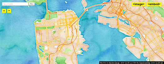
Stamen's Watercolor Map is rightly one of the most popular and well known map styles. I've even seen this one popping up in maps developed with the Google Maps API, swapping out the Google Map tiles for this beautiful OpenStreetMap. If you like the Watercolor Map style you should also have a look at Oregon State University's Crinkled Watercolor Map.

2. The Comic Sans Map

This one really shouldn't work. Using the world's most despised font you would think would make this map style a complete disaster. However the Comic Sans Map is not only a great example of how changing the label font can have a huge influence on a map's design it actually looks great as well.

3. The Burning Map Style

Back to Stamen again. I'll admit outside a fun Burning Man map I can't think of many cases when you would want to use the Burning Map style. However the Burning Map is a great example of how you can use the latest WebGL technology to interact with the underlying OpenStreetMap data to create truly dynamic maps.

4. Red Alert

Cloudmade's Map Style Editor has a huge number of example map styles created with the editor. There are hundreds of styles to choose from here. I went for this Red Alert style but you can browse through the user submitted styles yourself (under Change Style) to find your own favorite styles.

5. MapBox Streets

MapBox Streets is probably the most ubiquitous OpenStreetMap style (for example it's used by foursquare). The map itself was built to be customized and users can change the map colors, show and hide features, and even configure the labeling language.