Mapping Traffic Density

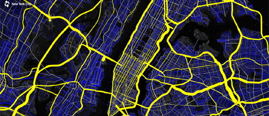
Mapbox has created a map visualizing the latest Highway Performance Monitoring System national highway dataset. The Open US Highway Dataset Map shows all the HPMS traffic density measurements for US roads.

Roads on the map with traffic density data are colored yellow. The thickness of the yellow linea on the map relate to the amount of traffic. Thick lines indicate more traffic and thinner lines less traffic. Zoom in on the map and you can view the average number of vehicles per day for different sections of roads.


Comments