Maps of the Week

Last week Mapbox revealed their new extrusion properties for data layers in Mapbox GL JS. These new extrusion properties allow you to create 3d buildings (extruding buildings by their number of floors) or other 3d data visualizations on a map using your own data layers.
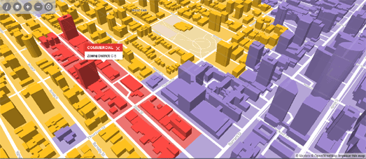
Robert White has already used Mapbox's new 3d buildings option to create this impressive Vancouver Zoning Map. Robert's map not only has 3d buildings but also uses data styling to color those buildings and other map features to show Vancouver's distinct city zones.
Using the map you can explore how & where Vancouver uses zoning within the city. You can also see how this zoning has an effect on the building heights in Vancouver's neighborhoods.

Andy Woodruff has invented a kind of hydrodynamics physics engine for interactive maps. It allows him to create an animated map which visualizes water drainage flow for any location on Earth.
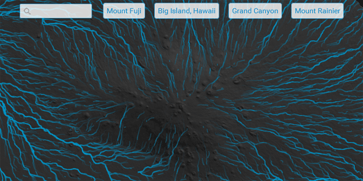
In the Rain on the Terrain Andy tries to answer the question of where water would flow if you poured it over the terrain at any location on the planet. His solution is essentially to use elevation data to find the lowest adjacent location for any given location. Drop some water at this location and it will find the path of least resistance and move to the adjacent location with the lowest elevation.
Repeat this process and you can plot a long path of the least resistance, moving downhill. If you then animate a polyline along this path you can create a map of flowing rivers. Andy's map allows you to visualize the animated flow map of drainage for any location on Earth (based on his simple algorithm). The map also includes some quick links to zoom the map to a number of locations with interesting terrain.

Recently National Geographic has started using Leaflet.js to provide interactive versions of the beautiful supplemental posters issued with each months National Geographic magazine. The September poster, exploring life in the Pacific Ocean off British Columbia, is available to view in the British Columbia Supplement.
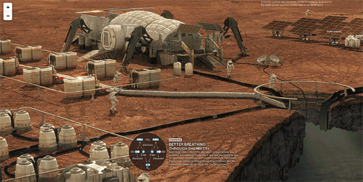
The October print edition of the National Geographic includes a double sided poster about Colonizing Mars. The art side of the poster depicts a possible human colony on the red planet. It explains some of the technical difficulties which would be faced in establishing a Mars colony and shows what such a colony might look like.
The map side of the poster is a new map of Mars based on imagery and data from NASA's most recent missions to the planet. If you are interested in maps of Mars you might also enjoy National Geographic's article on the history of mapping the planet, What Mars Maps Got Right (and Wrong) Through Time.


Comments