Maps of the Week
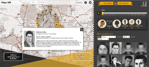
There have been a lot of maps released this month commemorating the 25th anniversary of the fall of the Berlin Wall. Among my favorites was this map from Spanish radio & television broadcaster RTVE. The map investigates the 138 victims who were killed trying to cross the Wall during the Cold War.
During the 28 years of the Wall's existence 121 men, 8 women and 9 children were killed while trying to cross into West Berlin. Caidos en el Muro uses the Google Maps API to plot the locations where each of the 138 victims were killed while trying to cross the border between East and West Germany.
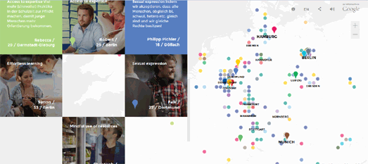
Google took a different approach to their commemorations of the reunification of Germany. 25 years after the fall of the Berlin Wall Google interviewed twenty-five young Germans to find out what life is like in the new Germany. Google's #Deutschland25 features twenty-five interviews with individuals who have grown-up in Germany's Generation Mauerfall.
In the interviews director and journalist Bettina Blümner questions twenty-five extraordinary young Germans about their lives, hopes and dreams for the future. #Deutschland25 also includes a prominent Google Map which allows you to view comments that other Germans have left on the website and to leave your own comments about life and the important social issues in Germany today.
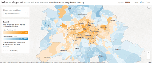
The Berliner Morgenpost has also created a new map of Berlin which reveals a new dividing line in the city. How the S-Bahn Ring Divides the City is a map of the German capital in which the neighborhoods have been colored to show whether most of the inhabitants were born in or outside Berlin.
The map reveals that within the S-Bahn ring in every neighborhood, except Neu-Templhof, the majority of the residents were born outside Berlin. Outside the S-Bahn ring many of the neighborhoods are dominated by native Berliners.
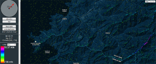
DataDraw is a JavaScript library for the Google Maps API which can be used to visualize and animate large amounts of data on a Google Map using a canvas layer.
You can view the library in action on this impressive Wind Visualisation map. The map simulates wind patterns on a styled Google Map. If you select the 'animated style' option you can view a beautiful animated simulated visualization of wind patterns. You can adjust the direction and strength of the wind by dragging the red arrow in the circular wind control.


Comments