Maps of the Week
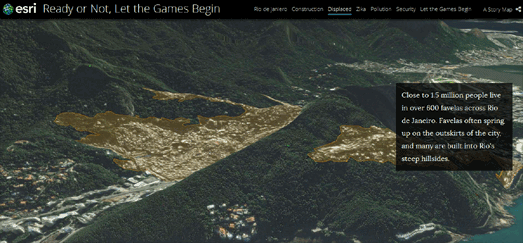
Esri has releaseded a great interactive presentation exploring Rio de Janeiro's preparations for the 2016 Olympic Games. Ready or Not, Let the Games Begins examines the impact on Rio, both positive and negative, of the infrastructure developments being made for the games and how these changes are affecting the city and its citizens.
The interactive is divided into five main sections looking at; the impact of construction projects, the displaced people living in the favelas, the spread of the Zika virus, pollution and security issues in the city.
Because the presentation is created by Esri many of these issues are, of course, illustrated with accompanying interactive maps. The interactive uses a story map format, so that as you scroll through the presentation the maps automatically update to illustrate the accompanying text. I particularly like how Map Swipe is used in some of the maps to automatically reveal and compare different base map layers.
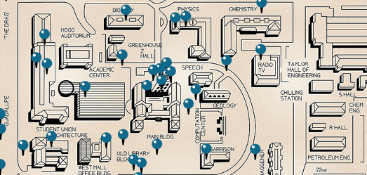
Fifty years ago Charles Whitman killed 14 people and wounded 32 others at the University of Texas. The Texas Standard has interviewed nearly 100 survivors of the UT Tower Shooting, including professors, students and reporters. You can listen to the interviews and view archival newspaper reports & photos about the shooting on the Texas Standard's new Tower History website.
Out of the Blue: 50 Years After the UT Tower Shooting features a prominent interactive campus map of the University of Texas at Austin. The map markers allow you to listen to eye witness accounts of the UT Tower Shooting. As well as allowing you to listen to the interviews many of the markers include textual reports and archival photos.
The map itself is a really nicely designed custom map of the campus site. It has been made interactive using the Leaflet.js mapping platform.
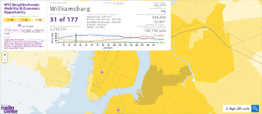
Eighteen of the top Twenty neighborhoods for job access in New York City are in Manhattan. If you live in Manhattan there are an average of 4,128,263 jobs accessible within one hour by public transit.
You can use the Rudin Center's NYC Neighborhoods: Mobility and Economic Opportunity interactive map to view the number of jobs available within one hour of travel in each of NYC's neighborhoods. If you select a neighborhood on the map you can view a basic isochrone layer showing the neighborhoods in range of 30, 45 and 60 minutes of travel on public transit.
You can also view details on the number of jobs accessible within 60 minutes of travel and the types of job (by industry). The information panel includes other details about the neighborhood, such as the population total, median income and the unemployment rate of the selected neighborhood.


Comments