Mapping New York Taxi Data
This year there has been a number of really great mapped visualizations of New York taxi data. This latest map visualizes taxi traffic from JFK and LGA airports during the 2013 holiday season (Nov 15th to December 31st).
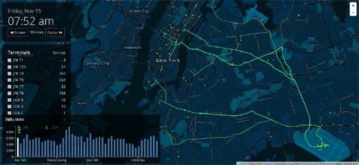
The NYC Taxi Holiday Visualization animates taxi journeys from New York's airports over the course of a month and half. As the animation plays you can view the animated tracks of thousands of individual cab journeys taken from JFK and LGA airports to all parts of the city.
While the animation plays out on the map the side-panel keeps a running total of the number of taxi trips taken from each of the airports' terminals. A bar graph at the bottom of the map also reveals the number of taxi journeys taken on each day. The graph reveals the drop in flights during Thanksgiving and a distinct rise in traffic after the holiday weekend as people fly back into NYC, presumably after visiting family outside of the city.

NYC Taxis: A Day in the Life is a MapBox visualization of the journey of one New York taxi over the course of 24 hours.
The map animates one New York taxi's route over the course of one day. As the animation plays the taxi's position is shown by a yellow circle map marker. All the passenger journeys are added to the map with a blue polyline. While the animation plays the map also keeps a running total of the cab's total number of passengers, fares and tips received.
Once you have viewed a day in the life of this New York taxi you can choose from another one of thirty cab journeys mapped over 24 hours.

Hubcab is a mapped visualization of 170 million taxi trips over one year in New York City. Using the map it is possible to view all pickup and drop-off points in the city and to view the number of trips taken between two separate locations.
Locations that were used as taxi pickup points in the city are shown as yellow dots on the map and drop-off points are shown as blue dots. It is also possible to refine the results displayed on the map by time of day.
You can view the number of taxi journeys between two different locations by dropping two markers on the map. After you place the markers on the map you can see the number of taxi journeys taken in one year in both directions between the two locations. You can even refine the results by time of day to explore when the most journeys between the two points are made at different times of the day.


Comments